
This week the professor assigned to created a logo to go for a student run News program called #WhatsGoodCityTech. During the program Students will go around interviewing and shedding light different events going on in and around the College. Places such as restaurants and student functions will serve main focus for the program. The logo was suppose to represent the hip and cool part of City Tech as well as embrace to Hashtag (#) culture which exist on social media.
As a person who isn’t necessary versed in Adobe illustrator, it was a new experience that before, I had to basically learn how to illustrator. I watched videos on the subject and basically had to teach myself. That part wasn’t bad seeing how kind of always talk myself. To make sure to logo was great, I was paired with another intern at the office. We both brainstormed tons of ideas together as well as on our own. I put my all into it. I don’t know what’s wrong with my but I love turning things into competition. I always want to outshine someone. After a few days after starting the project, I came out with six solid well thought at designs. He had about the same
We both submitted our designs to the professor for final approval. Out of the ten, The professor chose two of many designs. I love it when I get my way at anything in life. I wonder which one of logos I made the professor had chosen?
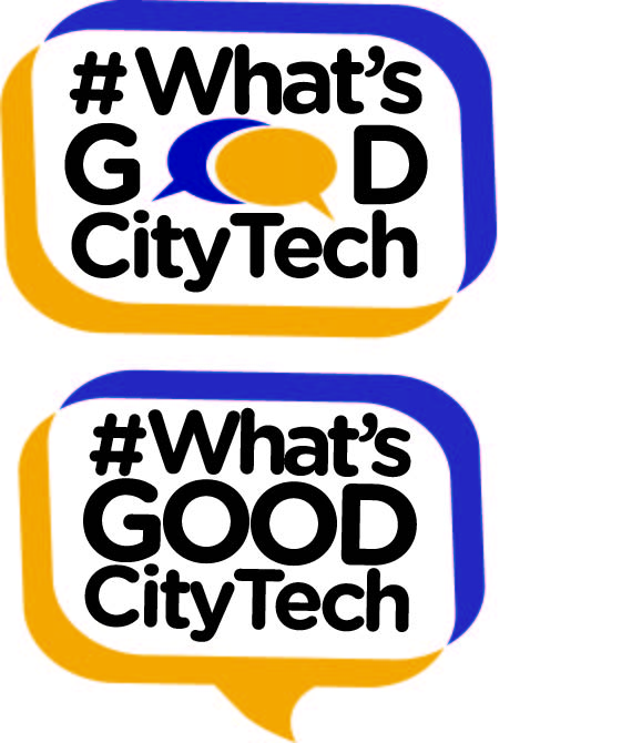
My overall thought behind the creation of the logo was to try to the incorporate speech bubbles into the Design. The reason being because the phrase of the logo relates to a social media form of greeting. I also wanted to keep the school colors. I hate restrictions but i also enjoy the challenge and the thinking it encourages.

