Logo Design

I started with a bunch of random sketches of my name, taking it in no direction or the other. I found it a little difficult to get very creative with the initials “JB” without them looking too much like “BJ”, which…is something I wanted to avoid entirely.
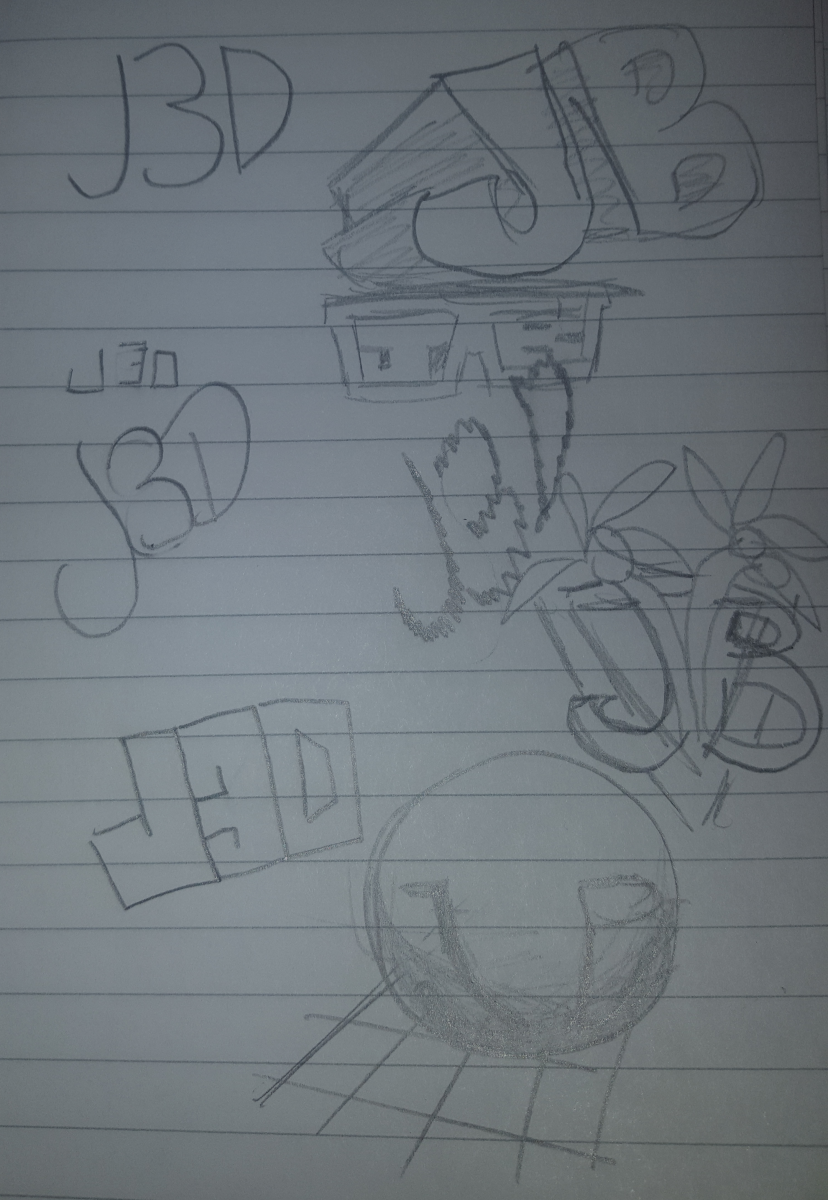
I started noticing that the B could easily be replaced with a 3, and could then incorporate my core focus of study, 3d modeling. So I decide to play around with the initials J3D. I’m also a big fan of 80’s aesthetic, and you can see a little bit of that here.
![]()
My first design. I borrowed from a few of the design ideas I’d sketched out, including that graph-like field you’d see in a lot of 80’s video games that simulated a 3d space. I thought it came out pretty well, but as my processor pointed out, it would make more sense to incorporate the back end of the J in place of the green stroke I’d used to make the 3 into a B. Sort of embarrassed I didn’t think of that myself!
![]()
Finally, I ended up with this completed design. I merged the J and the 3 together, which still maintains the Illusion of the B. Also, I tweaked the D on the end to be more uniform with the final design. Al in all, I’m pretty satisfied with the final result.

