My interview with my classmate Ezra
My interview with my classmate Ezra
Jennielyn Aquino
Prof. Goetz
COMD 1112
Research Paper
Alexey Brodovitch
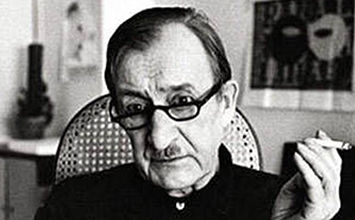
Alexey Brodovitch was both a Russian-American graphic designer and photographer. He was known to be the art director for a fashion called Harper’s Bazaar. Brodovitch was born in 1898 in Ogolitchi, Russia. Brodovitch was born into a wealthy family. He began his career as a graphic designer when he was in Paris from 1920 to 1930. But It was right after he was enlisted to fight in a Russian Army during World War I. After World War I, Brodovitch returned to France to reunite with his family. He started to look for a job for the first time since he was deprived of wealth. He always wanted to become a painter, so he took a house painting job. He was able to work as a painter for backdrops at Diaghilev’s Ballet Russe because of the connection he had with emigrated Russian artists. During his spare time, He would begin sketching designs that were for textiles and jewelry. Soon enough, his side project became successful in selling his designs to fashionable shops after he completed his ballet works. He took another part-time job which where he was creating layouts for art journals and design magazines. He juxtaposed the type, photographs, and illustration of the magazine. However, Brodovitch started to gain recognition for his design work which won first place for a poster competition for an artist event called “Le Bal Banal.” This poster was a bold design that was inverting the mask shape, type, and background. He continued gaining that recognition just after his success in the Paris Internation Exhibit of the Decorative art during 1925, earning at least 5 medals. In 1930, Brodovitch started to move to the united states after accepting a job post as a professor of advertising in Philadelphia. Then in 1934, Carmel Snow who was the editor-in-chief for Harper Bazaar hired Brodovitch as the art director in order to revive the magazine with his modern spirit. He would modernize the magazine graphic along with bringing photography to the fore. Brodovitch became a huge influence on many photographers.
CITATION
“Alexey Brodovitch Paintings, Bio, Ideas.” The Art Story, www.theartstory.org/artist/brodovitch-alexey/.
“Alexey Brodovitch.” Artnet, www.artnet.com/artists/alexey-brodovitch/.
“Alexey Brodovitch: Biography, Designs and Facts.” Famous Graphic Designers, www.famousgraphicdesigners.org/alexey-brodovitch.
Biography by Andy Grundberg September 4. “Alexey Brodovitch.” AIGA, www.aiga.org/medalist-alexeybrodovitch.
The Editors of Encyclopaedia Britannica. “Alexey Brodovitch.” Encyclopædia Britannica, Encyclopædia Britannica, Inc., 11 Apr. 2019, www.britannica.com/biography/Alexey-Brodovitch.
Nick_L. “(12/55) Alexey Brodovitch – Photographer/Designer.” Photographs Etc., 1 Jan. 1970, nicklloyd.blogspot.com/2013/01/1255-alexey-brodovitch.html.
“Quick Design History: Alexey Brodovitch #ThrowbackThursday.” Shillington Design Blog, 2 Apr. 2019, www.shillingtoneducation.com/blog/alexey-brodovitch-tbt/.
SeungYu. “Alexey Brodovitch.” Design History Mashup, 1 Jan. 1970, designhistorymashup.blogspot.com/2008/04/alexey-brodovitch.html.
Jennielyn C. Aquino
COMD 1112 D109
Prof. Tanya Goetz
Due: 9/09/19
Assignment #2: Logo History
“Walt Disney Logo.” 1000 Logos The Famous Brands and Company Logos in the World, 1000logos.net/walt-disney-logo/.
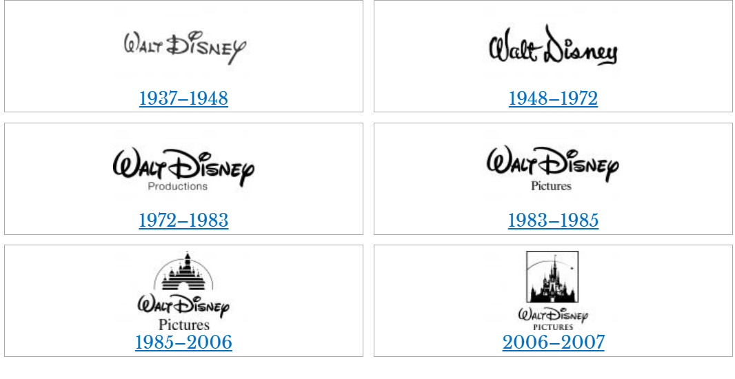
Walt Disney started off his career with his first-ever business which was Laugh-O-Grams Studios. It was the beginning of his creation of cartoon films. But in 1923, Laugh-O-Grams studio was suffering from an unfortunate bankruptcy. Because of this bankruptcy, Disney moved out Hollywood in order to start all over again. He had only $20 to his name. With the help of his brother Roy, Disney was able to produce his own short cartoon animation called “Alice and Oswald the lucky rabbit.” Both cartoons became very successful and popular. However when he tried to earn some money from his distributor for his cartoon. He founded out that his distributor went behind his back and signed up almost all of his animators in order to make Oswald cartoons make less money. Disney reread his contract and soon realized that he didn’t own the rights to Oswald. In 1928, he lost his legal copyright for these characters since he couldn’t protect his legal right for his character.
Along with the help of his chief animator Ub Iwerks, Disney was able to design a brand-new character which was a little mouse and able to give the little mouse a personality. Ub was able to animate two Mickey Mouse cartoons. However, Disney couldn’t sell his cartoons due to the fact that the original two Mickey Mouse cartoons did not yet have sound. In their third cartoon Steamboat Willie, they introduced synchronized sound to the animation. The little mouse from Steamboat Willie became known as Mickey Mouse. Mickey Mouse became one of the most famous Disney characters that Walt Disney created. Due to the success of Steamboat Willie, in 1929 Walt Disney Production was created. This was the very beginning of Walt Disney’s successful career.
![]()
Stark, Tony. “The Walt Disney Logo.” Logaster Blog, 11 Sept. 2019, www.logaster.com/blog/walt-disney-logo/.
When Walt Disney production was first created, its first-ever logo was the profile of Mickey Mouse which was rotated and changed colors. The logo featured a stylish word which was Walt Disney and home entertainment right below the logo. It takes advantage of Disney’s first-ever creation which was Mickey Mouse. This logo was showcasing the improvement in technology animation during that time. Mickey Mouse was transformed from a touching mouse into a most famous brand. Mickey Mouse was the first cartoon character who was able to exceed the bound of screens
![]()
Sandu, Bogdan. “The Disney Logo and All There Is to Know about the Walt Disney Brand.” Design Your Way, 13 Nov. 2019, www.designyourway.net/blog/graphic-design/the-disney-logo/.
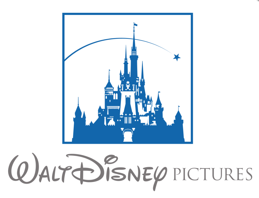
In 1985, the Walt Disney logo had a transformed in its logo. They added a key visual,Cinderella’s castle, to the Walt Disney name. The logo was on a dark purple/blue backdrop along with a shower of light that was descending from the top of the screen. It was forming into a stylized ,segment castle which was a either white or purple with only 6 flags. Through the main gate of the Cinderella’s castle had a white ball of light that formed and then extend out to form the word of Walt Disney along with the word “PICTURES” that was faded underneath Walt Disney
Nostra. “The Story Behind… The Walt Disney Pictures Logo.” My Filmviews, 19 Dec. 2012, www.myfilmviews.com/2012/10/31/the-story-behind-the-walt-disney-pictures-logo/.
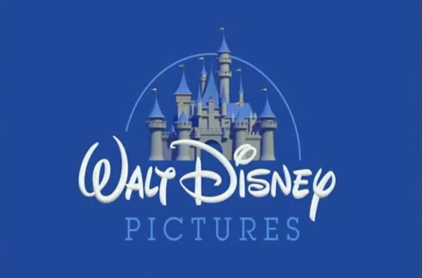
In 2007, Disney had struck a deal with Pixar to created an animated 3D version of their previous logo. The camera would zoom out of the castle while the 6 flags were moving. “Walt Disney Pictures” is shown after while the stars was drawn a line that was behind the castle which cast a shadows onto the castle.
RESOURCES:
Admin, Joe – LMW. “The History of Disney and Their Logo Design.” LogoMyWay Blog, 7 Mar. 2017, blog.logomyway.com/history-disney-logo-design/.
Sandu, Bogdan. “The Disney Logo: All There Is to Know about the Walt Disney Brand.” Design Your Way, 17 June 2019, www.designyourway.net/blog/graphic-design/the-disney-logo/.
Stark, Tony. “The Walt Disney Logo.” Logaster, 22 Aug. 2012, www.logaster.com/blog/walt-disney-logo/.
“Walt Disney Logo.” 1000 Logos The Famous Brands and Company Logos in the World, 1000logos.net/walt-disney-logo/.
Www.facebook.com/stuartlcrawford. “History Of The Disney Logo Design And Branding Evolution.” Inkbot Design, 13 Aug. 2019, inkbotdesign.com/disney-logo-design/.
Nostra. “The Story Behind… The Walt Disney Pictures Logo.” My Filmviews, 19 Dec. 2012, www.myfilmviews.com/2012/10/31/the-story-behind-the-walt-disney-pictures-logo/.
“Walt Disney Pictures Logo.” Disney Wiki, disney.fandom.com/wiki/Walt_Disney_Pictures_logo.
“Walt Disney Logo.” Graphic Design I, 9 Mar. 2012, graphicdesign1aust.wordpress.com/2012/03/09/walt-disney-logo/.
“How Disney’s Iconic Look Has Changed From 1923 to the Present Day.” D23, 27 Mar. 2018, d23.com/walt-disney-productions-logos-through-the-years/.
Stark, Tony. “The Walt Disney Logo.” Logaster Blog, 11 Sept. 2019, www.logaster.com/blog/walt-disney-logo/.
QUOTE OF MY CHOICE:
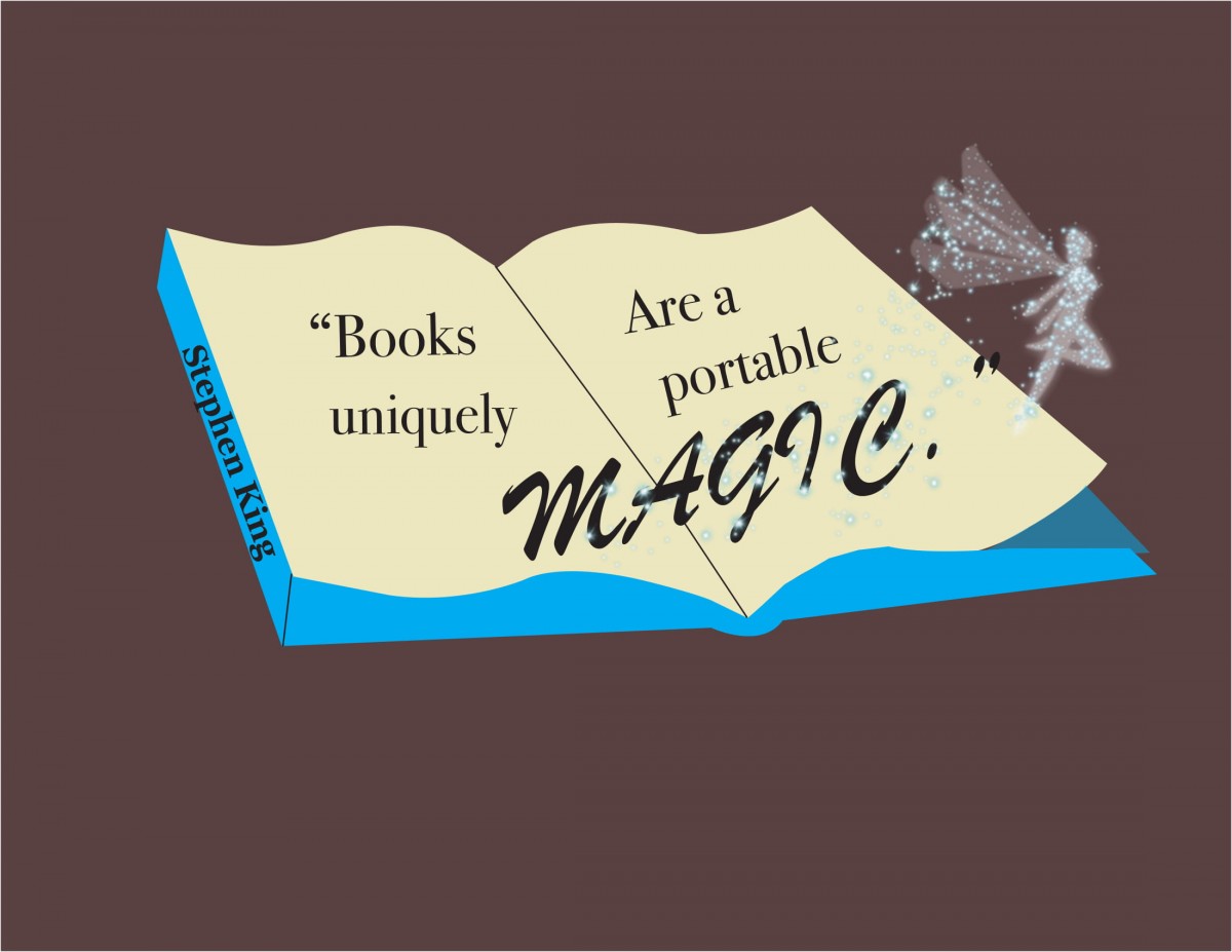
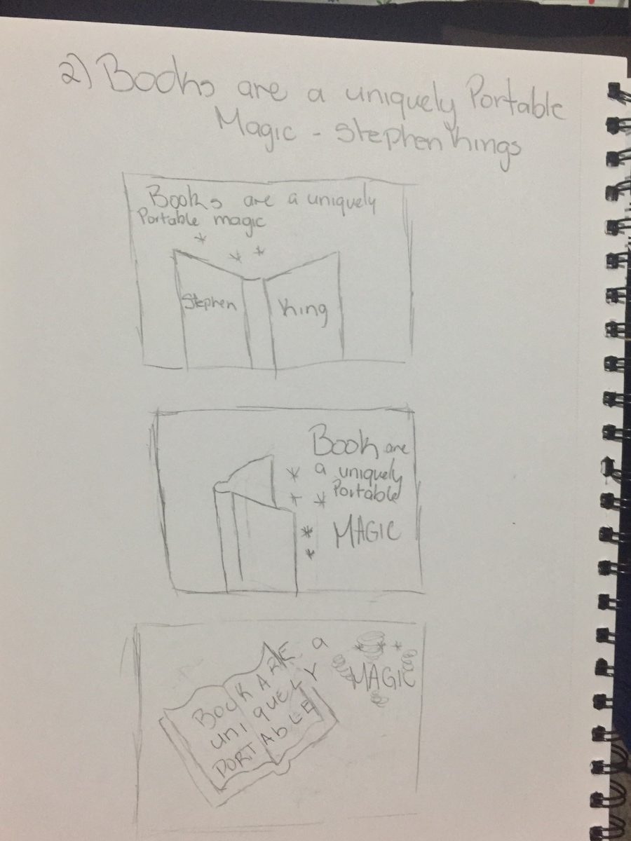
“Books are uniquely portable magic.” -Stephen King
Since I could not find the author of my original quote, I decided to go with the one that I was the most familiar with.
Thumbnails:
Final Concepts:
#1

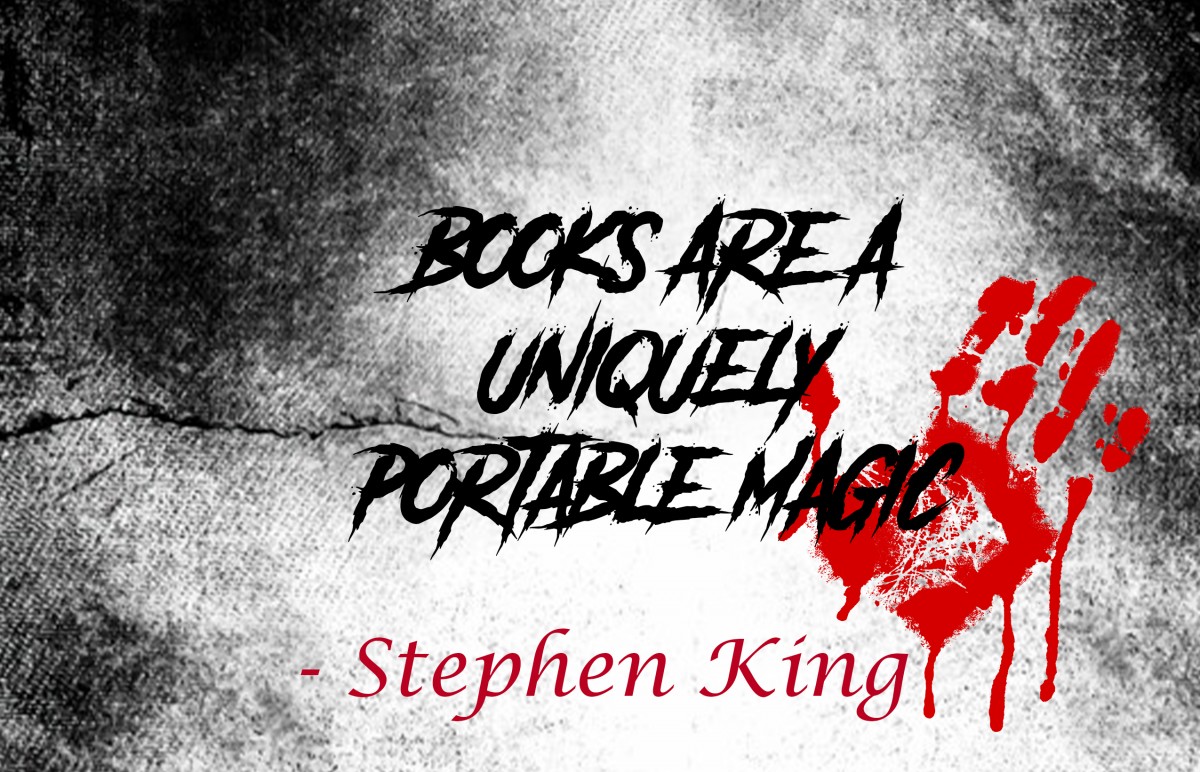
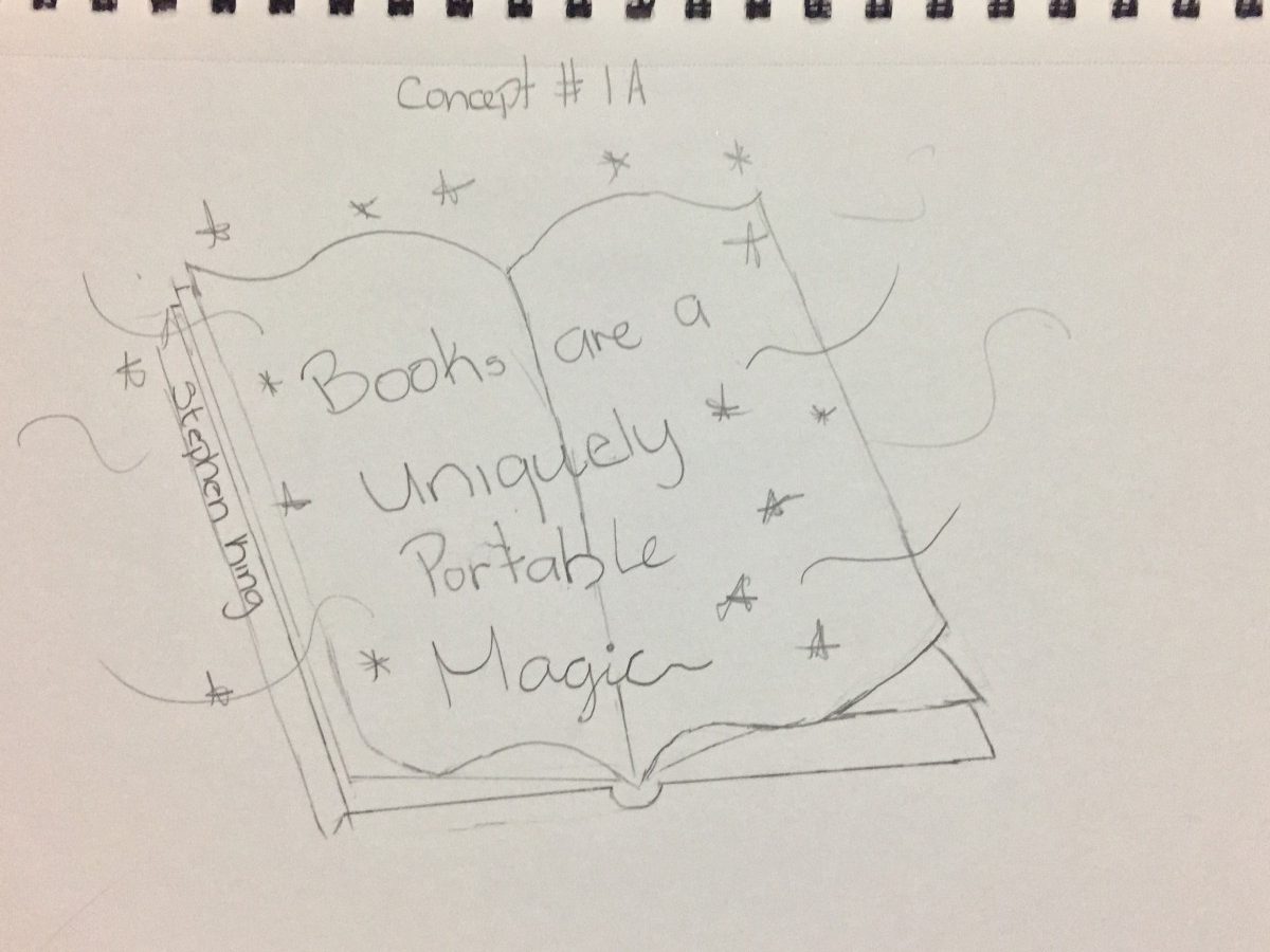
For the first concept, I chose an opened book since an opened book was the first thing I think of. I thought of having to put a black background for the book to pop up along with the quote. I thought I would use a script typeface for the word “Magic” to intimate the word magic. But it wasn’t successful for most people. It was making my quote more Disney-like rather than Stephen King since he was known for his horror theme books & horror movies. I added a horror theme background instead using a black background. For the font typeface, I looked up a horror font on Dafont. I ended up using a font called another danger. For the font color I used for Stephen King , I used something that was the color of blood. I used a bloody handprint to make it more horror.
#2

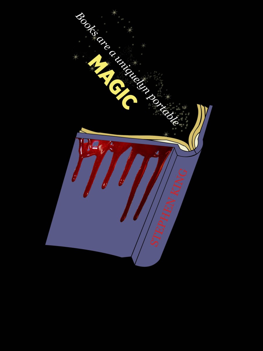
For this concept, I keep the same concept as my first one just from a different perspective. For the color choice, I ended up choosing this purple-blueish color for the book itself. But however, for my concept, I made the font color I just put a regular black for Stephen King. But my final concept I ended up changing up the alignment for Stephen King more in the center. Adding some kind blood drip from the book to intimate the horror feel you get when you read Stephen King
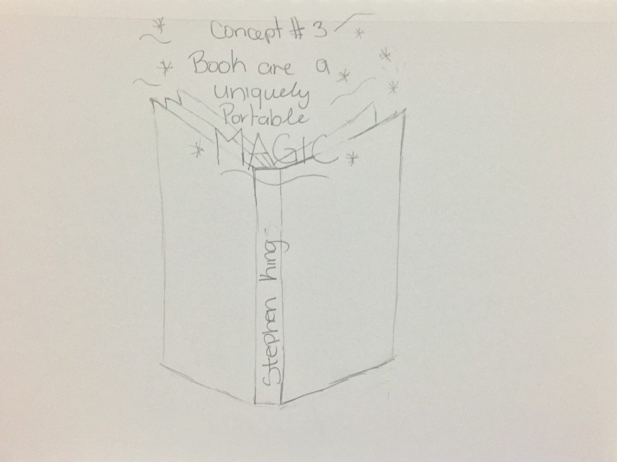
#3
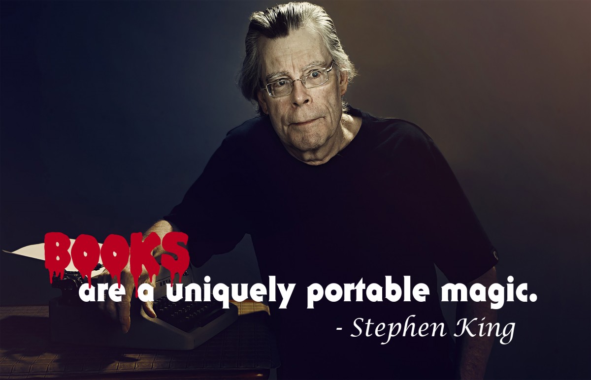
For this concept, at first, I did another opened book but however, It wasn’t successful as I thought it would be. So I ended up changing up my idea and using a different way to visually show this quote easily. I used a picture of Stephen King as my concept to make it more different from my second concept. For the font I found another horror that look like a bloody word. The font name for this is called Double Feature. I was able to find it also on Da Font.
The OpenLab is an open-source, digital platform designed to support teaching and learning at City Tech (New York City College of Technology), and to promote student and faculty engagement in the intellectual and social life of the college community.