Visual Quote Project

cdmg-1111text-onlycdmg-1111

This is the illustration along with the quote that i’ve used for the visual quote project and it was a fun project to do because I got to make an illustration along with looking through the quotes that were memorable and find which were the best to use. The only challenge I would say I went through is deciding if to use color or not for the illustration along with what type of font should I use that would go well with the illustration but in the end I found the font and I chose not to use any color or light and shadow and decided to use the font called “Stixgeneral”.

Project #2: Get out and Vote

Project #2 was an interesting assignment because I had a lot of ideas that I really wanted to put into this assignment but unfortunately some of those ideas had to be taken out due to the requirements of the project but it was interesting because I really had to think about what would be ‘good’ for the sake of the project, but also what would be good for me as well. Overall, it was fun but challenging project to do.  thumbnail-vote-1 scan-14 final scan-5 scan idea-2

AIGA’s Get out and vote campaign

It's Your Move, America.

I would say out of all of the vote posters this has got to be the one that caught my eye. Things that I like about it is that it  makes the democrat donkey and republican elephant look like chess pieces and it make sense because they always seem to fight each other on different views and another thing I found interesting is that they have different issues as chess pieces and I think it’s clever and says a lot on how america’s system government is like.

CDMG 1111 Quotes Project (Refined Sketches)

cdmg-quote-experimentsimg_3726img_3725

These are some of the few ideas that I’ve had relating to quote when I saw this quote the main thing I wanted to focus was man trying to improve himself but going through pain while doing so I looked up some photos of men doing physical exercise but looking in pain while doing it. I also did some small illustrations of a marble sculpting itself but looking as though it’s struggling while sculpting itself.

Rolling Stones Logo Essay


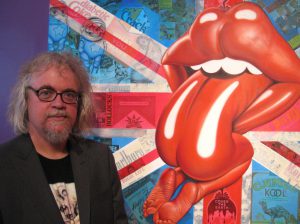
Throughout out our lifetime we see a wide variety of logos and/or symbols we either remember vaguely or remember distinctly. For example, the stop sign, we’ve all seen the sign before we automatically know what it means. Powerful symbols tend to that. In 1971 John Pasche created a symbol of a pair of lips and tongue. Little did John know those lips and that tongue would have the same reaction in hundreds of millions of people. In 2008, the red lips and tongue logo was ranked #1 on 50’s greatest band logo of all time on Gigwise.com through a This logo help represent arguably one of the greatest English rock bands of all time.

During the creation of the  logo for the Rolling Stones 11th album “Sticky Fingers”, John said that the mouth was inspired by the mouth of Mick Jagger during the their first meeting also the Hindu goddess of death, Kali. John said that tongue and lips help suggest sexual connotations and an anti- authoritarian attitude which were popular themes in the Rolling Stones music.

rolling-stones-logo-mouth

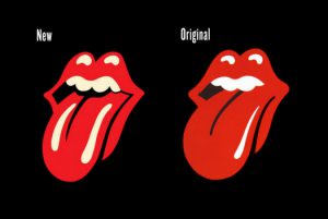
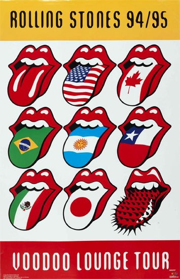
The original is the one on the right and the new version is the one of the left. The new version is found on shirts, wallets and a wide variety of accessories. Throughout it’s existence there were only few adjustments that were made such as there are now two highlights on the tongue, the red is more saturated, the outline is complete on the end of lips, the corners of the lips are more sharp, there is a shadow on the tongue from the teeth. While there have been adjustments to the logo, there are those who made their own variations of the logo such as American contemporary artist Ron English, and another which was done by Mark Norton who made different variations of the logo for the rolling stones voodoo lounge tour. Powerful symbols tend cause a wide variety of reactions such as inspiration, fear sadness, happiness, anger, while symbols are just symbols in the end, it’s the powerful ones that are unforgettable.

1993-voodoo-loungeimg_8576_p-nguyen

Thoughts on Graphic Principles class

Graphic principles class has taught me a lot about graphic design and the different ways you can create a design by using color, shape, point, plane, and illusions and different ways you can attract someone and how you can control someone’s eye using visual hierarchy, it’s all interesting. Ever since I started learning about these things I’ve started to notice these principles in subway ads and knowing what rule/principles and color combinations that were used to make the ads to attract to the eye. Overall I enjoyed this class and the information I received from it.

Project #2 Thoughts

Project #2 was a mixed bag. it was mixed bag because while using music and design principles such as rhythm and contrast to create a wide variety of mock ups was fun and exciting, doing the final product was tedious and time consuming. IMG_2619