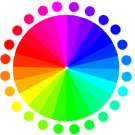
Prismatic color
The colors of the visible spectrum produced by passing white light through a prism; red, orange, yellow, green, blue, indigo, and violet
source
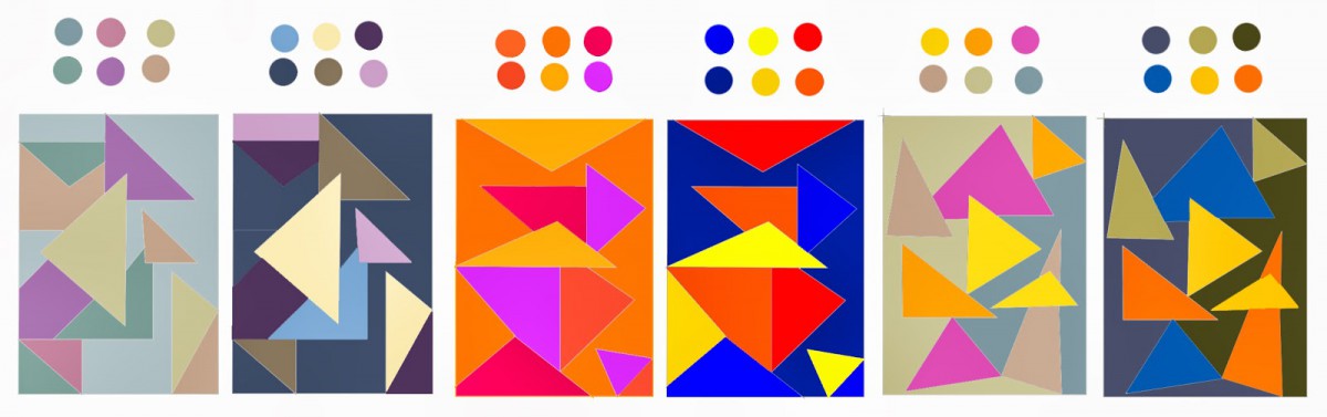
Muted color
For purposes of this conversation it is any highly saturated hue (such as those from Flat UI Colors) and adding a tint, tone or shade to make it less bright and more subdued. The result is often a softer, calmer color that can be easier to work with and match to the overall design.
informal: similar to Matt or semi matt color hue in painting and usually used to create a constrast with other design elements
source
Achromatic gray
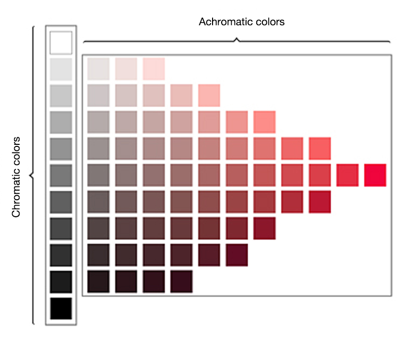
Achromatic colors (white, grey and black) have lightness but no hue or saturation. They can be created by mixing complementary colors together. Chromatic colors, on the other hand, have characterizing hues such as red, blue and yellow, as well as saturation, which is an attribute of intensity, in addition to lightness. The elements of hue, lightness and saturation found in chromatic colors are referred to as the three attributes of color, and specific colors can be represented by stipulating the values for each of these attributes.
source
informal:
Chromatic gray
Chromatic grays [or tinted grays, as they are sometimes called] are used extensively for walls and furnishings in buildings of various types–and not always with great sensitivity to the way color, light, texture, and pattern are able to affect the feeling-tone of an environment.
Chromatic grays were used with great skill by French artists of the middle of the nineteenth century–by Corot in his landscapes, which derive much of their quality and originality from his sensitive adjustment of earth colors to warm and cool trays, and by Courbet in his bold paintings of the woodlands, chalk cliffs, and damp caves of his native Franche-Comté. [19] The Jongkind, used tinted grays to simulate moist atmosphere and veiled sunlight over sand and water. The American painter James McNeill Whistler used gray tones in his mood pictures, or Nocturnes, as he called them. The master of warm and cool grays in the 1860s and later was, of course, Manet, who based his new technique, peinture claire [light painting], on a most advanced handling of paint and of values–values more and more in the middle to light registers. He softened most light and shadow contrasts., illuminated his subjects broadly and evenly, and virtually eliminated traditional modeling or shading.
source
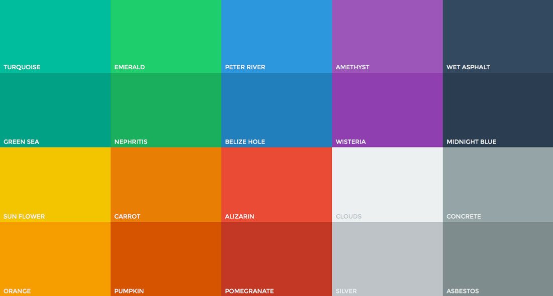
Additive color

If we are working on a computer, the colors we see on the screen are created with light using the additive color method. Additive color mixing begins with black and ends with white; as more color is added, the result is lighter and tends to white.
source
informal:
Subtractive color