Design Journal entry #22
 source: ja
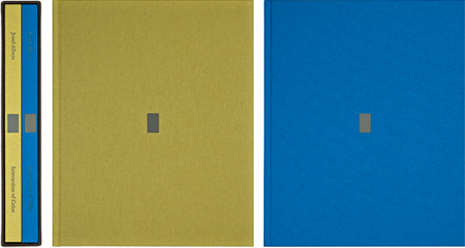
Josef Albers
To Albers’s mind, such studies had little practical value for the artist. As he noted at the outset of Interaction of Color: In visual perception a color is almost never seen as it really is—as it physically is. This fact makes color the most relative medium in art. In order to use color effectively it is necessary to recognize that color deceives continually. To this end, the beginning is not a study of color systems.
In Albers’s universe, color seduced, beguiled, schwindled, and these characteristics made color the most fascinating of art’s formal elements. Albers’s passion for color prompted his decision to launch what was possibly the first full-blown course in color ever given anywhere, and certainly the first based exclusively on direct observation of color’s behavior. . . . Color behaved. Color was magic.
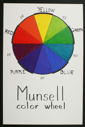
Johannes Itten
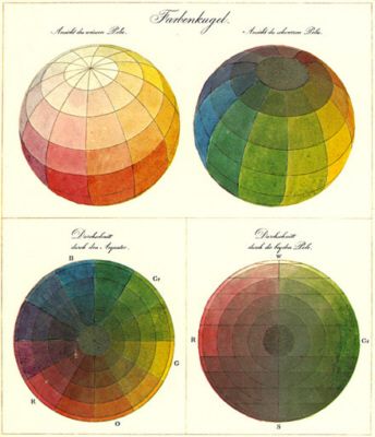
Source: JI
Johannes Itten taught at the Bauhaus from 1919 until 1922, and he taught one of the fundamental preliminary courses that – among other things – grappled with color theory. Itten gave us a color sphere comprised of twelve colors (three primary, three secondary, and six tertiary) that shows the relationship among colors, as well as gradations of saturation. The influence of psychoanalysis is apparent in Itten’s color theory, as he was one of the first to associate different colors with specific emotions and study the impact of color on our moods. He also studied how individuals perceive color.
Itten taught that there were seven different methods of contrast: contrast of saturation, of light and dark, of extension, complementary contrast, simultaneous contrast, contrast of hue, and contrast between warm and cool colors. One of his particularly interesting practices in the classroom was to work students through an examination of color and in particular his theory about contrast by first examining abstract works, reflecting the Bauhaus’ move away from exclusively representational works. After students studied the abstract pieces, they would move on to look at more realistic works, and finally would apply what they had learned of color theory to their understanding of classical works.
Itten’s most enduring contribution to modern day color theory, though, is his characterization of colors in terms of temperature, and his designations of certain colors as warm and others as cool persists to this day.