-
RHYTHM
I noticed Rhythm in these examples of graphic work because the designs have a strong repeated pattern and energy to the works. Forms of variations in color ways and shapes that follow with a flow and movement to the design hierarchy therefore, it makes sense to the viewers eye to have a full visual understanding of the graphic.
Kristina Wedo
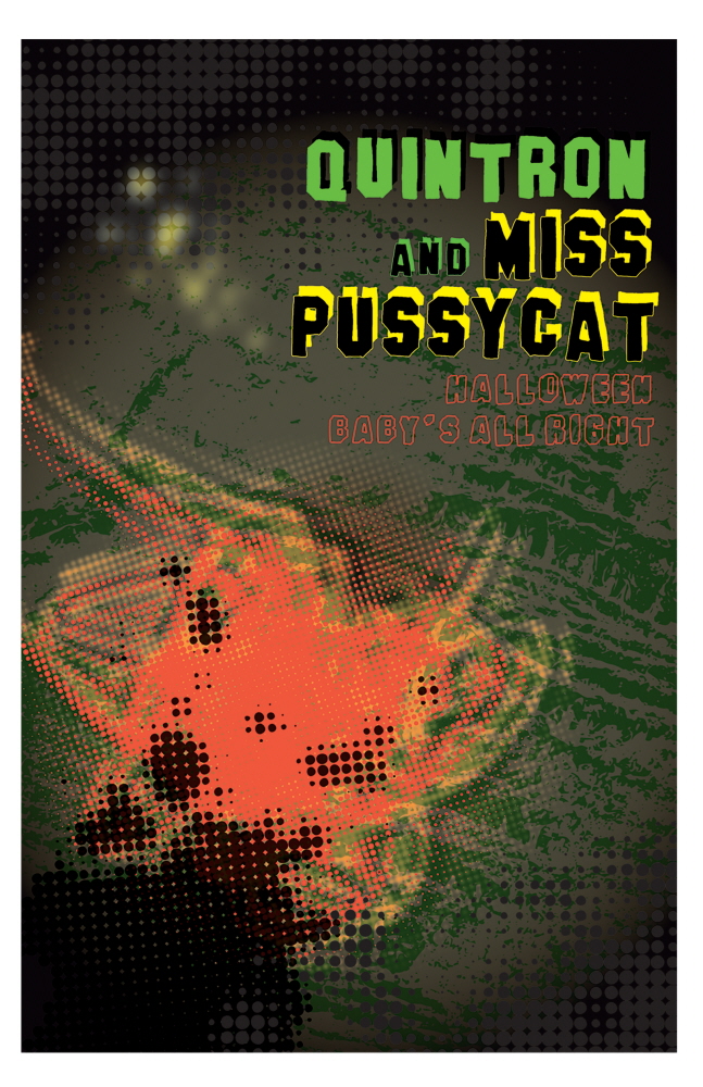
Wedo’s graphic for Baby All Right’s Halloween Showcase shows rhythm in the type and color palettes the designer chooses to use within the flier and using the color to travel throughout the graphics.
Alejandra Garcia
Garcia’s design stood out to be as a viewer because there is a rhythm to the design and makes it feel less violent with the orange background behind the figure, even though this used for gun shooting ranges practice sample body. The designer customized this design with gun holes and spattering blood references which create a swing to the design and makes it less familiar and less static but more active guiding the viewers eye to the type to promote the Play or showcase.

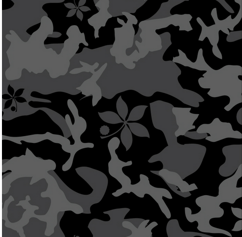
BRAD ADAMIC
Adamic’s pattern has a lot of movement within variations of greys and black (figure ground influences) working as a contrast but feels very active as a print. The design is is varied between leaves and camo design. In a way looks like dried up leaves and lively leaves.
MOVEMENT
BRIAN NAYLOR
Naylor’s shows movement in his work by having the coffee flying in against a white background and give you the feeling of the movement that it is an active and healthy snack. The coffee is the main focus of the design, espresso is the main ingredient in the health bar, One Whey (Zero).
-
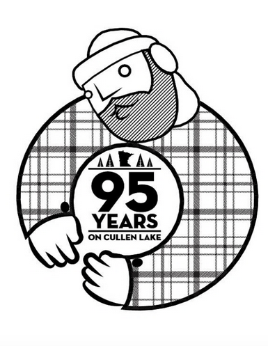
Timothy Hirschey
Hirschey’s logo explores movement with the shapes of circles, oblique and scaling of the logo to make your eye to focus in on the designs. The hands of the logo creates closure and swing to the logo. The plaid design within the logo creates this lumberjack feel against the lines within the beard of the lumberjack adds more direction to the contrasting designs.
-
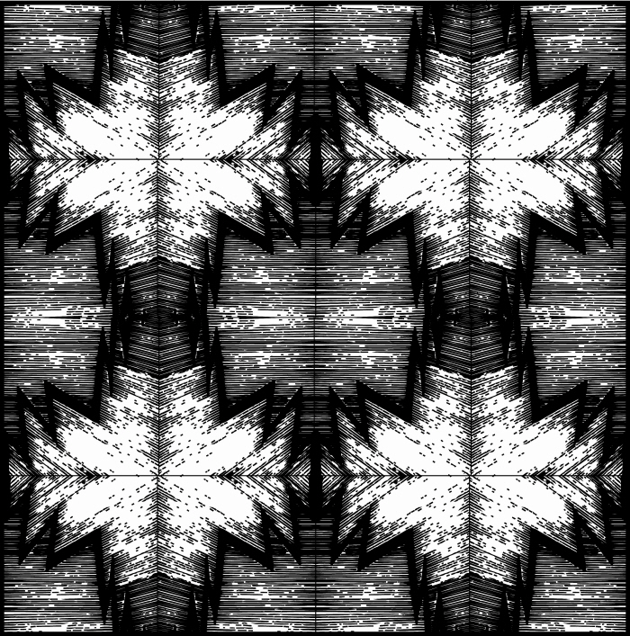
Alejandra Garcia
Garcia’s movement in the designer work’s theres a variation of energy with the white/black/grey tones in the shapes starred layered design and the background with grey tones. The movement is in the lines and it feels like the graphic was active through the shapes that are interlocking within each other.