My thought process behind this video was to portray one day of my life. I chose this day specifically because I was going to one of my favorite places the Metropolitan museum of art. The Met is one of the most inspirational places to me and is full of so much art and culture. I wanted to do my video there specifically to represent ones of the most important things about me which is being an artist. when watching this video you are getting a sense of what inspires me as well as what my favorite art styles are.
Poster

For my poster I wanted to bring awareness to mental health,because I believe it is something that should be talked about more. I wanted to name bring specific mental illness in my poster. I designed the image in the poster in a way that shows the words coming out from the persons ear. My idea behind this concept is to have the words represent a thought, and since the ear leads to the brain I thought this was the best way to represent mental health. I also included a link to a mental health charity on the bottom of the poster to emphasize the importance of the poster and to showcase its purpose more.
Field Trip Report
[pdf-embedder url=”https://openlab.citytech.cuny.edu/imahrouss-eportfolio/files/2019/05/home-work-week-10.pdf” title=”Field Trip Report”]
Logo Research Paper
[pdf-embedder url=”https://openlab.citytech.cuny.edu/imahrouss-eportfolio/files/2019/05/logo-research-paper-final-.pdf” title=”logo research paper final”]
Visually Enhanced Quote
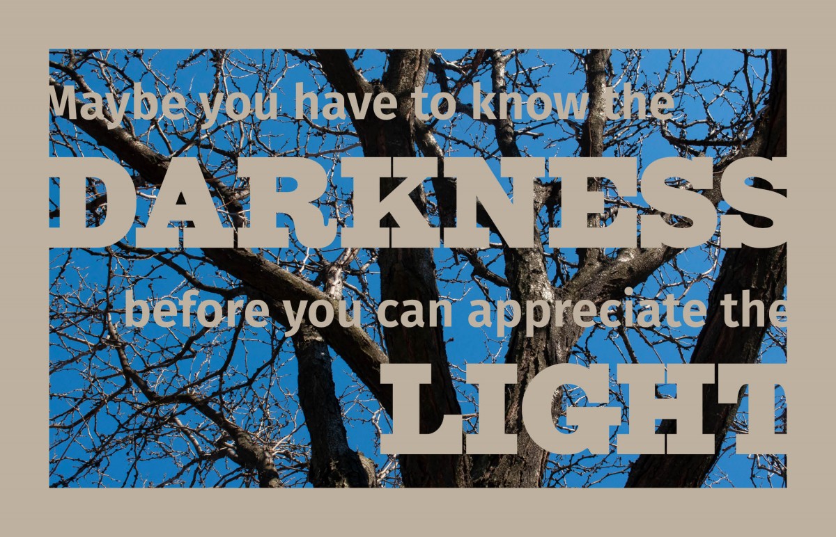
For my last design I decided to keep it simple and create a negative space using an image of a tree. I was inspired by the natural color of the tree and made my text a light tan color to compliment the image. I also decided to play around with the negative space of the text and border of the image to make the design more interesting. I used a slab serif typeface for the main words darkness and light since they were the largest words. The rest of the quote I used a sans serif typeface, so they were clearer to read since they were smaller.
Visually Enhanced Quote
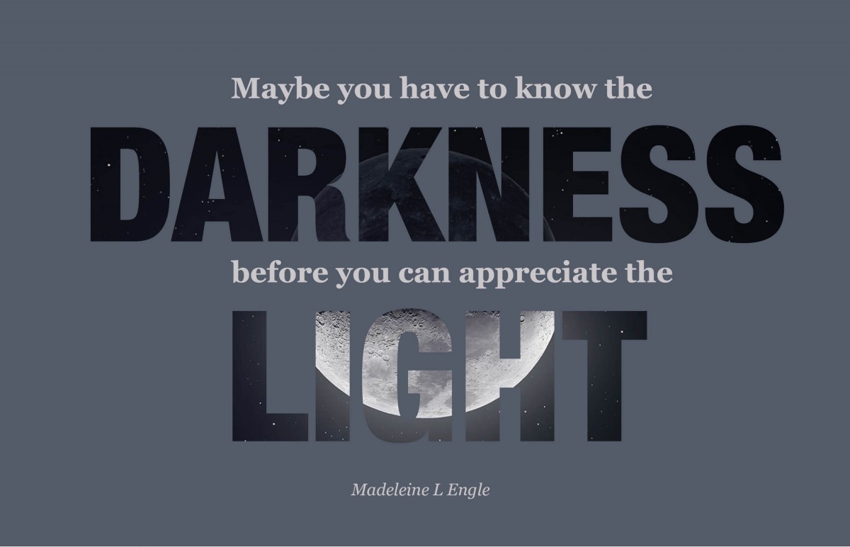
For my second design I used an image and placed it inside the word’s darkness and light. I put the rest of the quote above and in between both words. The image inside the text is the moon and the shadow half are inside the word darkness, while the light side is inside the word light. I thought this gave the words more meaning which is why I did it.
Visually Enhanced Quote
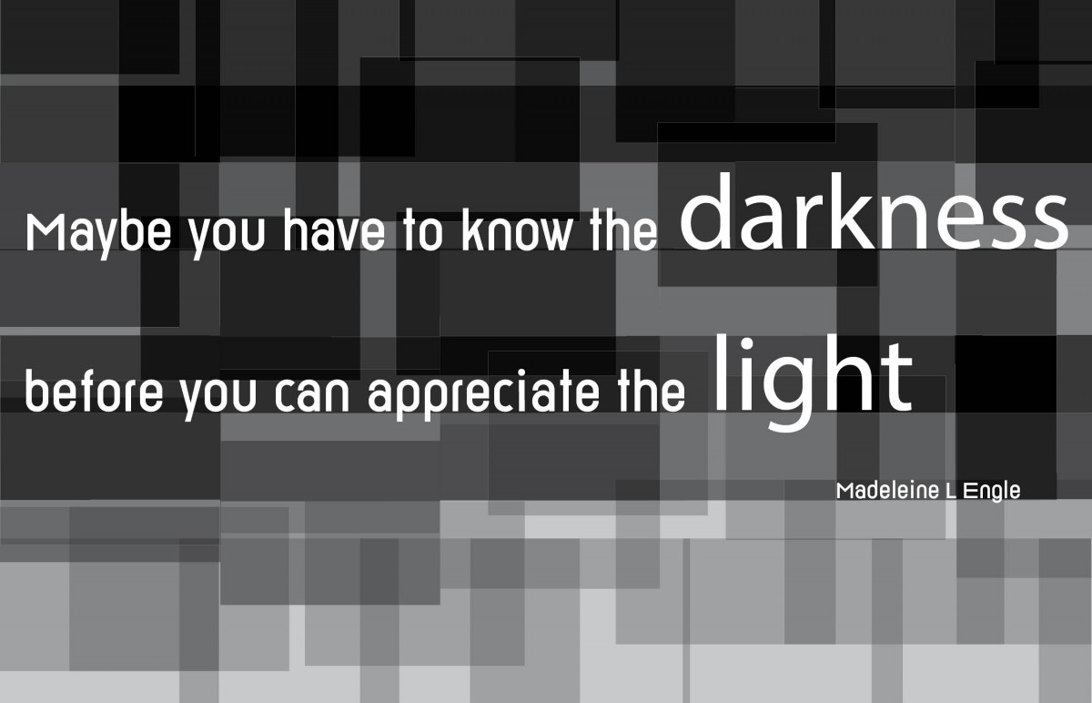
For the first design I decided that I wanted to create a monochromatic image to represent the quote itself. More specifically I wanted to represent the literal meaning of the word’s darkness and light. I created an abstract image that fades from dark to light. I kept my text in the dark area of the image, so it stands out. I used san serif typefaces such as Reross and Helvetica to make it bold and stand out of the background even more.
Photoshop Animations
For this assignment I had to create three animations using Photoshop.
Parallel Lines That Show Movement: project #1
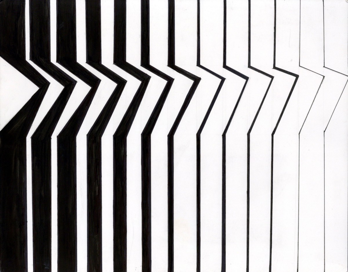
This Project was my first assignment for this course. I think for my first project it was a good introduction to the rest of the projects in the class. I found the project very interesting because I was forced to think outside of the box. I definitely think I broke out of my comfort zone in this project including all the other projects done in this class. For this project, I had to create parallel lines that showed movement. Starting with the thumbnail sketches I struggled with the first 4 that I had done. I think this project included some trial and error especially when it came to the thumbnails. When I finally had my selected composition I had to draw it on the bristol paper. When drawing it on the bristol paper I had to measure where I was putting drawing my lines to make sure I filled up the whole page. Since this was my first project for this class I was using new materials that I had no experience with. Using the FW ink to fill in the Large black areas was a new experience for me. For this project I actually had two attempts, my first one is where I messed up with the ink where I used too much of it and it spread all over the page. My second attempt was successful though. Overall I think this was a fun project to do but, If I could change one thing it would be the white triangle space on the left side. It seems very out of place to me and should have been filled in.
Texture exploration and organization: project #2
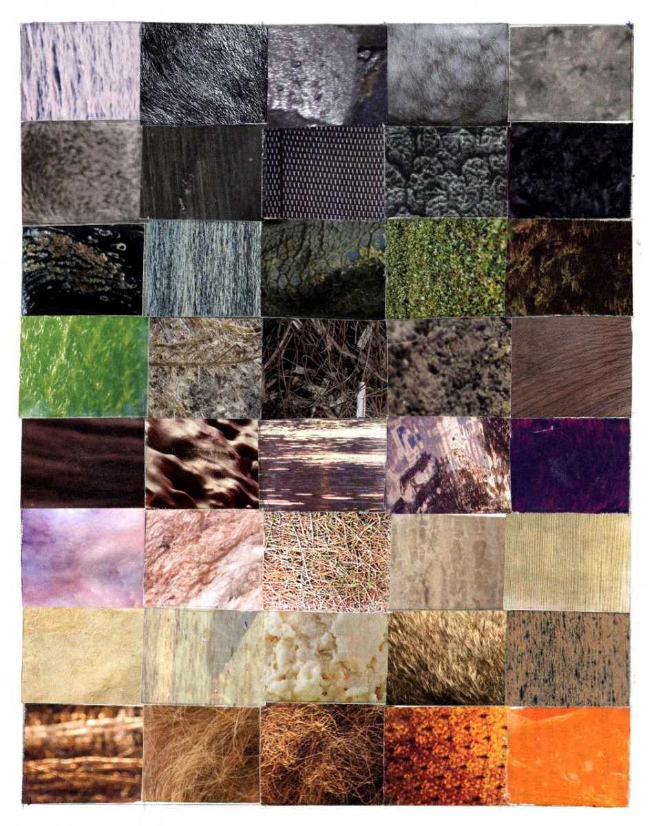
For this project I had a confused experience with it. At first I didn’t know what to do with the textures that I had found. I think what I struggled with the most was arranging them on the bristol paper. When I was arranging my textures, my first instinct was to arrange them by color. I arranged them horizontally by color for example, the last row textures are arranged by orange tones. After arranging them by color I noticed that a majority of my textures had a large focused scale and a small very detailed scale. After discovering this I rearranged them based not only by color but by their scale. The textures that have large focused scales are placed towards the outside, while the textures with a small scale were placed on the inside. Something else that I struggled with was finding textures to use. Many magazines had some good textures but many of them also had textures that resembled things such as hair or fur. For this project I think it was important to choose textures that were more abstract. If I could do this project again I think I would had tried to find better textures because some of my textures are based on things such as human hair or plants.

