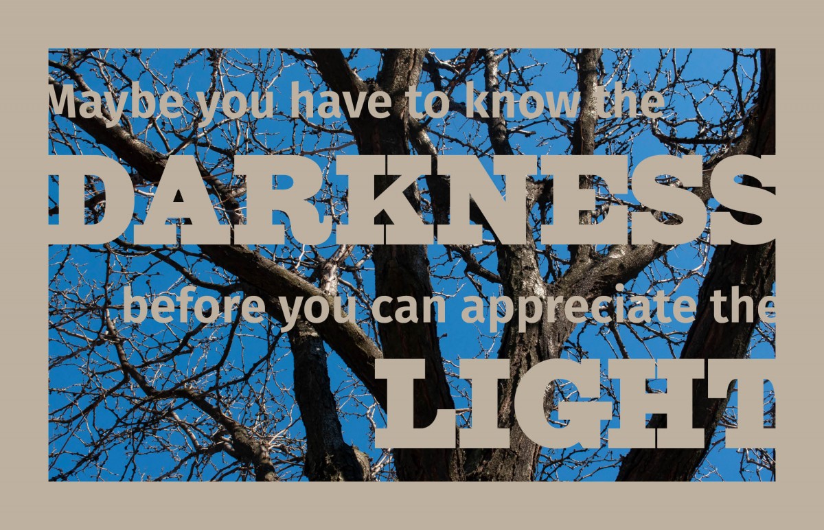
For my last design I decided to keep it simple and create a negative space using an image of a tree. I was inspired by the natural color of the tree and made my text a light tan color to compliment the image. I also decided to play around with the negative space of the text and border of the image to make the design more interesting. I used a slab serif typeface for the main words darkness and light since they were the largest words. The rest of the quote I used a sans serif typeface, so they were clearer to read since they were smaller.

