In 1926, the oldest broadcasting company in American history was founded by David Sarnoff. In 1915, more than a decade before Sarnoff founded the company, he had envisioned a service which would make it possible for “… the national audience to share a single experience.” (NBCUniversal) More than a decade later, Sarnoff founded the the National Broadcasting Company, or more commonly known by its abbreviation: NBC. This broadcasting company made it possible for Sarnoff to execute his vision. The success of the National Broadcasting Company took off rapidly, and in “… less than a year into the network’s existence, NBC was already broadcasting some of the biggest events in the nation.” (LogoMyWay)
Over the years, as the National Broadcasting Company continued to evolve, it “… became the owner of thirteen popular television stations, and an affiliate of two hundred other stations.” (LogoMyWay) According to Karen Herman of the Emmy’s Archive of American Television, experimental television broadcasting began in the 1930s. However, it was not until the World Fair in 1939 “… where NBC unveiled their new TV studios in Rockefeller that network television was first introduced.” (Herman) NBC was a pioneer of this new revolution in media.
As their brand continued to grow, it was imperative that their logo followed. Over the course of NBC’s existence, their logo has evolved more than ten times. A logo must continuously evolve to become symbolic of the brand’s ideals and concepts. In the 1930s, the National Broadcasting Company dominated the radio. This was during a time period known as the Golden Age of Radio. (LogoMyWay) The first couple of NBC logos featured radio waves as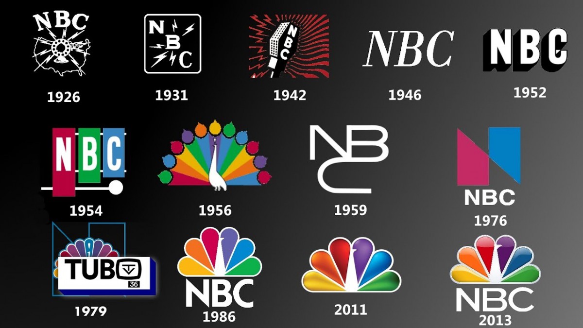 a design element, symbolic of the brand’s “roots in radio.” (Holmes) The logo introduced in 1926 consisted of a microphone with the letters “NBC”. In 1931, the microphone was removed from the logo. “NBC” became the focal point, with radio waves emanating out of the letter “B”. As stated by Angela Riechers of Adobe Create Magazine, people were fascinated by the invention of radio waves and the fact that they could “… travel through the air carrying news, music, and entertainment into their homes.” (Riechers) These logos played on the curiosity of their audience.
In the 1940s, a new logo was introduced. This rebranded logo was of a microphone with their abbreviation. The waves on the left of the microphone were meant to symbolize the radio network, and the waves on the right were to symbolize the television n![]() et work. (Holmes) It was in the 1950s that the logo changed, and became more simplified. The new NBC logo was letters only.
et work. (Holmes) It was in the 1950s that the logo changed, and became more simplified. The new NBC logo was letters only.
In 1954, a xylophone with the notes labeled NBC became the new logo. This “… provided a literal counterpart to the network’s chimes.” (Riechers) It should be noted that this was the first NBC logo that featured color. This provided a transition point for the National ![]() Broadcasting Company’s most iconic and well known logo to date; a prideful peacock, proudly displaying its feathers. This original peacock logo was designed by John Graham. The colorful feathers of the peacock are meant to be representative of the network’s color programming. (LogoMyWay) Although the logo continued to evolve over the years, the peacock would soon resurface, because of its ability to “… communicate the mission of NBC, a network devoted primarily to entertainment.” (Riechers)
Broadcasting Company’s most iconic and well known logo to date; a prideful peacock, proudly displaying its feathers. This original peacock logo was designed by John Graham. The colorful feathers of the peacock are meant to be representative of the network’s color programming. (LogoMyWay) Although the logo continued to evolve over the years, the peacock would soon resurface, because of its ability to “… communicate the mission of NBC, a network devoted primarily to entertainment.” (Riechers)
Prior to the resurgence of the peacock logo, Graham designed another logo, which is known as the NBC Snake logo. This logo was simple and elegant, however, it was disapproved by the majority of critics. As stated by Steven Heller, all network companies were trying to compete with CBS, because their eye logo was considered the creme de la creme. (Riechers) However, it seemed like NBC was having an identity crisis. CBS’ eye logo represented “clear ![]() objectivity” and therefore was representative of their mission in news broadcasting. The NBC snake logo did not seem to represent anything, it was just visually pleasing. As stated in an article written by Ryan Rahinel and Noelle Nelson, “… designs should reflect the beliefs one wishes to promote” about their brand. (Nelson, Rahinel) The original peacock logo was praised because it was representative of NBC’s mission in the entertainment business.
objectivity” and therefore was representative of their mission in news broadcasting. The NBC snake logo did not seem to represent anything, it was just visually pleasing. As stated in an article written by Ryan Rahinel and Noelle Nelson, “… designs should reflect the beliefs one wishes to promote” about their brand. (Nelson, Rahinel) The original peacock logo was praised because it was representative of NBC’s mission in the entertainment business.
In the 1980s, the peacock logo resurged. Steff Geissbuhler designed a cleaner version of the peacock, by using less plumes, and flat colors. The amount of plumes changed from eleven to six. Each plume was a different color, which was representative of six 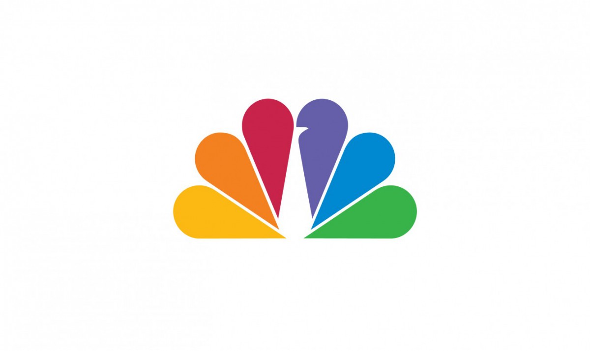 divisions of the company. News was represented by yellow, sports was represented by orange, entertainment was represented by red, stations were represented by purple, network was represented by blue, and productions represented by green. (Riechers) Geissbuhler simplified the peacock and made a timeless design.
In the 90s, seven artists were commissioned to create different renditions of the logo that would be used to “… engage viewers as small programming elements between programs, promos and advertising.” (Advertising Age) Among the artists commissioned included Peter Max, Al Hirschfeld, John Kricfalusi, and Joan Gratz. This mission was part of a bigger plan for NBC to help “brand” the company for consumers. (Advertising Age) “Branding” gives a company an identity and shows consumers what to expect. If the brand is strong, the company has the ability to attract a certain clientele while increasing their profits (Ingram, Smith). Although the logo continued to change in small ways as a branding strategy, NBC decided to keep the peacock as the subject of its official logo. The peacock is the current logo used today.
As the world continues to change and shift to social media and the internet as sources of entertainment, NBC noticed that their ratings for shows such as the “Today” show plummeted. NBC made a huge effort to rebrand their show, by using a new studio, mission statement, cast member, and logo. (Stelter) NBC made an effort to promote sustainability and going green, since environmental activism and sustainability efforts are at an all time high. They did so by turning their logo green and adopting the slogan: “ Green is universal”. (Stelter)
The National Broadcasting Company has changed its logo many times, symbolic of their technological advances. It is important that a company evolves with the times. NBC’s logo may have changed in many instances, but it has taken an ample amount of time to grow their brand and expand their vision in a way that is true, and relevant to their company.
Works Cited
“7 artists dress up NBC’s peacock.” Advertising Age. (September 13, 1993 ): 162 words. LexisNexis Academic. Web.
Admin, Joe – LMW. “A Look at NBC’s Logo and the History behind It.” LogoMyWay Blog, 13 June 2017, blog.logomyway.com/nbc-logo-history-behind/.
Herman, Karen. “TV History.” TV Video Library: Interviews and Video Clips – Archive of American Television, www.emmytvlegends.org/resources/tv-history.
Holmes, Chris. “Proud As a Peacock – NBC Logo Evolution.” The Man in the Gray Flannel Suit, 19 June 2013, www.grayflannelsuit.net/blog/pround-as-a-peacock-nbc-logos-throughout-the-years.
“Our History.” NBCUniversal, www.nbcuniversal.com/our-history.
Smith, William C. and Robert Ingram. “Building a Community: BRAND.” Economic Development Journal, vol. 11, no. 3, Summer2012, pp. 41-47. EBSCOhost, citytech.ezproxy.cuny.edu:2048/login?url=http://search.ebscohost.com/login.aspx?direct=true&db=a9h&AN=80224610&site=ehost-live&scope=site.
Stelter, Brian. “At NBC, the Brand Becomes a Slogan.” New York Times, 5 Nov. 2007, p. C11(L). Academic OneFile, go.galegroup.com/ps/i.do?p=AONE&sw=w&u=cuny_nytc&v=2.1&id=GALE%7CA170718656&it=r&asid=e9123f6dbbc7f083ec2b00c142e294e9.
Stelter, Brian. “NBC Announces a Face-Lift, and One New Face, for ‘Today’.” New York Times, 13 Sept. 2013, p. B3(L). Academic OneFile, go.galegroup.com/ps/i.do?p=AONE&sw=w&u=cuny_nytc&v=2.1&id=GALE%7CA342706675&it=r&asid=6b36a52ba8159979d1aaa9b6d402afc2.
RAHINEL, RYAN and NOELLE M. NELSON. “When Brand Logos Describe the Environment: Design Instability and the Utility of Safety-Oriented Products.” Journal of Consumer Research, vol. 43, no. 3, Oct. 2016, pp. 478-496. EBSCOhost, doi:10.1093/jcr/ucw039.
Riechers, Angela. “What You Can Learn from the Evolution of the NBC Logo.” What You Can Learn from the Evolution of the NBC Logo | Create, create.adobe.com/2017/8/25/what_you_can_learn_from_the_evolution_of_the_nbc_logo_.html.

