Author Archives: Israel Martinez

Deliver

With all the sketches that I have done and post I happy with the final that I made I feel like throughout this project I found out what it means to sketch. I was struggling to find the emotion in the other pictures, but in this one I feel like I got the setting. At the end I chose to go with anger which wasn’t one of the emotions that I wanted to do, but when looking back and restarting by taking a new picture I found that is what I felt from the photo. The feeling of anger is like disappointment and  recovery which affects us and can make us better when we get through things.

Deliver Line and Text Israel Martinez

final

One thing that I wish that I really did better at was sizing the images better than I did. One thing that I can take from this is being positive that everything is to perfection. I really enjoyed this project and showing how not every design has to do with shading and you can get the same design through lines and text and not only shading.
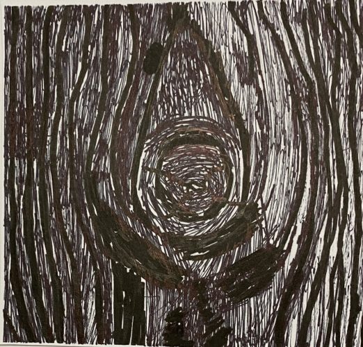
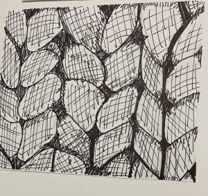
 Tree – Line

tree treeim

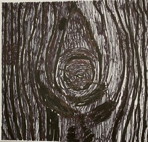
On the Left is the example design and on the right is my line design. I feel like this was the easiest one for me, but a lot of rethinking went into it. The hardest part of this was finding how to makes the dark’s, dark with out shading anything in. The way that I did it was by thinker lines with smaller lines in the filler spots. I feel like this is the best design that I did throughout this project.
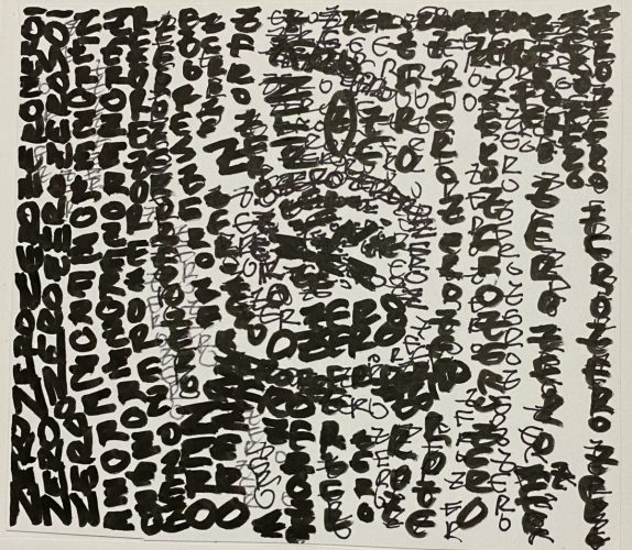
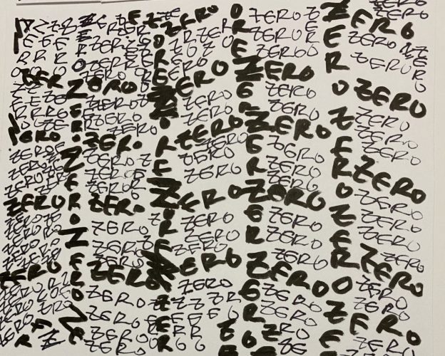
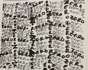
Text

treetextim

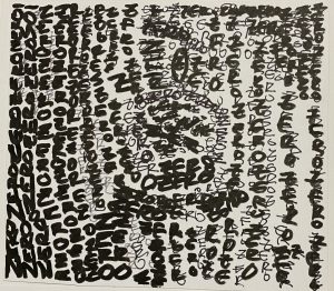
On the right is my text version of the tree design, this was the most difficult out of all the designs, because trying to catch all the details with text you have to be able to shift the words and letters in a way that it matches the design. For the effect of darkness I used a darker ink pen rather than finer. Also adding extra letters helped me out with trying to create the shadow and dark effect that it needs.
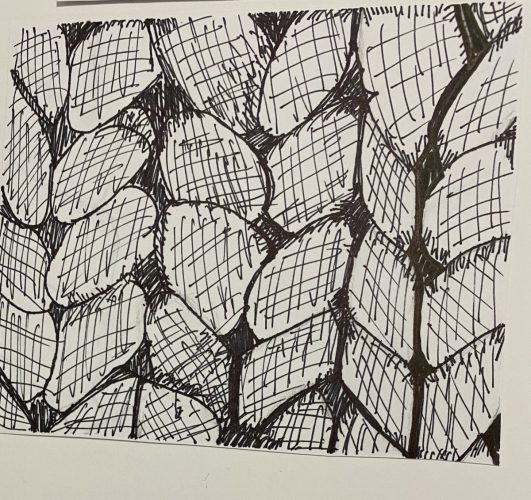
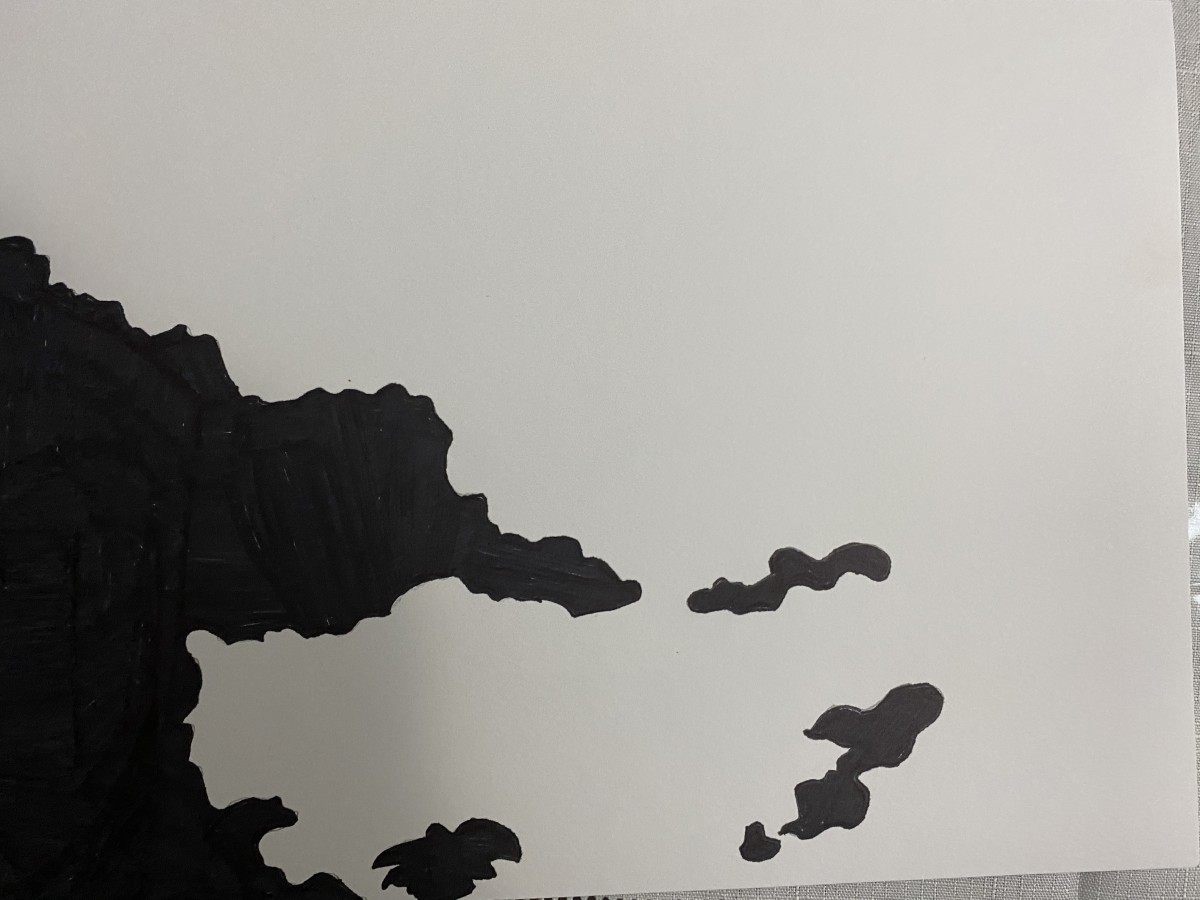
Yarn/ Rope  – Line 

yarn

My line design is what gave me trouble with the yarn/rope design I found my self getting in trouble with the spacing of the actual design. I do feel like that I did portray the feel of the original design. Finding the dark spots in the design and trying to do them in line was hard because in the original it is so fine that it makes it look like it is shading.

Type

yarn

In my design I feel like the way that I showed the spacing was good by making the letters and words in darker ink going the same way as the original. One place that I wish I would have done better in is there are some open spaces that could have been added with more letters. This design was overall my favorite that I did throughout the whole project, due to the fact that it shows how everything can be blended together.

Deliver – Israel Martinez

Some feedback that I got while presenting really stood out to about the ambiguous work is that when I was doing the work I thought the proportions were all good and after the feedback they were off. So when I resubmit that is one big thing that I will be looking at also the tidiness in making the shape in this also was off. Those two things affect me in the project, but will help in creating others in the future.

land

The thing that I found in my obvious is the way that I inked it. I should have put more in on the page so it could really show the effect of the 70/30 ratio. Also my mistake while presenting was being unprepared and not bringing in the actual photo for this one.

(The Photo Below)

obvious

Defining – Israel Martinez

https://drive.google.com/open?id=17eYLYjFBm02JS3PQ175yIBGJpAErRSyn

vault

My ambiguous was inking in a way that its like a left versus right. I wanted a yin yang which makes everything pop out more. My first ink drawing was smaller and made the drawing a bit bigger so it could relate everything better. The first one had a smaller shape shows more of the outside and didn’t get the right proportions that I wanted.

After presenting I found out what I did wrong and what I could to make everything come together better, and to focus on the actual black vs white.

land

My obvious ink drawing started off good, but the proportions were off just a bit so I changed it while going into the Bristol. So I zoomed in on the picture and made the proportions better. From 60/40 to 70/30.

I will be editing the pictures and turning in on Tuesday


Story Behind the Pictures Israel Martinez

Ambiguous

This is a picture number 1 of the Lost and Found Project

The story behind this is that two major lands are fighting to get all the keys to unlock the vault. This vault contains much military power that can change the war, both sides have all, but two of the keys to unlock the vault this is one of the doors that opens the vault and with the key you must try and complete the puzzle to continue. When the key is put in the all three turn and lead to the puzzle room which nobody has ever got into. Lets hope the rumors are real and we are able to unlock vault and win this war for my land.


obvious

This is picture number 2 of the Lost and Found Project

This picture represents the two lands that are fighting in the war. Both lands fighting against each other to control all the land. The leaders putting both lands in hard times just for power they conquered other lands took people hostage and destroyed villages just to grow in strength. The people of both lands want this war to stop and be united peacefully, but the leaders both just want as much power as possible.