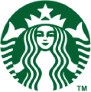
Redesigned logo used from 2011–present.
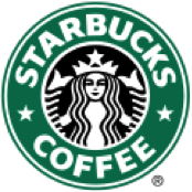
Green logo used from 1992–2011, still being used as a secondary logo.
The Starbucks brand is an American global coffee company. Founded by Jerry Baldwin, Gordon Bowker and Zev Siegl in 1971. They’re coffeehouse chain based in Seattle Washington. In 2006, Valerie O’Neil, is a Starbucks spokeswoman, she said that logo is a “twin-tailed mermaid, siren as she is known in Greek mythology”. This Logo has been significantly streamlined over the year after the original owners sold the Starbucks chain to former employee Howard Schultz.
Howard Schultz changes to the new logo. The second edition of the logo, followed the pattern of the original mermaid, but they did some changes, the mermaid did not have naked breasts and change the trademark color to green. So the second versions of the Starbucks logo were born. The Starbucks logo is circular in shape along with another circle within it. The word marks are inside the circles with two stars on either sides separating the words Starbucks and Coffee. The current change to the logo is a bid to highlight the Siren which is a symbol of the Starbucks’ legendary taste. The former Starbucks logo sported a bold but simple font that attracted all age groups. The new logo is without any word marks or stars with an enlarged siren.
January 2011, Starbucks published a new logo; they remove the “STARBUCKS COFFEE” word make from the old logo, only keep the image of the mermaid in the middle of the logo and making it green. The two-colored Starbucks logo characterizes the simplicity of the brand. White and deep green are the only colors that are used in the new logo. The two tails are white in color whereas green forms the background of the logo.


