AIGA Field Trip Report

01_Manuel-Estrada

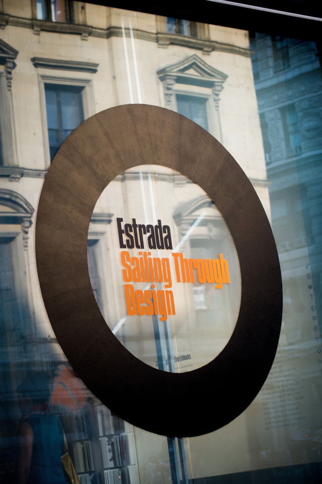
  My trip to the AIGA (American Institute of Graphic Arts) was very interesting from what I usually see at an exhibit.s visual diaries, which he uses to register his working process including ideas, perceptions and first sketches. s specific creative process but also the steps that any design project may involve. The show takes us from first ideas to final designs, guiding us through the stages in between where concepts and shapes change until reaching the most adequate conceptual, contextual and formal result. is also a journey through Spanish culture. Mainly devoted to corporate identity and editorial design, Estrada has worked for some of the most significant cultural institutions and companies in Spain. Through his designs we encounter the writers, institutions and events that are at the core of contemporary Spanish life.

52

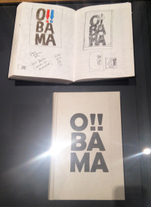
  The first piece I’ve chosen is Estrada’s cover for Barack Obama’s autobiography. In the cover is use Sans Serif typography and uses three line type to stand out the “OBAMA”. The text is aligned in the center and each roll has two letters. The size of this book is 1.5 x 5 and have around 400 pages. The cover of this book is very simple.

02_Manuel-Estrada

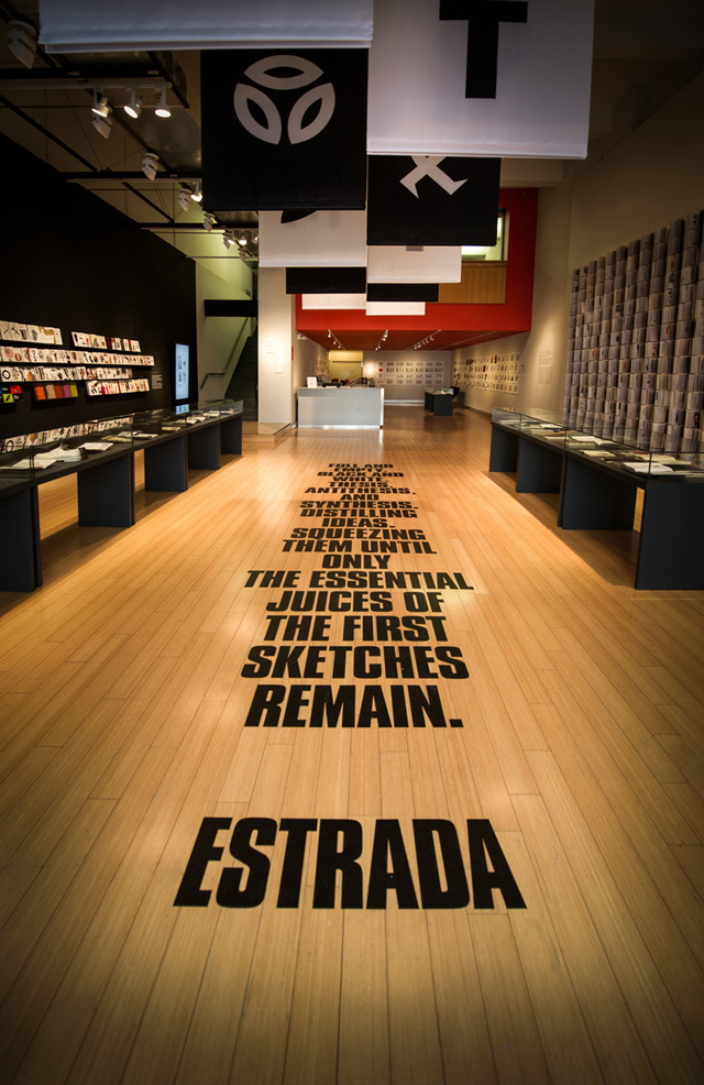
  The second one I’ ve chosen is the in center of Estrada: Sailing through design and there is a quote that read about:

“ Full and empty.
Black and white.
Thesis, antithesis, and synthesis. Distilling ideas. Squeezing them until only the essential juices
of the first sketches remain.”

-Estrada

  In this quote it use the thick black capital letters and capture your attention when you enter.

  “Estrada: Sailing through design” is an exhibition at at the AIGA National Design Center, structured around the graphic designer Manuel Estrada’s visual diaries, which he uses to register his working process including ideas, perceptions and first sketches.


My Visually Enhanced Quotation Concepts.

 Quotes2

Quotes Design1.

“For every good reason there is to lie, there is a better reason to tell the truth.”

The Quotation I had chosen is from Bo Bennett. In my first design quotes I had choose an exclamatory mark’s photo for my background. But the shadow of the exclamatory mark is a question mark. Which I think is very interesting and matches this quote. In the other way to look at this quote it is a good question to me. If we tell the truth to the people who we love then maybe will hurt them. So this quote can be an exclamatory mark or a question mark. Also I had make a bigger size of the word “Lie” and “Truth” which make people focus on this two words and use black and white color.

Quotes1

Quotes Design 2.

In my second design quote I had use twilight’s picture for my background.  This picture makes me feel warm and match the quote. I had made a bigger size of the words Lie and truth to point out the words. Also use a special font and align text left and right.

Quotes3Quotes Design 3.

In my third design quote I had use a woman who is open her mouth and wear red lipstick’s picture for my background. I had put the word “Lie” into her mouth which is mean people always lie to people. And I had use Red, Black and White which are the color of the image to set as my font color.

Starbucks Logo History Report.

Redesigned logo used from 2011–present.

Redesigned logo used from 2011–present.


Green logo used from 1992–2011, still being used as a secondary logo.

Green logo used from 1992–2011, still being used as a secondary logo.


Original brown logo, used from 1971–1987

The Starbucks brand is an American global coffee company. Founded by Jerry Baldwin, Gordon Bowker and Zev Siegl in 1971. They’re coffeehouse chain based in Seattle Washington. In 2006, Valerie O’Neil, is a Starbucks spokeswoman, she said that logo is a “twin-tailed mermaid, siren as she is known in Greek mythology”. This Logo has been significantly streamlined over the year after the original owners sold the Starbucks chain to former employee Howard Schultz.
Howard Schultz changes to the new logo. The second edition of the logo, followed the pattern of the original mermaid, but they did some changes, the mermaid did not have naked breasts and change the trademark color to green. So the second versions of the Starbucks logo were born. The Starbucks logo is circular in shape along with another circle within it. The word marks are inside the circles with two stars on either sides separating the words Starbucks and Coffee. The current change to the logo is a bid to highlight the Siren which is a symbol of the Starbucks’ legendary taste. The former Starbucks logo sported a bold but simple font that attracted all age groups. The new logo is without any word marks or stars with an enlarged siren.
January 2011, Starbucks published a new logo; they remove the “STARBUCKS COFFEE” word make from the old logo, only keep the image of the mermaid in the middle of the logo and making it green. The two-colored Starbucks logo characterizes the simplicity of the brand. White and deep green are the only colors that are used in the new logo. The two tails are white in color whereas green forms the background of the logo.

Untitled

About Me!

Hi, welcome to my E-portfolio site. My name is HuiHeng Ruan, and you can call me Hanna. I am a sophomore in New York City College of technology. My major is Advertising Design and Graphic Art, and I am pursuing a bachelor’s degree in this major. The other course I have taken in this major are Foundation Drawing, Publications Media, Graphic Design Principles 2 and 3, Raster and Vector Graphics and Figure Drawing. There some basic knowledge of programs I have learned from those courses is InDesign, illustrator and Photoshop. I am choosing to pursue Advertising Design for my major because I have always had an interest in art and design. Every time I have some idea of my design I will draw it down, and after I finish the whole design I feel so great of it.

Welcome!

This is the first post on your Learning Blog. Edit or delete it, then start blogging!

The ePortfolio is both a Learning Blog and an Academic Career Portfolio. Use the Learning Blog to document your learning experiences and class assignments each semester. As time goes by, add content to the Academics and Career sections to show your department, graduate institutions, or future employers how well prepared you are for your chosen career.

NOTE: Remember to add appropriate Categories and Tags to your posts. This will help your professors and other visitors find the content they are looking for. The Categories “Coursework” and “Field Trips” and the Tags “OpenLab” and “City Tech” have already been applied to this post. Feel free to make changes!