Logo History: Parental Advisory
Hilda Jara
In America there are many logos that signify with our culture. Although, most of these iconic logos belong to the corporate world of the U.S. One of the most iconic logos in American culture is the Parental Advisory logo provided by the RIAA (Recording Industry Association of America) in 1985. It was not the RIAA’s plan to divide the music industry between explicit and orderly, it was the PMRC (Parents Music Resource Center) lead by founder Mary Gore that insisted parents should be cautioned about unsuitable material for children. Although strangely, the Parental Advisory sticker is not legally binding at all. Before the label there was a list of unsuitable music that included all genres pop, rock, hip-hop etc. ironically titled the “Filthy Fifteen “considering the PMRC’s movement.
First version mock up “Explicit Lyrics” instead of Content, 1990
In 1985 there still had been no conversation about an appropriate label, only various concerned parents. On September 19, 1985 there was a hearing in the United States Senate regarding whether such label is allowable for content. Many musicians attended, Musician Frank Zappa openly testified against the RIAA warning label decision. Openly stating “the PMRC’s demands are the equivalent of treating dandruff by decapitation. “It took two months after the hearing for the organization to agree upon the proper wording for this label. Due to the PMRC’s proposal of a rating system similar to the MPAA’s:
X for “profane or sexually explicit” lyrics
V for violence
D/A for drug and alcohol references
O for “occult” content
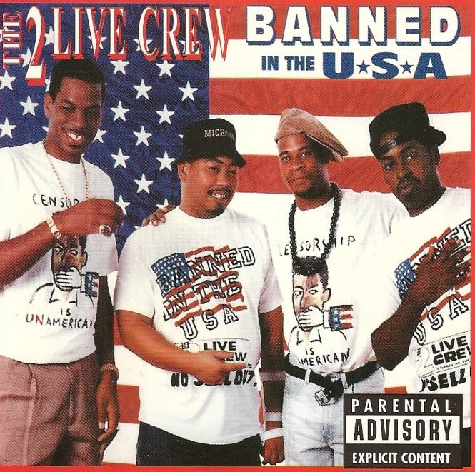
The RIAA rejected these demands and suggested a label reading, “Explicit Lyrics – Parental Advisory” but, later a revised rewording was introduced “Parental Advisory – Explicit “This decision marks the first agreeable term for unsuitable material for minors. All musicians were required to have this message on their packaging or include lyrics.
Before label was finalized, written warning After label was finalized and enforced
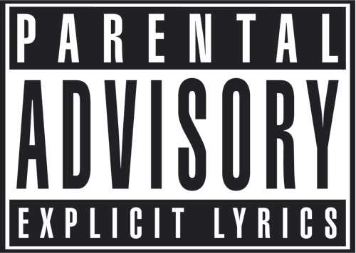
No actual label was introduced until 1990. The debate dragged on and Congress held more hearings in 1994. The result was a slightly revised label the one still in use 16 years later: “Parental Advisory: Explicit Content.” The RIAA revised the guidelines for its members as well. The Logo is made up of 3 medium sized rectangular boxes balanced together with Arial Narrow and Black typeface in knock-out and vise-versa. The standard color palette of black and white is intentional taking into consideration the continuous use of the label in the future. After the logo, was created and made a requirement for packaging by 1992 over 200 records had been marked with warning. Since he logo was imprinted the economic impact on the music industry wasn’t as negative as predicted.
Parental Advisory Sticker Specification
Wording: Parental Advisory | Explicit Content
Color: Black and white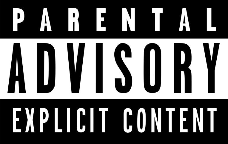
Placement: Bottom right front on all products
Size: 1” x ½” on cassette and CD jewel boxes
1½” x 1” on vinyl albums and 12” singles
Current version used since 1994
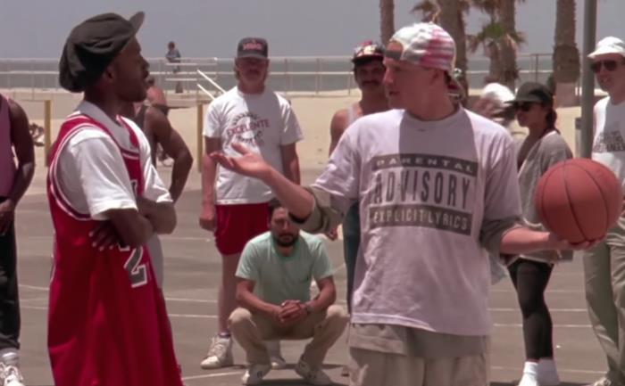
The artwork surrounding this logo today is not affected by it. The music industry has learned to embrace this obstacle in their creative process. The label moved on from just being a sticker added to album cover to being part of the integral design of the album’s Artwork itself. Since 1994 the logo has taken on various mediums entering the digital age such as digital albums, video streaming and streaming service sites. I believe that the RIAA & PMRC didn’t fully fathom the reality of their intentions in censorship. The parental advisory logo has been adopted into the American culture as a seal of approval making it more appealing to listen to than less. It has also become a symbol of rebellion among youth, developing a marketing tool. This goes to show that a Logo or design can be adopted into any concept over time.