

The ad communicate well, works well; and is a success.
STRATEGY: 1 The ad established a clear concept for the proper audience.
LAYOUT / DESIGN: 1 The ad is organized and designed with a creative solution in hierarchy, typography and contrast.
COPY: 1 good, the ad uses words to characterize the voice and tone of the client.
MESSAGE: 1 The ad is a clear understanding of who the audience is, and how this audience should react and respond.
CREATIVITY: 1 The ad is unique.

The ad communicates well, and works well and is a success.
STRATEGY: 1 The ad established a clear concept for the proper audience.
LAYOUT / DESIGN: 2 The ad is organized and designed in a way to adhere to visual standard, hierarchy is good.
COPY: 1 The ad uses words to characterize the voice and tone of the client.
MESSAGE: 1 The ad is a clear understanding of who the audience is, and how this audience should react and respond.
CREATIVITY: 1 The ad is unique.


The ad communicates well, and works well and is a success.
STRATEGY: 1 The ad established a clear concept for the proper audience, using the appropriate channel.
LAYOUT / DESIGN: 2 The ad is organized and designed with a creative solution in a way to adhere to visual standard, hierarchy is good.
COPY: 1 The ad uses words to characterize the voice and tone of the client.
MESSAGE: 1 The ad is a clear understanding of who the audience is, and how this audience should react and respond.
CREATIVITY: 1 The ad is unique.
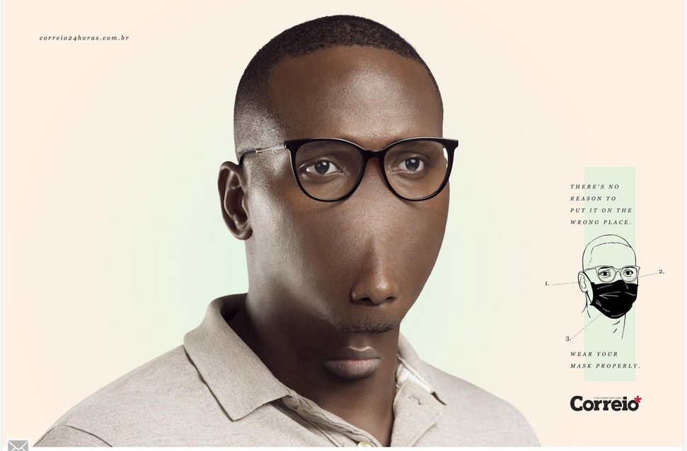

The ad communication may not work well to wearing mask.
STRATEGY: 5 The visual concept does not establish a clear audience.
LAYOUT / DESIGN: 3 The ad adheres to visual standard the hierarchy in mask wearing is not clear to the audience.
COPY: 4 The voice and tone of the client is different from its audience.
MESSAGE: 4 the message is not clear.
CREATIVITY: 1 The concept is unique.

The ad communication may not work well in relationship to poverty.
STRATEGY: 5 The visual concept does not establish a clear audience.
LAYOUT / DESIGN: 2 The ad adheres to visual standard the hierarchy in fair and clear to the audience.
COPY: 4 The voice and tone of the client is different from its audience.
MESSAGE: 4 the message is not clear.
CREATIVITY: 1 The concept is unique.

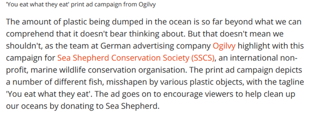
The ad communicates not to the audience and may not be a success.
STRATEGY: 4 The ad established a concept to fish eaters and not necessary to the public.
LAYOUT / DESIGN: 2 The ad is organized and designed with a creative solution in a way to adhere to visual standard, typograph is small.
COPY: 2 The ad uses words to characterize the voice and tone of the client.
MESSAGE: 4 The ad is not a clear understanding of who the audience is, and how this audience should react and respond.
CREATIVITY: 1 The ad is unique.


Leave a Reply