Monthly Archives: October 2016

Assignment #2

Brooklyn and Queens have never been this expensive by Emily Nonko

(http://ny.curbed.com/2016/10/13/13257034/brooklyn-queens-sales-market-manhattan-rentals)

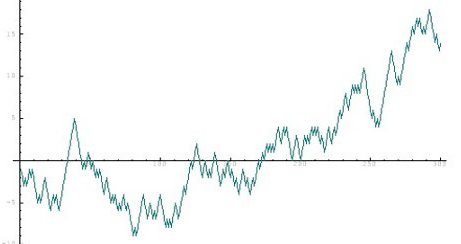
This article focuses on home sales in Brooklyn, Queens and Manhattan.  Home sale prices have reached a high record for the third quarter of this year.  There are many factors that contribute to this increase in sale prices that in turn create a decrease in inventory available for sale.  Prices are escalating without negotiations between sellers and buyers.  Investors conveniently are launching several apartment listings that end up spending more time on the market due to being placed in a high price bracket.  As a result, buyers are being presented with a large supply of options, however all of this supply is priced at the higher end.  One graph in the article is used to support the information presented on the borough of Brooklyn:

fullsizerender

The graph displayed is from the Brooklyn Concoran’s Group Resale condos data and it is used in the article to show the comparison of this year’s third quarter (3Q16) with last year’s third quarter (3Q15) in condos resale in Brooklyn.  The graph uses data of several condo listings that the Brooklyn buyers have at their disposal on the housing market.  It demonstrates that with only 4% increase in developments (inventory), the market for resale condo is still yielding strong sales with a 9% increase in price value.   The condo resale prices are not only above median price but also above average price between these two quarters.  This graph demonstrates that the record increase in Brooklyn home sale price is still going up.  A prosperous outcome for investors selling property in Brooklyn.

For more information, the remaining two graphs are from the Concorran’s report (link found at the bottom of the article under sources) that illustrate resale condos prices at a steady increase from 3Q8 until 3Q16 and a more graphic representation of the increase in median and average price value over the last two quarters 3Q15 and 3Q16.

fullsizerender2fullsizerender1

Assignment #1

jr

My name is Jenny (R.T.) and I am majoring in mathematics to work as a financial analyst.  Probability and statistics besides being an enjoyable and fundamental course for my degree, relates to my future career.  As a financial analyst, I would be focused on the relationships of time value of money and interest.  Measuring the risks involved with statistics, I would be recommending the best choice among several alternatives to my clients with the goal to reduce risk and monetary losses.  Financial analysis uses probability and statistics by evaluating alternatives allowing for the determination of the probability of success or failure of a project or investment opportunity.  Investors (private, government, public organizations, among many others) seek the assistance of financial analyst because of their thorough examination of all possibilities that will not only generate more income but also service producing outcomes.  By being presented with this evaluation, they can assume the risk involved or opt for ways to prevent or reduce these risks.  Probability and statistics is highly beneficial to this degree for the reasons stated.

Rafeek- OL Assignment #2

In the article, “Everything You Need to Know About Shark Attacks as Told by Graphs” reported by Meghan Keneally and Jan Diehm for abc news were interested on detailing the most recent number of shark attacks in comparison to the attacks that happened over the centuries. They also recorded interesting figures on the target surface activities where shark attacks happen the most in U.S and around the world. The news became of interest after two teens were injured in North Carolina not long ago and in addition the following data were collected by Florida Museum of Natural History at the University of Florida.

According to their finding the most frequent shark attacks occurs to individuals who use “flotation device” such as surfing board, water skiing, wind surfing etc. In other words swimmers who perform activities on the surface of the water are the main target by the sharks.

1

In the above bar graph the numbers show that the most often target are the surface re-creationists compared to swimmers and bathers with a dramatic increase. From 2000-09 alone there has been over 300 shark attacks and the sudden increase happened between 1980-89 and 1990-09 with roughly a difference of 145 attacks.

2 3

Figure 1                                                                 Figure 2

Figure 1 shows that there has been 701 shark attacks from 2005-2014 in world locations with highest shark attack activity. Only 59 or about 8.4% were recorded fatal. However, the exact number hasn’t been determined by the researchers because the victims were unable to recall the exact details about their attacks. The researchers added that they were able to determine the most common species of sharks that were responsible for the attacks. As shown in figure 2 they are the white sharks followed by tiger sharks and bull sharks. These sharks were named the “Big three” as they are mostly found where people enter the water and also they are known for their shearing teeth.

4 5

figure 3                                                  Figure 4

Figure 3 shows the number of shark attacks around the world. As you can see US experiences the largest amount of shark attacks with 1,104 as opposed to other continental areas. In the US, Florida is reported to have the largest number of attacks as shown in the line graph in figure 4. As mentioned previously, Florida experienced 219 out of the 701 attacks that happened in 2005- 2014 preceded by Australia, Hawaii and South Carolina.

These were some interesting information I found from abc news, I hope it doesn’t scare the ocean lovers away.

Citation: http://abcnews.go.com/US/shark-attacks-told-graphs/story?id=31779076


Assignment #2

The graph that I found interesting is from newspaper “The Washington Post”. It appeared in the article Graph(s) of the day: Two terrifying charts for newspapers. Basically, the whole article explains how the advertising in newspaper and magazines was changing over time. The most interesting graph is the following:
graph

This graph shows the revenue that newspapers, magazines and Google gets from advertising. As you can see in 2004 when internet wasn’t that popular and easily accessible, newspapers were dominating the market and its profit from advertising was incredibly high. Over one year of 2004 all newspapers earned around 42 000 million of dollars while Google got only around 2500 million dollars. In other words, Newspapers earned 16.8 times more than Google from advertising in 2004. Nevertheless, as Internet grew and became more accessible, in the year of 2012 Google’s revenue reached Newspapers’ revenue level. Although, Newspapers’ revenue got dropped from 42 000 million of dollars in 2004 to around 9 000 million in 2012 while Google’s revenue increased from 2500 million of dollars in 2004 to 10 000 million in 2012. All these numbers mean that Google not only become more popular but significantly dropped revenue of his opponents (newspapers and magazines). There are a lot of reasons but the biggest one is that advertisement is a lot cheaper in the Internet and while Google and Newspapers have equal popularity nobody wants to overpay.
To conclude, newspapers are experiencing recession in advertising as their rival(Google) becomes bigger and bigger and offers lower price on advertising.


Work Cited

https://www.washingtonpost.com/news/wonk/wp/2012/12/03/graphs-of-the-day-two-terrifying-charts-for-newspapers/

Assignment #1

electronic-004

Hi, my name is Alexey Kiriluk. My major is Electronic Engineering. Statistics and Probability probably won’t play important role in my future career. Nevertheless, I think Probability and Statistics are definitely interesting and helpful for your self-development. I’m pretty sure I will be able to use knowledge from this class when talking to my friends, coworkers or in some rare and unusual situations. Furthermore, I already use some of the knowledge from the class. A perfect example would be card game with name “Hearthstone”. As we all know, card games involve a whole lot of random and it is always interesting and exited to watch people getting destroyed by randomness. Now, I’m now only capable to enjoy that moments but also calculate the probability of that. I think Probability and Statistics are great class and I look forward for each of our meetings during the week to learn something new.

Assignment #1 Corrected

probMy name is loudia Martinez and I’m currently pursuing a degree in math education . As a future math teacher probability ad statistic relate quite deeply in my career . I can use probability and statistics to help me improve my teaching methods . I.e. if I know the percentage of student who are visual learners and those that are not I can create lesson plans that can reach all the different learners in my classroom. Probability and statistics also plays a key role in grading and creating datas that relate to my field. As I advance in my education journey I’m sure probability and statistic will play an even bigger role in my career and the many ways in which I will utilize probability and statistics

Assignment #1

stat-eeet

Hello my name is Calvin Persaud and my major is Electrical Engineering Technology. There are many applications of statistics and probability in electrical engineering. One of the simpler applications being in the communication department in electrical engineering where statistics is used to calculate the probability that you’ll transmit a bit incorrectly. Most commonly known as the bit error probability. Other applications of statistics in electrical are failure rate prediction, filtering digital signal processing, design of computer algorithms, noise characterization, digital signal encoding, tolerance analysis and many more.

Assignment 2

Link:http://www.pbs.org/newshour/rundown/chart-americas-rising-suicide-problem/

This article is about the rise of suicides in the United States.

According to the the article, the rate of suicide from 1999 to 2010 had jumped by 28 percent. They also stated that the people who are likely to commit suicide are middle aged Americans. It also noted the rates on how they committed it. It also stated that firearms and suffocation was used mainly by middle aged man, while middle aged women used firearms and poisoning.

The graphs used, separated the rates between men and women as they have extremely different tendencies when committing suicide.

ASSIGNMENT # 2


graph-1graph-2graph-3graph-5http://www.usnews.com/education/online-education/articles/2016-08-22/explore-online-education-trends-in-4-bar-graphs

These graphs are from the Us. news article which focuses on the growing trends of online education  from 2012 to 2016. the article is called exploring online education trends. The article  focuses on a report released earlier this year from the Babson Survey Research Group . the report states that  5.8  Millions of  students enrolled in an online course in fall 2014.  The graphs breaks down the number  to show the areas of studies most popular for online education  and which institutes had the largest number of students enrolled in online courses. The article focused on public institutions, as well as private non profit and private , for profit colleges. I like these graphs because they are easy to read and the data is well organized. The article did a great job summarizing its results of students currently taking online course , those panning to and those who are undecided.