Statistics is all around us and this fall, we will be subjected to a bombardment of media coverage profusely sprinkled with projections, predictions and poll results. Look at the following graph:
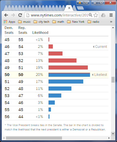
It represents the probability distribution for how the Democrat/Republican numbers in the Senate will end-up after the elections (as predicted by the New York Times). Presently, 54 members are Republican. The most likely scenario is that the election ends with a 50-50 split. If that does occur, then the vice-president would cast the tie-breaking vote. In other words, the Senate would be controlled by that party which is in the White House.
Since we are not in a political science course, for us as Statistics students, what is most notable about the graph is that it follows the classic shape of the normal curve, most famously pictured by our avatar, the Galton Board:
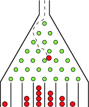
This is a clear illustration of what is called the Central Limit Theorem, basically, that a sum of many random events often results in a bell-shaped curve.
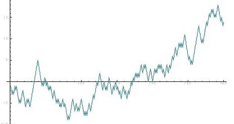
Also in the NYT article is a time series graph showing how the chances for the Democrats to take the Senate has fluctuated over the last few months:

For us, it shows the existence of randomness. However, let’s compare this graph which clearly shows the existence trends, momentum and spurts with our header, a simulation of coin flipping where we keep track of the balance between the number of heads and tails (say the difference):

This looks a more like a stock price trajectory. The phenomenon of reaching high highs and low lows is known as the gambler’s ruin. In a nutshell, in a “fair” game, the person with the most resources is likely to win as they are more likely to survive the extremes.
Can you program a simulation to look like the control of senate race? Perhaps the chance of going more in a direction (up, down or the same) will be weighted more than going in different direction.

