Number of HIV infections per year and per age group


The number of Cases of HIV/AIDS per year per age group

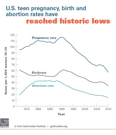
This graph represents data collected over  four year periods combined together, and published 2008, based on compiled information of infections within certain age demographics. The information within this chart shows the actual amount of new infections as oppose to collected data over the course of the life span of this illness.

I have never really paid much attention to graphs before but I noticed that not only does this graph break down the amount of infectious cases per year it also binds those data markers together under a four year age bracket; which is all in clear color coded detail while being placed together. Not to mention the information that the graph portrays is frightening. Be safe all and stay well.

http://www.project.org/info.php?recordID=476

Assignment #2:Line Graph on Smoking Between H.S Students and Adults in U.S.

Screen Shot 2015-04-10 at 3.34.49 PM

There are many ways that the information from the graph above could be portrayed.For example, a dot graph and a time series graph. A line graph is the most convenient way to portray this type of information because it easily is set up to show the percent of smoking trends amongst teens and adults from 1965-2011. This graph is easily done by plotting the percentage by year for both students and adults for each year. The graph shows that adults have been smoking since 1965 at a high rate and slowly started increasing. Students did not  start smoking with a high percentage until 1991 and increased rapidly as well as decreasing after a few years. By 2011, the percentage for adults and students had a 1.1% difference. The graph also shows the pert age expectancy for the year 2020 showing a 4% higher smoking trend amongst students than in adults.

The link to this article is :

http://www.cdc.gov/tobacco/data_statistics/tables/trends/cig_smoking/

Ass.2 graph

imageThis Line graph shows the rates of teen pregnancies, birth and abortion rates in the United States between the 1990’s and 2010 around the ages of 15-19. This line graphs shows the increase and decreases every 5 years for 1000 women between ages 15-19. Teen pregnancy hits its peak in 1991 at about 115,000 it slowly decreased about 45% later on.
According to the article in 2010, about 614,000 pregnancies occurred among teenagers 15–19, for a rate of 57.4 pregnancies per 1,000 women that age. That marked a 51% decline from the peak of 1990, and a 15% decline in two years, from 67.8 in 2008, according to “U.S. Teenage Pregnancies, Births and Abortions, 2010: National and State Trends by Age, Race and Ethnicity.


assg #2 by Anne Duchemin

my first post had some faults i decided to post something different

Screen Shot 2015-04-19 at 7.30.59 PM

this graph was taken from the article ” Obesity: Are we food Obsessed?”
the hyperlink is >> http://blogs.discovermagazine.com/neuroskeptic/2012/03/24/obesity-are-we-food-obsessed/#.VTQ9Y0uTS0t

This post illustrates results from a research engine and scientific articles that correlate with health, more importantly food and exercise . The article itself explains the addiction to keeping up and understand what we eat . The article also ask a question to why people were more concerned about food related topics then actual physical activity. A hypothesis that I’ve come with is that people now are more concerned about being healthy without actually have to do any workouts. Being in such a technological advanced society , I’ve come to my own conclusion that being physically active had decreased as more people become effectuated with the world wide web. Unfornatly this is just an acusition I’ve come up with from personal opinion; however this can be a possible answer to the articles question ,

Graph Assignment #2- Obesity-percentage of population

FullSizeRender (2)


When it comes to data, there are many types of graphs that shows different data and statistics. However, each graph has a different way of showing the data; that’s why when we make a graph it is very important to analyze which one would fit better for our data. For example, this is graph is showing data about the percentage of obesity in males and females from different countries. We can notice that the females from USA (black) has the highest percentage of obesity with approximately 37%. Also, we see that when it comes to men, USA (Mexican) and Czech republic has the higher percentage with approximately 23%. Why did the organization who made the study decided to use a bar graph instead of a pie chart or line graph? Well, as we can notice, the study is for males and women, meaning that there will be two different types of results. So, a pie chart cannot be made if there will be two or more classifications for a result, whereas a bar graph would make this data look more organized, easy to read and professional.

Baragraph Assignment #2: Population of the U.S

united-states-population

This baragraph represents the population of the united states and how it has grow tremendously over the course of a 12 year span.

Bar Graphs

image

Bar graphs are used to compare the rate of change throughout different points of time. They are also used to show results from different actions that were taken and compare what was accomplished with these acts.

http://www.theguardian.com/commentisfree/2012/jul/21/colorado-shooting-james-holmes-history

Assignment #2

http://economix.blogs.nytimes.com/2009/05/05/obesity-and-the-fastness-of-food/

INSERT DESCRIPTION
This graph shows Nations around the world’s average time spent eating per-day in comparison to their obesity  rate. While the Turkish spend more time eating per-day than the others their obesity rate is fair. The United States on the other hand spend about 100minutes less eating per-day than the Turkish and has the lowest time out of all the other Nations, but our obesity rate is the highest.

Assignment 2: Bar Graph

=geo graph
 Came across this bar graph on http://www.eia.gov/todayinenergy

diabetesWhile searching the New York Times, I stumbled upon an article with this graph. This graph shows the demographics of people with diabetes. The demographics range from people ages 20-39, 40-59, 60+ years, male or female sex, and also by ethnicity. It showcases results dating  from 1998. It is important to graph information like this, because it give us a way to forecast the progression or regression  of diabetes based off of past statistics and advancements in fighting the disease.