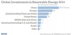
While looking for newspapers articles with graphs. I found the article on www.usnews.com. The article talks about the solar wind and other green energy sources had a leap in investments last years. That 17 percent worldwide is reversing two years of decline.
The link is http://www.usnews.com/news/blogs/data-mine/2015/03/31/solar-wind-investment-surge-reversing-2-year-decline


Reference? Also, how was THIS graph used in the article? What are your own thoughts regarding the graph?