The title of this article was named, ” Ebola in graphics: The toll of a tragedy”. The article spoke of the most current events of the outbreak of Ebola which started in December 2013, in an area called Guéckédou which is located in Guinea and near the border with Liberia and Sierra Leone. Travelers are suspected to be the reason why the disease spread. Reportedly 759 people were infected by the end of June 2014 an 467 people passed, which made this the worst of case of an Ebola outbreak. As of May 9th “Liberia was declared Ebola free”, for Guinea and Sierra Leone the cases are improving. According to the World Health Organization, “each country now has enough treatment beds to be able to isolate and treat patients with Ebola, and to bury everyone known to have died of the disease”.
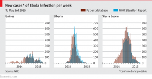
The image above is a line graph, which shows the new cases per week of Ebola infections from 2014 to 2015 in Guinea, Liberia and Sierra Leone. As you can see the brown lines indicates patient reports of the Ebola infection and the blue represents the World Health Organization reports. For Guinea reports from each party are about the same, as for Liberia “W.H.O” has more reports than the patients report, and for Sierra Leone the patient reports are more than the “W.H.O reports.
Reference: http://www.economist.com/blogs/graphicdetail/2015/05/ebola-graphics?page=1


Reference (link)? I am not sure that this qualifies as a graph. I know technically they are pie charts, but in my opinion, pie charts should really have at least 3 parts. Perhaps a bar chart would have been a better choice. Also the writing could use some editing.
What stood out to me about these graphs is not only how fast the ebola virus spread in these countries, but how fast the percentages of it spreading was decreased. The quick acting of the W.H.O organization was one of the top reasons the virus was able to be maintained and kept from spreading. This is evident because today ebola seems to be long gone in the past.