Discussion:
You must be logged in to reply to this topic.
- Every Day Graphics
-
March 20, 2012 at 5:25 pm #12658

Prof. Mary BrownParticipantType and Graphics, what do you see? In your everyday life you encounter both good and bad graphic design and or typography. The next time you see something that captures your eye—whether you’re on the train, walking down the street, reading a magazine, etc—take a snapshot of it with your camera phone (or pocket camera). Write a brief description about what you saw, where you saw it and why it caught your attention. Post the photo and your comment on the page, Every Day Graphics. Feel free to post more than one BUT every student should post at least one image.
Here is an example:
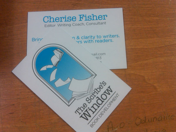
I designed this logo and business card for a client. I am only using this an example. Please add your photos to the thread.March 21, 2012 at 12:57 am #15103
crisythaisMember
This ad is very interesting. It’s simple, to the point and has a strong message. The main message is to live a healthier life. The question was asked, “Are you pouring on the pounds?” It encourages us to think about how we are treating our bodies and what we are putting into it. The hint of pink draws your eyes to the message of the ad, “Pounds” and “don’t drink yourself fat”. “Don’t drink yourself fat” reminds me of the saying “Don’t drink and drive”. They both save lives. It’s positive; it says what we should not drink and also what we should drink to replace those sugary beverages.
March 21, 2012 at 7:04 am #15104
Prof. Mary BrownParticipantI agree… it is simple and to the point, yet it causes you to pause and take notice.
March 27, 2012 at 4:09 am #15114
jasminewelchParticipantI’ve passed by this diner in Chinatown many times, and have always liked this sign. Its simplicity is very appealing. I like both the large sign and the small sign. The colors are simple, yet bold. Red, black, and white is always a strong combo.
Of course, the adorable name doesn’t hurt, either, and as a fan of anything vintage I enjoy the obviously antique sign. One of my favorites.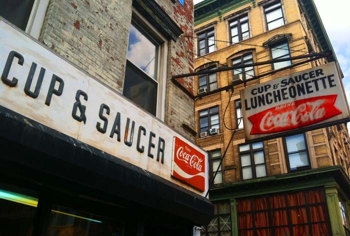 March 27, 2012 at 4:27 am #15115
Prof. Mary BrownParticipantIt’s actually amazing that the sign is still there… it looks like it goes back about 30 years. The thing to consider is that simple is always a long lasting design. It has none of the trendy design “fades” that come and go.
March 27, 2012 at 2:20 pm #15116
Derek MathisParticipant
When i saw this the style used on the word “you” really caught my attention. I liked how they used the classic combination of black white and red. For me those colors have always worked really well together for me. I also liked how it looks like the word is almost popping out of the wall leaving a red holes in the black wall. Just a very aesthetically pleasing to me and felt like it was definitely worth sharing.
March 31, 2012 at 9:30 pm #15140
yuenParticipantI choose this picture because it conveys the message is very clear. A fat man becomes a fit man. It tells us go to GYM to do more exercise, you will become a fit man. The concept is very clear. Even the children look at this picture, they also know the idea.
 April 3, 2012 at 1:37 am #15142
Chanthorn PangMemberI like the fonts used in these sign because it is really retro and the sign kind of take you back in time when you are looking at it. In addition, the sign make you feel like you are in a small town rather than in the city.
 April 3, 2012 at 2:12 am #15143
jbrown648ParticipantI had passed this advertisement on the train while i went to school.The thing that have gotten my attention was how similar this felt to a party poster. Siloulettes are layered in a way it appears three dimensional. With the simple amounts of colors used, one can easily see this being a different advertisement instead one dealing with Bioheat. Last, the part of the advertisment that caught my attention the most was the logo.I love how the symbol in the middle captures the essence of both “Bio” and “Heat”.
April 3, 2012 at 4:47 am #15144
smorsnirMemberThis picture is just something that shows what i want to do. It shows the things in game that i want to create using my graphics art knowledge.
April 3, 2012 at 5:15 am #15145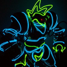
Barrington SimpsonParticipantI found this poster online as an advertisement for the upcoming G2 at the time in 2008. I loved how the designer used all warm colors in his work and kept it simple with a the colored paint blending into a white background.
The use of random music notes and shapes helped give an idea of what the phone was featuring.May 22, 2012 at 2:14 pm #15222
Sean NurseParticipant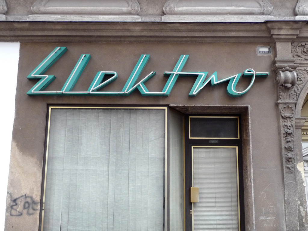
I found this logo for the front of a store in Vienna and I really like this kind of design, that is very stylized and charecteristic of the 50’s and 60’s while still seeming modern even in present day. There are more designs like this on this website.
http://letterology.blogspot.com/2012/03/mid-20th-century-radiographix.html
You must be logged in to reply to this topic.

