Discussion:
You must be logged in to reply to this topic.
- Value in Illustration
-
October 15, 2018 at 8:37 pm #51136

Sara Gómez WoolleyParticipantREAD: the following 2 posts on VALUE:
Composition Basics: Value Structure -By Dan dos Santoshttp://muddycolors.blogspot.com/2012/08/composition-basics-value-structure.html
Value & Composition – David Palumbohttp://muddycolors.blogspot.com/2014/07/using-shape-and-value-for-better.html
DO: After reading this post, choose an illustration which you feel makes strong use of value structures and tonal organization. Share it along with a few sentences about why you chose it, who the artist is, and how the artist uses value in our discussion.
October 15, 2018 at 11:37 pm #51145
Isabella GomezParticipant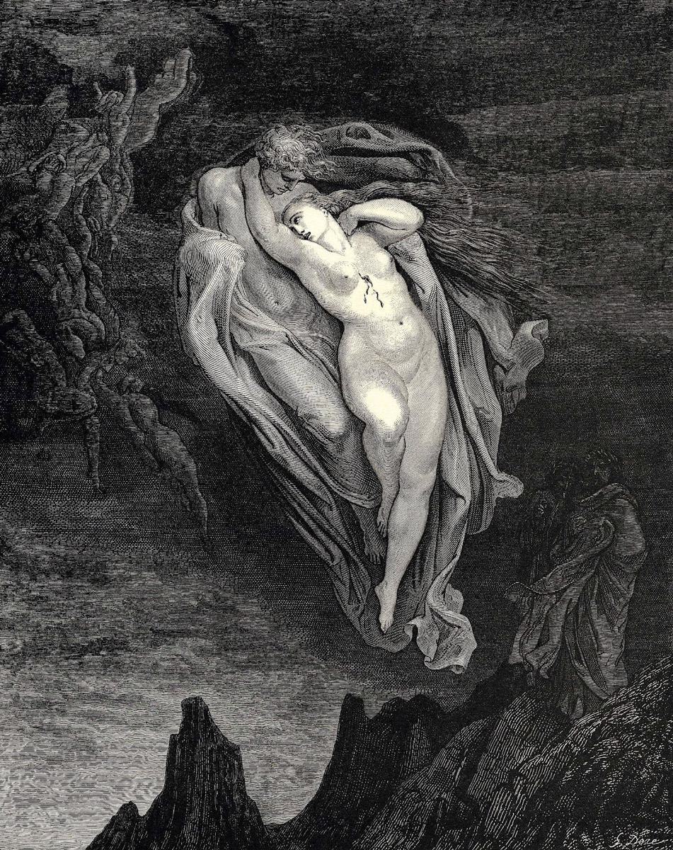
I chose this illustration from the article because it perfectly demonstrates the technique the author was talking about. There is a clear distinction from background, middle ground and foreground. The woman is mostly in white, which gives the implication that the light is hitting her, thus bringing attention to her. The man who she is beside is in shadow, pushing him further back than her.
The middle ground is the land surrounding them, there is still detail in the middle ground, and it is easy to decipher. The background, middle ground and foreground all blend together and looks naturally structured.
October 16, 2018 at 12:57 am #51148
Mahnoor SheikhParticipantWhile reading the article I was actually reminded of the etchings by Francisco Goya because I feel he was a master at arranging value to create intense drama without losing unity in his work. Goya’s depictions of nightmarish themes included demons, death, human suffering and the brutality of man. Below I have attached one of my personal favorite pieces of his, “The Sleep of Reason Produces Monsters”, I love the use of line in this piece the most. There is the main figure in the foreground completely white with their head down, assumed to be sleeping. In mid-ground are monsters that occupy more space in the piece than the actual figure. The monsters are not all a solid gray wash rather variations of gray, Goya creates depth by making some of the monster become darker the more to the right they are. The background is a solid gray wash with ample negative space to frame the image and give viewers breathing space in the image.
https://museum.cornell.edu/sites/default/files/img//pd-om-sleepofreason.jpgOctober 17, 2018 at 5:16 pm #51171
Savannah HendricksonParticipant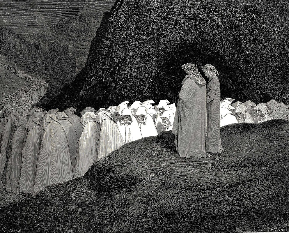
This illustration by Gustave Dore is really interesting because the colors that was used for the background, middle ground and foreground created a strong contrast within the illustration. Dore used grey for a foreground, white for the middle ground, and black for the background. I’m especially impressed at the fact that white was used for the middle ground color instead of the foreground. The grey for the foreground make it look as if the two people watching at a certain distance from the group.October 22, 2018 at 6:53 pm #51276
Yimei HanParticipantI was attracted by this illustration, created by Sam Weber. The little boy and the rock in the foreground is the darkest value. The middle ground is the brightest value which the boy’s upper body was against with. Although, the boy is the silhouette but still can figure out some of his facial features. The gray tone at background enhanced the whole scene. Make the boy pop out more.
-
This reply was modified 5 years, 6 months ago by
 Yimei Han.
November 17, 2018 at 8:18 pm #51749
Timothy DennisParticipant
I chose the 1891 poster “La Goulue au Moulin Rouge” by Henri de Toulouse-Lautrec. I chose the poster because it makes use of flat planes of color while also managing to create a sense of depth. The dancing figure in the middle ground has the lightest value while the figures in the background appear dark and the contortionist in the foreground appears a middle tone. -
This reply was modified 5 years, 6 months ago by
You must be logged in to reply to this topic.

