Your ePortfolio project will be due in a few weeks. Ask questions during class, but also use the Getting Started section of OpenLab for more information.
ePortfolios
2
Your ePortfolio project will be due in a few weeks. Ask questions during class, but also use the Getting Started section of OpenLab for more information.
![]() As you may know from the construction down at the World Trade Center, a building is going up to replace the Twin Towers. A London-based company has designed a logo for the new building. Take a look at the other variations and answer the following questions. THIS IS A REQUIRED ASSIGNMENT. LEAVE YOU ANSWER IN THE COMMENTS SECTION.
As you may know from the construction down at the World Trade Center, a building is going up to replace the Twin Towers. A London-based company has designed a logo for the new building. Take a look at the other variations and answer the following questions. THIS IS A REQUIRED ASSIGNMENT. LEAVE YOU ANSWER IN THE COMMENTS SECTION.
Take a look at the different variations… (click here)
What is your perception when you see this new logo? Do you like it or not? What about it do you like or not like? Of course the events of 9/11 were very tragic, and even almost 11 years later, memories are very emotional for some. Does the logo evoke certain feelings or emotions for you? Do you agree with some of the comments in original post?
NOTE: ADD YOUR COMMENT ON THIS PAGE, USING THE REPLY BUTTON AT THE END OF THIS ENTRY.
Students, if you have not visited the construction going on down at the WTC, I recommend you take a train ride down there. As residents of the city, you should at least know what is going on. ONE WORLD TRADE CENTER is the address of the new building replacing the Twin Towers. The name of the building is the Freedom Tower. Don’t get hung up on 9/11. Answer the questions in light of the design as a designer.
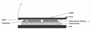 Here is an article that gives a very good history of letterpress printing. Letterpress 101 offers a video demo of the letterpress printing process and an essay that reviews the history of printing—starting with the Gutenberg press. As you read the article you will definitely recognize a few familiar names. Are you surprised that a press as primitive as the letterpress is still used? Considering what we’ve learned so far, what type of projects would this press be best suited?
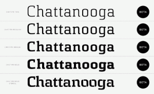 Can a typeface really help to improve a city’s image? There are a few people in Chattanooga who think so. It’s a project of a few designers and brand specialists. The city has begin going through a comeback and the designers want the city to accentuate the city’s potential to become the “Silicon Valley of the East Coast.”
Excerpt from Can a Font Help a City Make a Comeback?
Known in the 1960s as one of the country’s filthiest cities, Chattanooga has managed to clean up its act and its image in recent years, with a redeveloped riverfront and an artist relocation project. But the city’s “brand” is out of date and doesn’t live up to the creative energy on the ground, according to the team members.
Take a moment to read the full article and tell me if you think a font can help a city rebrand itself. If New York City had it’s own font, what aspect of the city would the typeface design portray?
The OpenLab is an open-source, digital platform designed to support teaching and learning at City Tech (New York City College of Technology), and to promote student and faculty engagement in the intellectual and social life of the college community.

