American Horror Story (Observation Settings)
When we had the option to choose a TV series or movies for our gothic space presentation, we chose “American Horror Story” by Ryan Murphy and Brad Falchuk. This series has many things in common with the book Dracula.
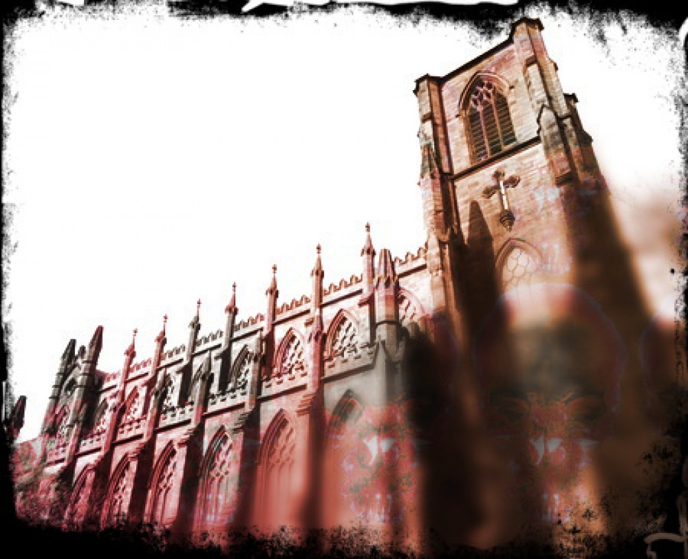
As soon as you enter the hotel the first thing you face is the lobby which is dark and weird. Usually, when we go into lobbies of hotels it looks like it’s “happy” with so very bright colors and lighting but the lobby for the Cortez was the opposite. We learned that the gothic-themed setting is usually dark and looks “sad” just like how Jonathan described Dracula’s castle. ( Dracula Page 12 ) Not that but also we see that there is a high ceiling that makes us look like we are small. Also, the red color intended for the couch and the rugs were also like an indication of blood because as we know vampires drink blood to survive. It’s like a sublime we see it’s beautiful but also scary or threatening. We can also relate it to the uncanny where it’s a hotel and we know that and have been to other hotel but this just seems to be different and can’t really familiarize it. When we look at the hallway we see that it’s long and narrow with walls that are yellow and door frames that are red. Usually, the walls are white or decorated that also make the area place look bright or welcoming but instead we have walls that look old, decaying (yellow wall) with blood (red frames). The long hallways make you feel like you might be in maize with secrets in it, can also make you feel claustrophobic because of the small but long space. This can be related to Jonathan how he had so many available doors in Dracula’s castle to explore but he was not allowed to, he felt trapped like a prisoner.
When I started to do more research on how the settings were made and what was the real purpose of this specific way of look it all came into place. The production designer Worthington really made it clear in an online article, “Inside the Creepiest Rooms at American Horror Story’s Hotel Cortez” he mentioned that the lobby was intended to be a place where the viewers would have a feeling of being “It’s a space out of time,” and the colors were intended to make it like the Depression-era. These were all custom-made for the purpose of this show. He also included that there was a painting of the Aztecs that were a brutal culture and they would do these sacrifices, Worthington said, “one of which involved plunging a knife into the victim’s chest, cutting out the heart, and holding it up while it was still beating.” One thing I did not notice but makes sense is that the columns in the lobby have a design where the capital of the column is a Venus flytrap, Worthington also mentioned in the article. Not only this but he also mentioned that the hallway was intended to look like it goes in circles and may make someone feel like it is a dead end.
Works Cited
Stoker, Bram. Dracula. 1897. New York: Oxford University Press, 1990.
Vineyard, Jennifer. “Inside the Creepiest Rooms at American Horror Story’s Hotel Cortez.” Vulture, 28 Oct. 2015, www.vulture.com/2015/10/american-horror-story-hotel-cortez-design.html.

