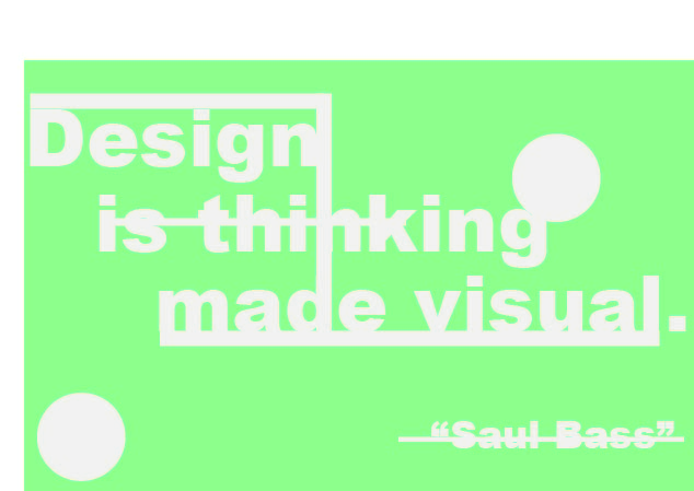
I chose this quote because i wanted to make a design that was more creative and “free”. The design behind this doesn’t really have a specific meaning I just had fun with putting all the shapes and lines where they looked best around the quote. I used the white shapes and the white fonts to create sort of blend between them.
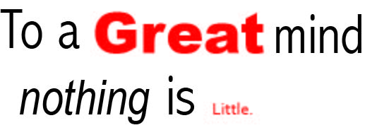
I kept this particular design very simple to put emphasis on the quote itself. The quote reads “to a great mind nothing is little” I made the word “great” typically bigger and bolder than the rest of the text and I made the word “little” significantly smaller which I think speaks for it self. The word nothing is italicized because i feel like it’s an important part of the design. quote by Arthur Conan
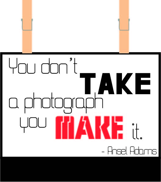
This quote appeals to my love of photography very much. The design behind it is pretty self explanatory. The quote reads “you don’t take a photography you make it” so i made the font in “take” and “make” a very important part of the design. The font “take” is normal and firm and straight to the point symbolizing someone just taking a photo and that’s it. The word “make” has a more interesting font, the cracks in the letter kind of look like they can be pieced back together which symbolizes the process of taking a good photography but the actual work that’s put behind it, it shows that photography isn’t just pressing a button it’s more than that. The box around the font symbolizes a Polaroid photo and it has the clips on top kind of how film strips are hanged when they’re being processed.


