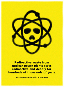
I chose this poster, Radioactive Waste by Daniel Young. This piece has a cool glow in the dark effect to it, which I think is nice and its very attention grabbing. It focuses on an important issue and tries to warn people about a problem, (public service ads). This design could have been so bizarre and all over the place but instead it is very simple. The color adds a nice touch, it makes readers or people walking past look at the ad because of how vibrant it is. I love this ad because it gets straight to the point.
I chose this peace, Need New Target by Matt Dorfman from the AIGA Exhibit because i felt like it was the most powerful and maybe controversial design in the gallery in my opinion. Its a photograph of Osama Bin Laden with a sheet over him and bullet holes shot through. I even think the bullet holes are the exact places where he was hit when he was captured. A lot of his work is very smilier and has eye catching photos.
I chose this piece Piece: If Not Now Then When by Garland Kirkpatrick because I thought it was pretty clever how he used the peace sign and cut it up in a slice like a pie. The name American Pie works well especially with the younger audience making reference to the popular movie “American Pie”. Garland Kirkpatrick is an award-winning designer. He focuses on social issues (like this piece). I feel as though his work is very bold and grabs your attention instantly.


