The Museum of the City of New York presents and interprets the past, presents, and future. This museum serves its visitors from across the country through exhibitions and collections. On April 20th my classmates and I had a pleasure to visit this beautiful museum. I was visiting it for the first time, which I loved it at first sight because it was all about graphic design.
“Everything is Design. Everything. ”
-Paul Rand
This quote belongs to one of the legendary American graphic designer who is Paul Rand. He was the first person who brought European Avant-garde art movements such as Cubism and constructivism to graphic design in the United States. Rand was best known as a logo designer. His well-known logo designs were IBM, UPS, abc, and Steve Jobs NeXT which some of them still in use. His work is a big influence for young students like me and also I think he still remains influential today. In our field trip the main point was to see Paul Rand’s exhibit which was spectacular.
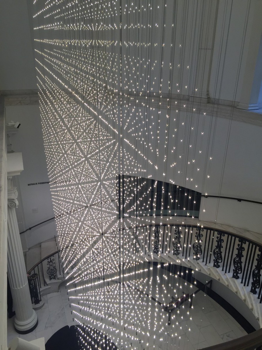
When I entered to a museum the very first thing that caught my attention was the led light installation “Starlight.” It is designed in a three-dimensional grid pattern, which changes geometry when the viewer ascends the stairs.
Than the second place I liked and loved a lot was the stairwell. It was designed as interior tower of words and pictures. Every single space in the wall was filled with historic quotations and photographs of New York.
.

From Paul Rand’s exhibit I liked couple of his works. The first one that I liked and loved a lot was “NeXT” that he designed for Steve Jobs. In 1986 Steve Jobs hired Rand to design a logo for his NEXT educational computer company. Rand actually renamed the company from being NXT to NeXT motivating the “e” as a meaning education, excellence, etc. rand decided to frame the word in a cube to evoke the product itself. He used simple Sans Serif letters for the work and chose red, yellow, green, and purple to stand out in black background. Rand splitted the logo into two line so it can give to viewers new look and to separate from common usage. Also it increased the letter size and hence the readability. The NeXT logo was successful in part because the cube was symbolically related to the product itself.

The second one that I liked was the IBM logo design. The IBM logo is well known all around the world because of its simplicity. Paul Rand also created it. The logo contains horizontal stripes, which are representative to a power of company. The company name “IBM” is highlighted fashionable, using capitalized black lettering. However, company uses blue shades to, blue is a very professional color that is often used for corporate logos. The letters “IBM” were featured in bold and sophisticated font style. The horizontal bars on the logo enhance the beauty of the logo.

And the final logo design that I liked most was the UPS logo. In 1961, Rand changed the UPS logo. It featured a simplified design a bow-tied package above the familiar shield to express the mission of the company. He made logo in black and white. The font he used it is possible condensed Grotesque. But it also seems likely that rand just draw those letters.


