
Assignment Z could not upload
Here’s a link via drop box https://www.dropbox.com/s/sdwwbt2tu34kbis/file-page1.jpg?dl=0
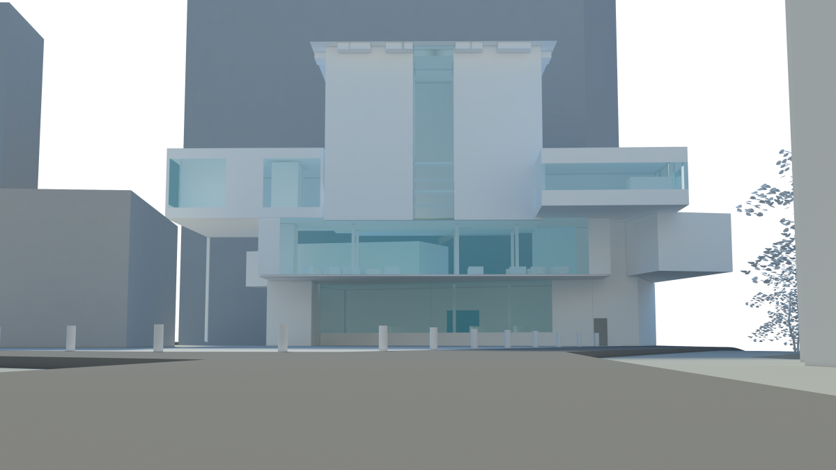
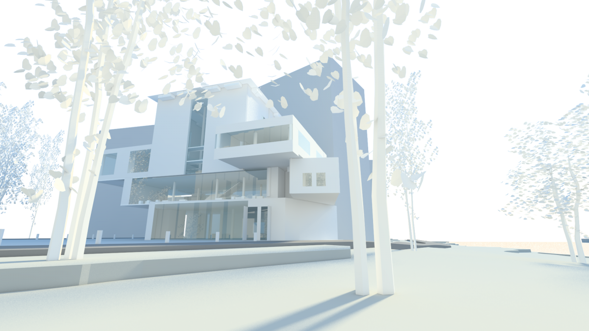
Assignment Z
Mock Pin Up
Assignment Y

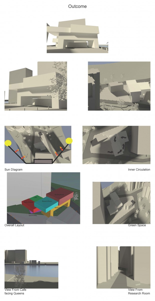
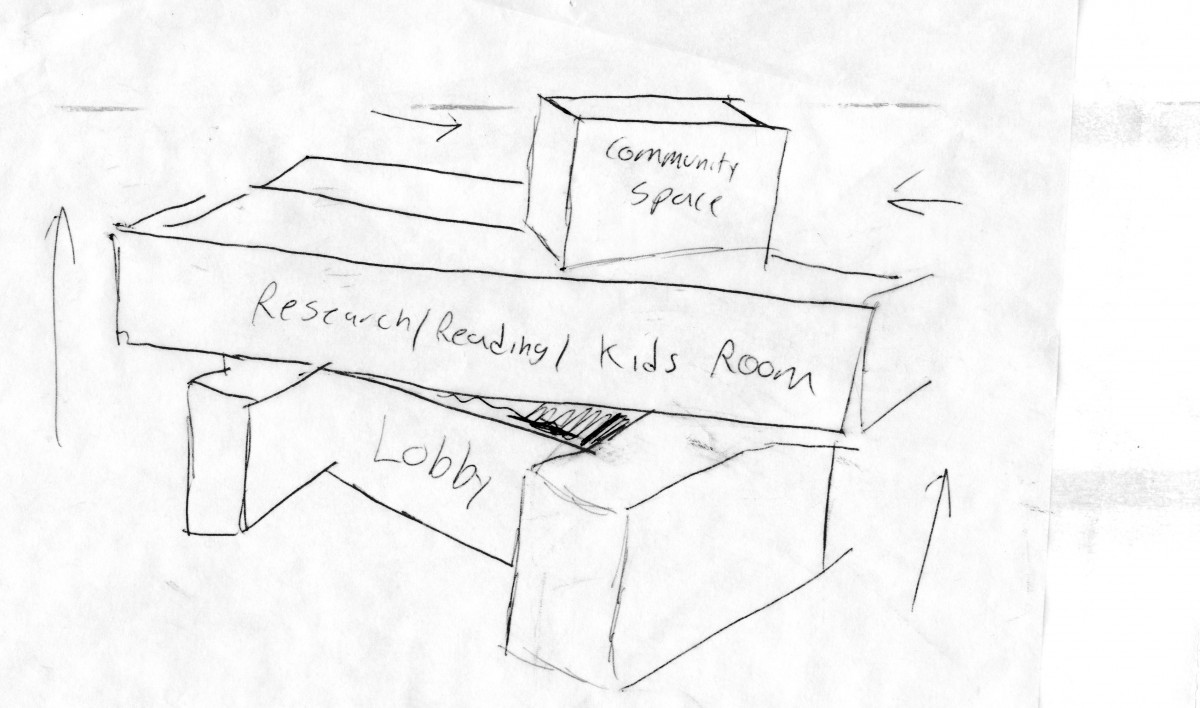
Lobby with view of Kids reading room Main reading room


Reading Room View of Manhattan


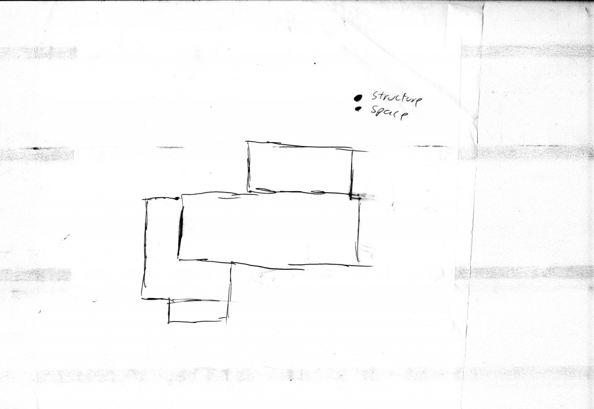
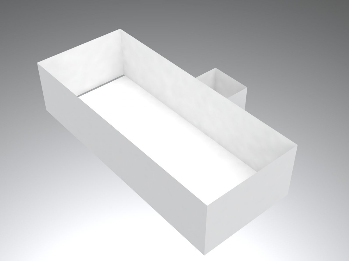
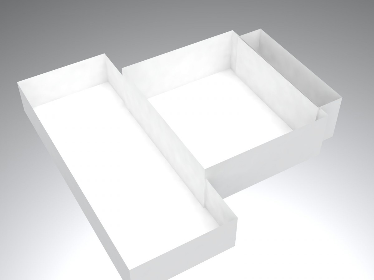
Structure Stair/ Work Room
Assignment V
 3rd Floor
 Second Floor
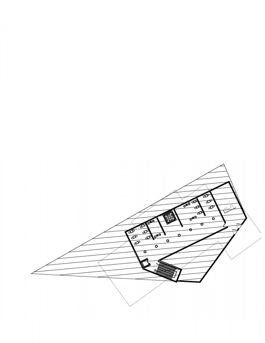 1st Floor
 Site
Site
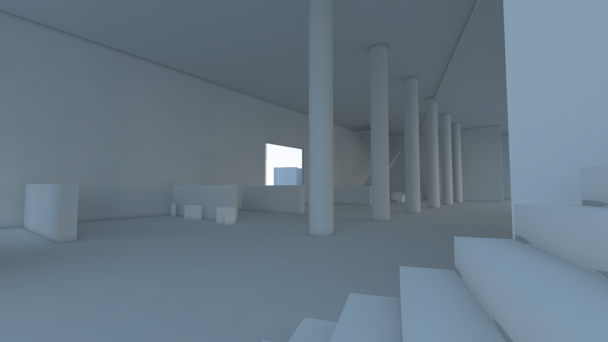
Assignment U
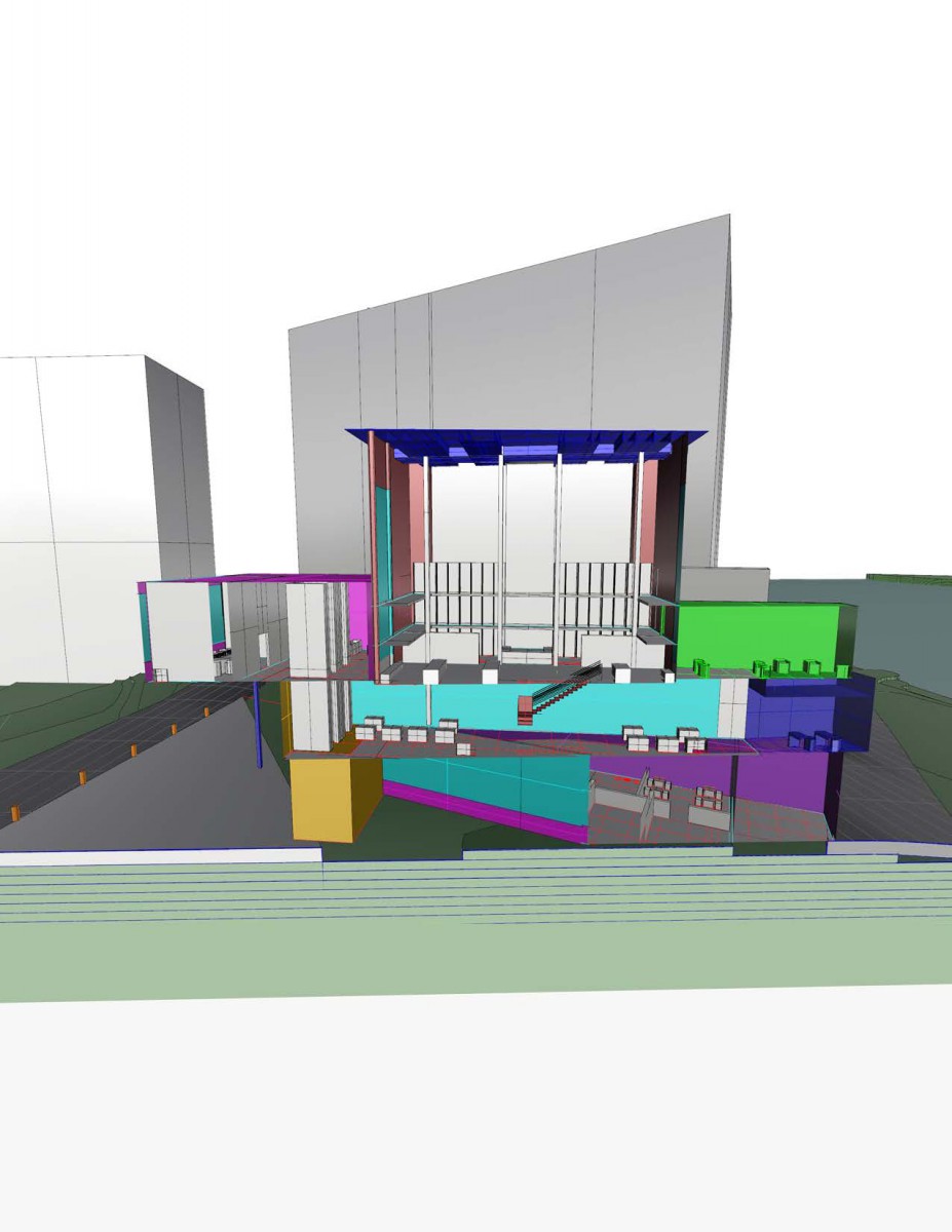
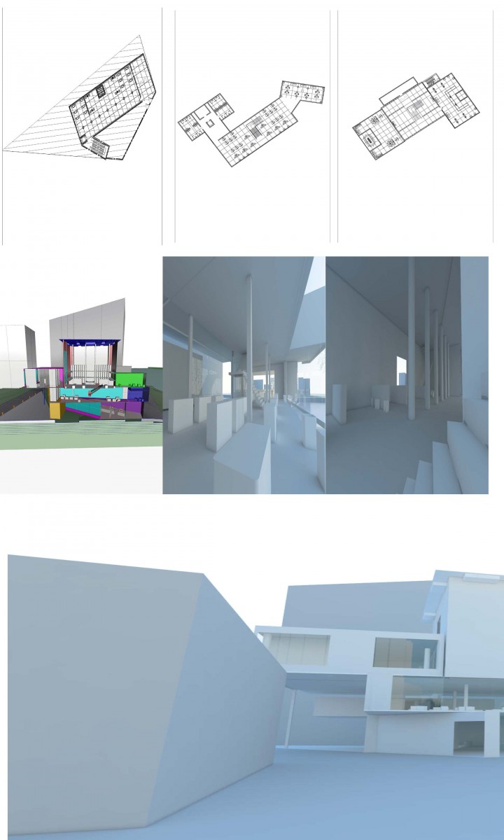
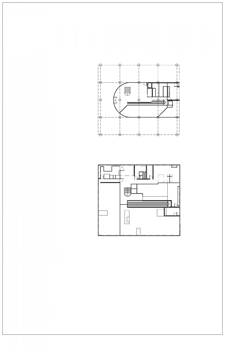
Rough Section Cut. In this image, you are able to see the main reading room, working space, cafe, office space, and the research room.
Assignment T

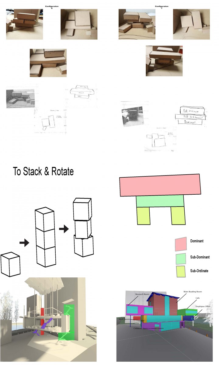
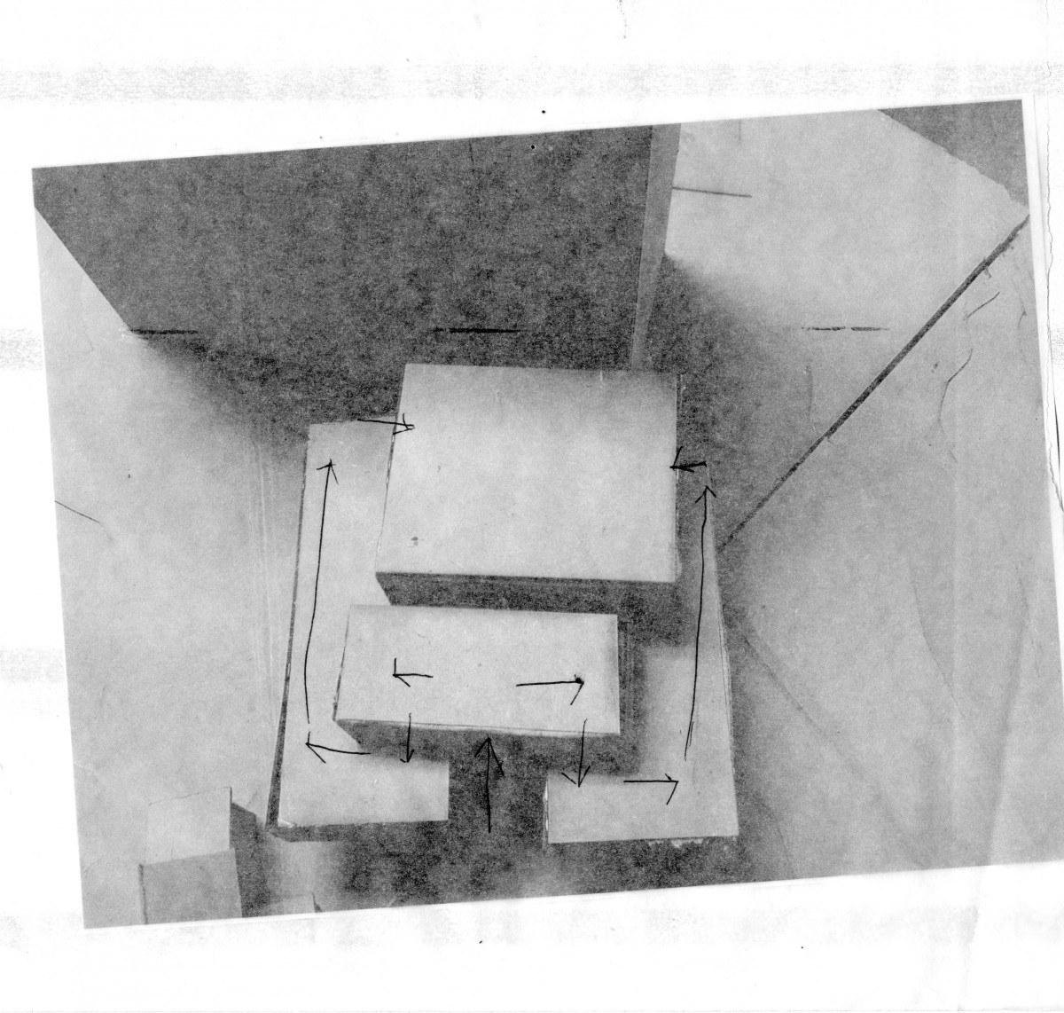
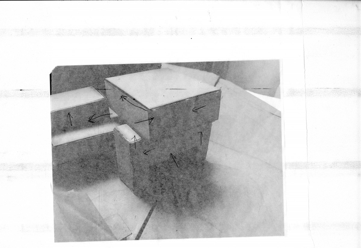
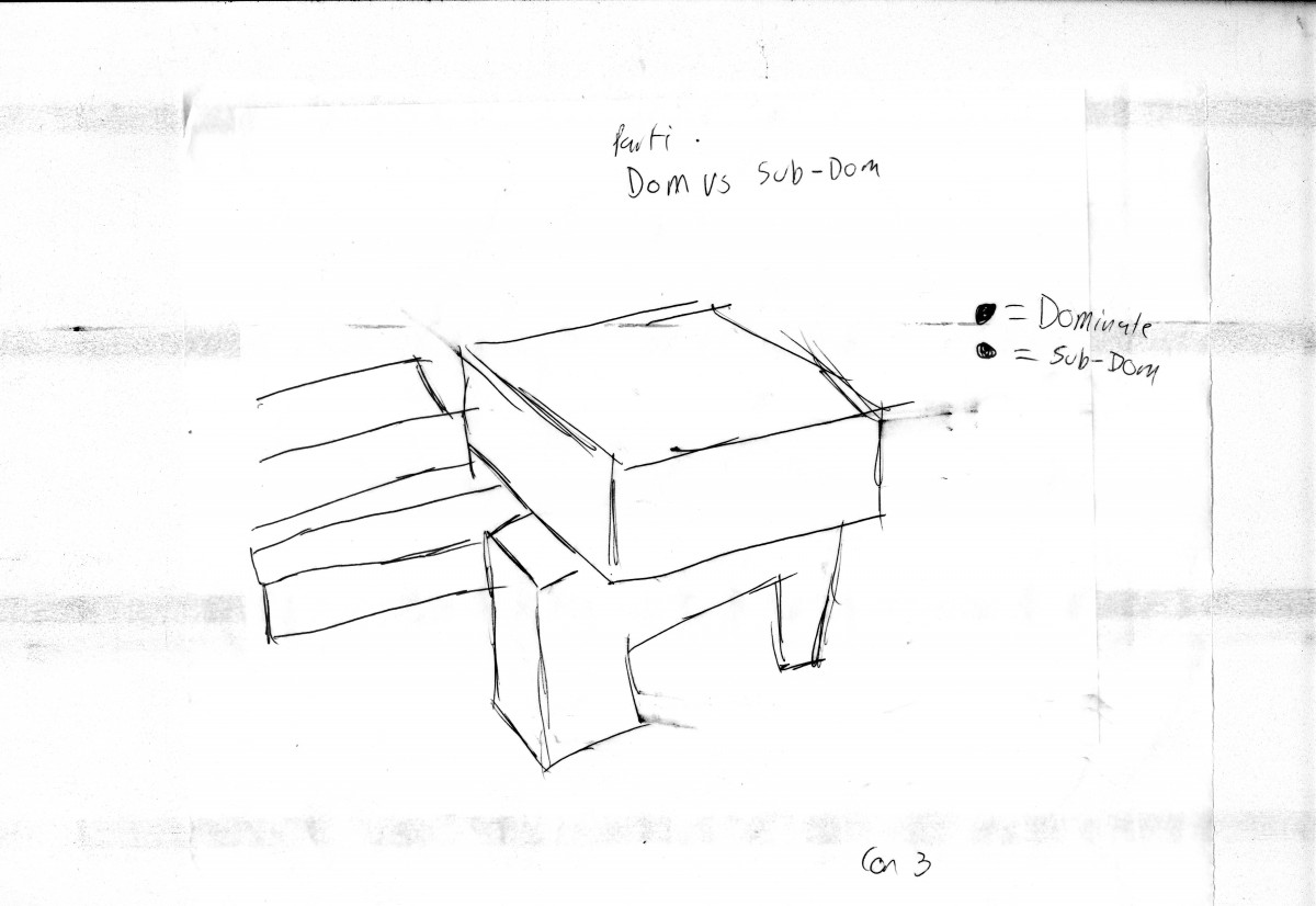
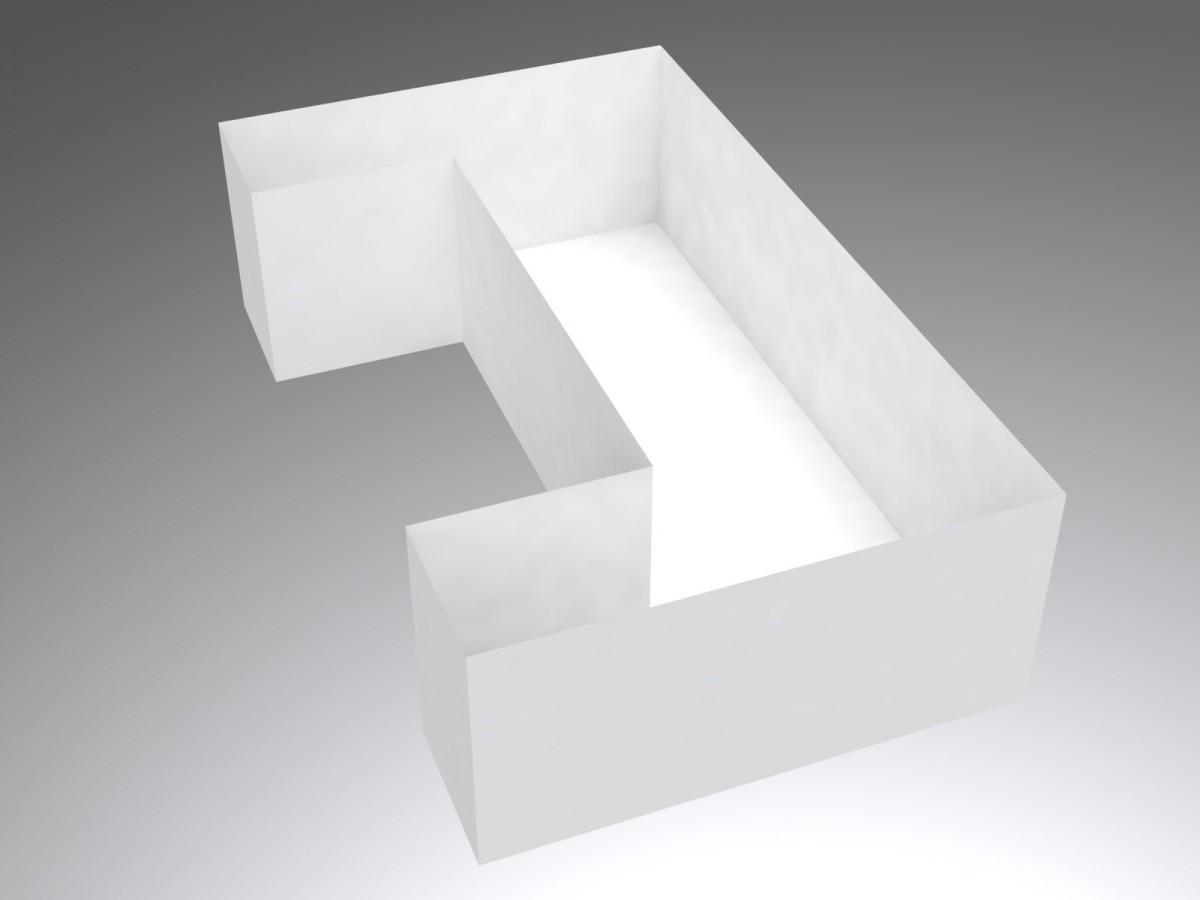
For this parti, i wanted to establish a dominant piece, sub-dominant and a subordinate. I established this by setting what i felt were the 3 main rooms of the building and labeling them. the main rooms were the lobby(subordinate) the work space(sub-dominant space) & and the main room which was the dominant piece. Once that was set up, i wanted also to bring a creative figure out of the building. I made the rooms be in certain angles where they would form different voids and allow different ways of light entering the rooms.
Assignment S

Assignment R
The second sheet didn’t want to upload so here is a link via dropbox to the second sheet with diagrams https://www.dropbox.com/sh/8r5b6pk4k23ynb9/AABpF40oG-RS54S2Ud5AI7iNa?dl=0


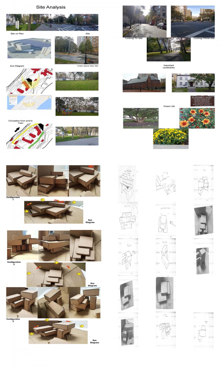
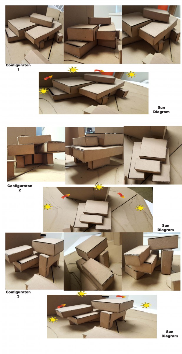
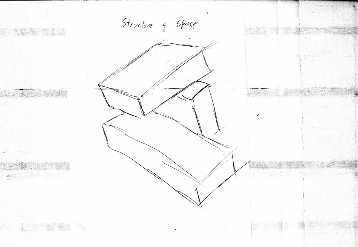
For this configuration, my parti was rotation. I wanted to add a twist to the overall look of the building instead of having it as just one solid object. i chose to leave the reading room in the back of the configuration in order to prevent direct solid onto the reading books but at the same time allow windows to be added on the sides of the room.
Con. 1
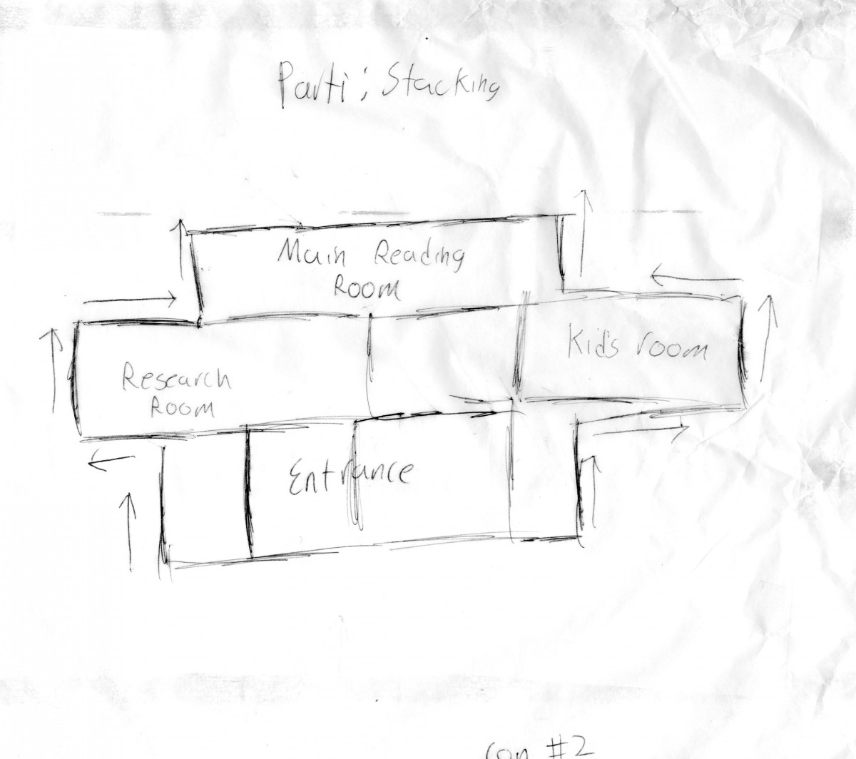

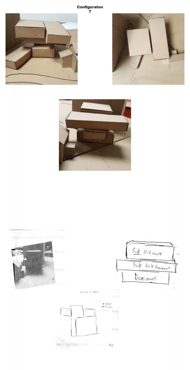
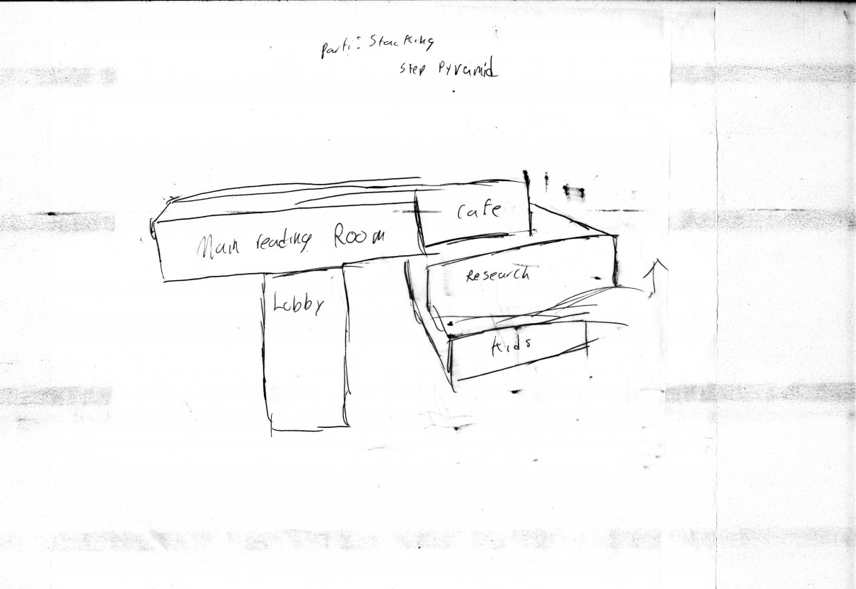
For this one, i was inspired by the aztec step pyramids. I liked the idea of having to reach the top to be able to reach your goals and reasons why i made this figure in a stacking way. By doing this i was able to provide some shading to the main entrance. Same as the first figure, the reading room is put in the back to get protection from the sun from the building behind it.
Conf.2
Conf.3
Conf.4
Conf.5
Assignment Q
CAFE RENDERING
 the cafe i made for easy movement. I set up the counter in the middle to allow seating and comfort space
CAFE LAYOUT
MAIN READING ROOM RENDERING
 the main reading room, i made massive since most branches i’ve visited has these big rooms. by doing this i allow easy circulation and allow more books to be stored and more people inside
MAIN READING ROOM LAYOUT
RESEARCH ROOM RENDERING
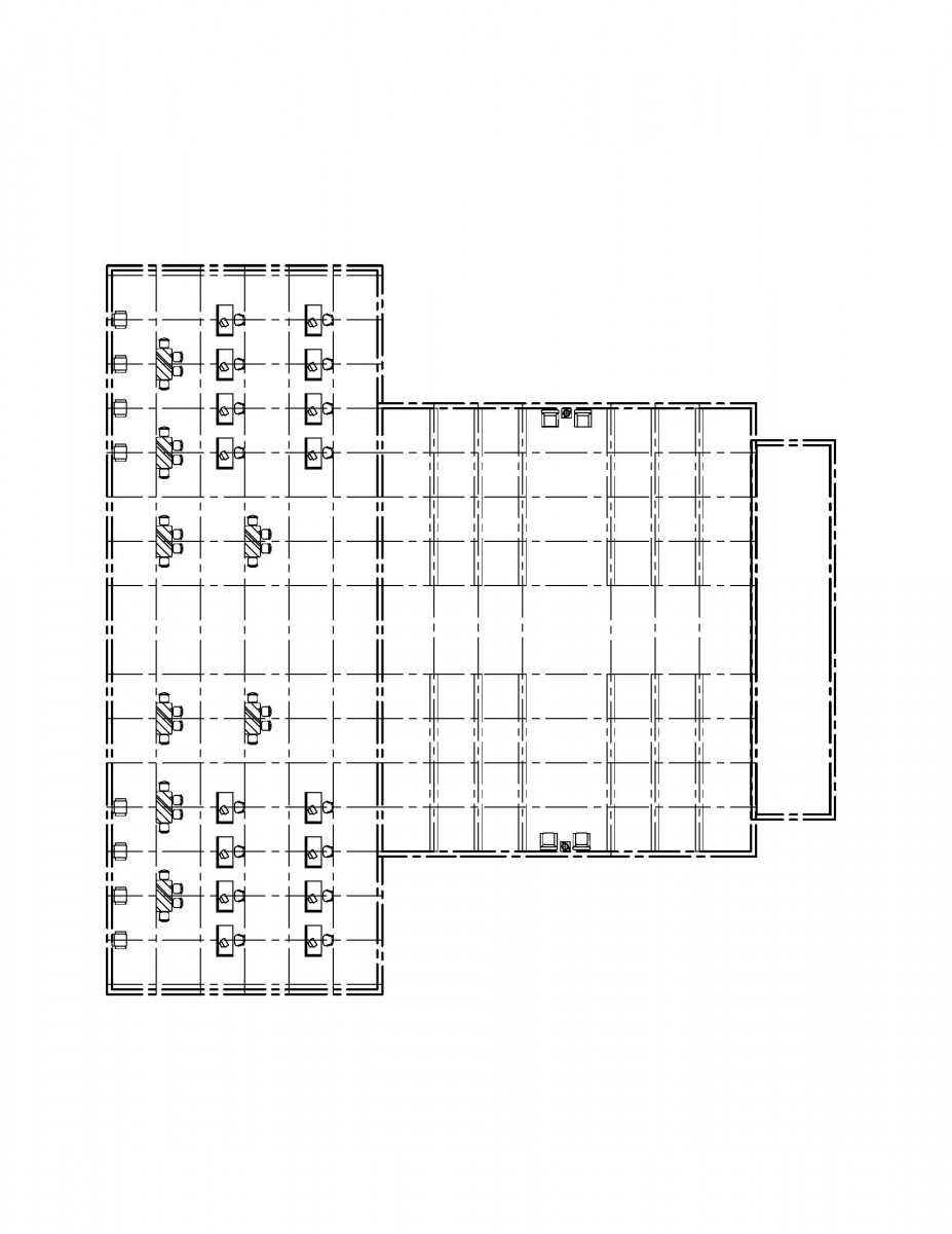
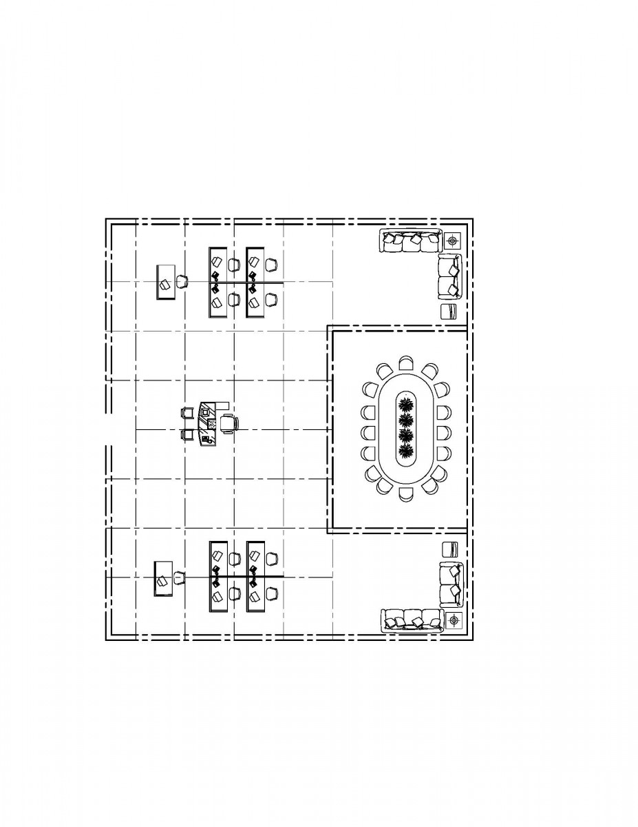 In a way for the research room i chose to have the layout follow a strict grid. i put the confrence room in the middle allow space to be available for other parts of the room.
RESEARCH ROOM LAYOUT
KIDS READING ROOM RENDERING
 the kids reading room, i took into mind my childhood. I took inspiration from the kids room in the branch i used to visit a few years back. I added my own touches which is shown. it allows easy circulation in the room while giving different spaces for different activities.
KIDS READING ROOM LAYOUT

LOBBY LAYOUT
 For the lobby i wanted to give a different type approach. for the lobby i added these two rectangles on the sides for a pathway to stairs. this allows more space inside the lobby while giving the stairs its own space.
LOBBY RENDERING
 This library has so much beauty in it. the materials used in it the stone types are in it gives it this wonderful touch to it. The high ceilings makes it feel like this place is massive. By being massive, i feel like it has the classic architecture in it. It feels like everything was hand crafted and has meaning to every part. The lighting for the room is beautiful. It has these nice voids that go very well with the room and the balcony adds a nice touch to this masterpiece
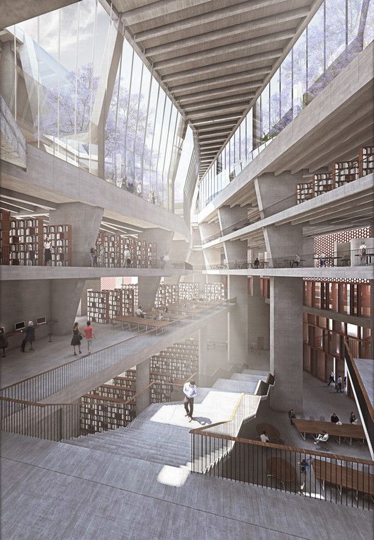 Looking at this at first glance, you wouldn’t think of this as a library. The whole thing looks massive compared to other libraries. I enjoy the huge windows on the top or sides of the ceiling. It allows the natural lighting to seep in directly into the middle of the room instead of going onto the books. This allows the books to be safe from sun exposure while allowing a great amount of natural lighting into the room. i love how everything is divided into 3 things. The shelves, a huge stair way and a sitting place. the stair looks great and makes me feel like the stairs won’t tire a person out from wating it. I love how there isn’t really any walls allowing you see the whole place in a glance
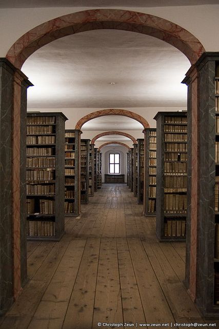 Where do i start with this one? This picture speaks for itself. I chose this as one my images is because of the texture. I enjoy the wooden floor and the wooden bookshelves. When i think of wooden materials, i think of massive trees. Trees are these strong plants of nature and when it is put into a design, i imagine it strong too. I feel like adding wood allows to have a more raw feeling into a design and it allows a different type of beauty into the design itself. The image also makes you feel the way it was taken that this is an endless rows of books. It forces you to focus on the window but allows the lighting to bring out a stronger image
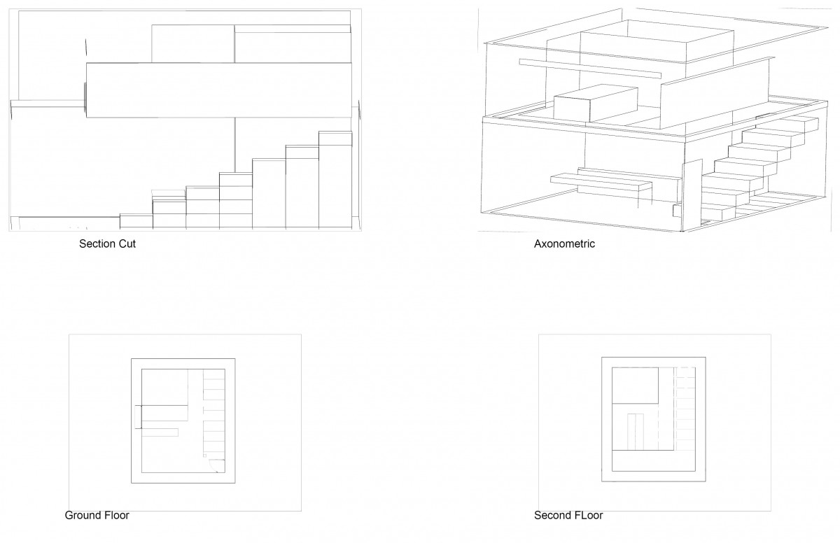
Assignment P
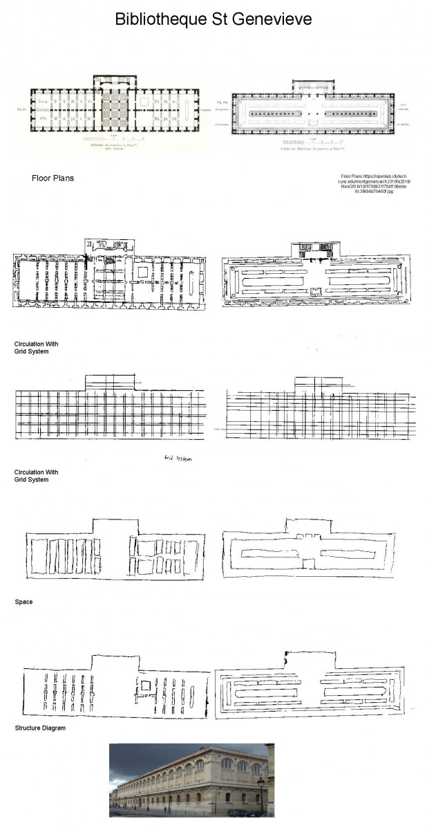
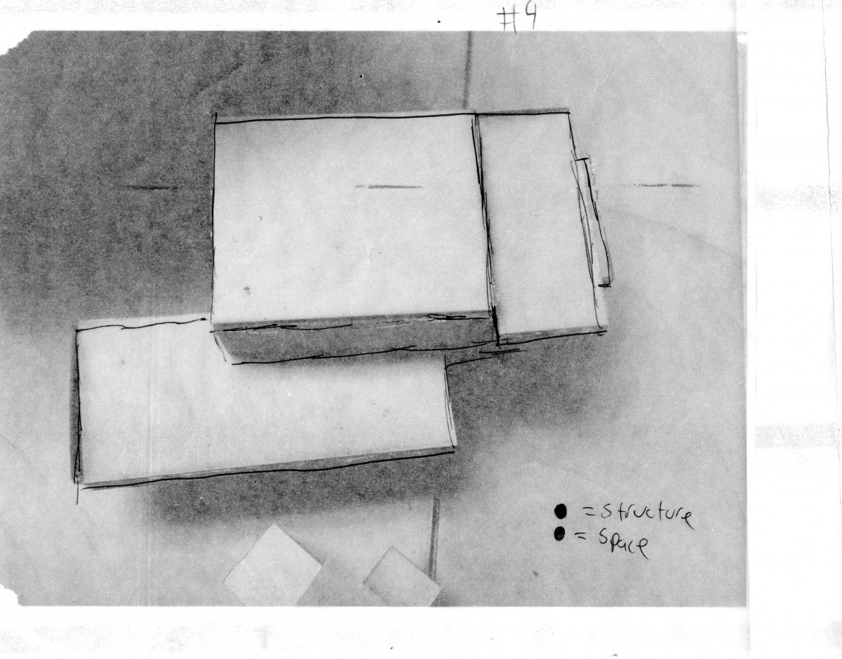
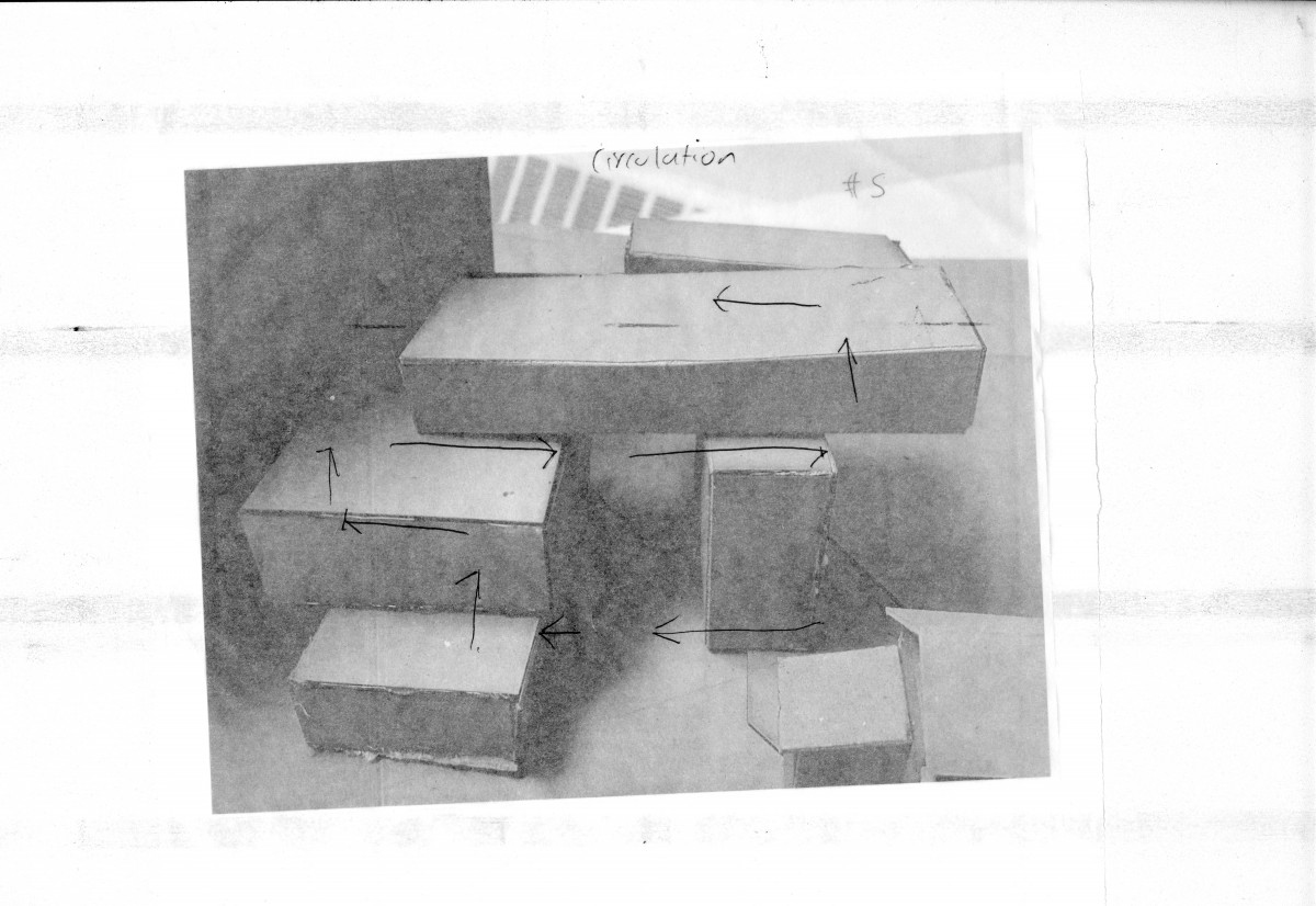
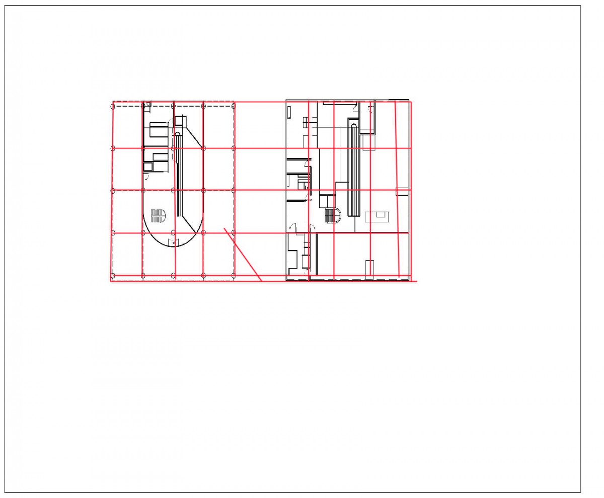
When looking first at the floor plans for this library, I noticed right away it followed a pattern and it caught my attention right away, hence the reason I picked this library. Bibliotheque St Genevieve, located in France, follows a grid system on both floor. The first floor mostly has private rooms most likely used for studying. Even the rooms are divided up equally are follow the grid. The second floor follows more of an open grid, meaning it has more openings in the room itself allowing easy circulation and seems like more of a social room. This room is also where the books are located and the checkout desk is also. I noticed while redrawing the floor plans were that there were columns feet away from the main entrance, serving as a path which leads you to the second floor. This is where most of the main ideas are. Even though you can easily go off and explore the main room, the columns are set up in a way that it’s calling you to follow its way. I was able to also notice that there were stairs in each corners of the room on the second floor that leads you to this mezzanine that has even more books on it. The ceiling for the second floor is very high and the mezzanine fits in well with the overall design. With my diagrams I planned on showing the grid system in the overall plan. The grid system also helps you understand how the circulation works in the library. The small rectangles are where the path is while the larger ones represents items around the path. The path itself falls into place with the grid system. In the 2nd and 3rd diagrams I tried showing the structures that were present in the plans and also the spaces available in the room.
Assignment O
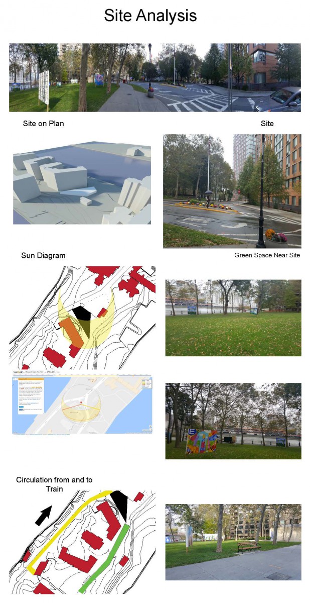

For my site analysis I mainly focused on the natural green space around the site. i documented the current green life around the site to document what plants are there for future use. For my project, i want to preserve that aspect of the community. I went twice to the site to site, on the day of the trip and that Saturday. I was able to observe the circulation on both day and notice a difference due to the weather. The diagram I have shown where the two main roads are from and to the subway from the site. I also show two sun diagrams. One of them is from SunCalc.net. This tool allowed me to see the sun path from the day of the trip. I used it as a reference to draw my diagram. I also documented where the new road would be once the building goes up. I documented the green space cross from the site and the important buildings in the area. When designing the building, the importance of the buildings will be considered in the design. The site itself falls into what i like to call the threshold of the island. The site falls on the border of older architecture with newer architecture. The north has these older buildings made decades ago, while the south has more commonly constructed buildings. When designing, I will have to take into consideration which path I want to follow that falls well into place.
Assignment N


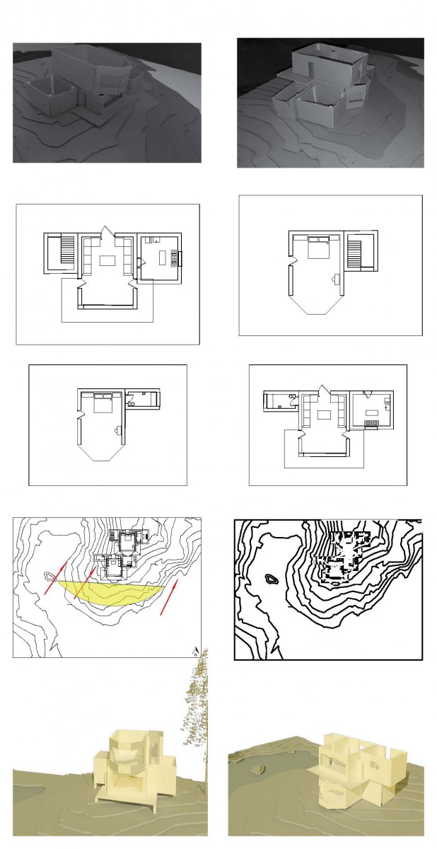
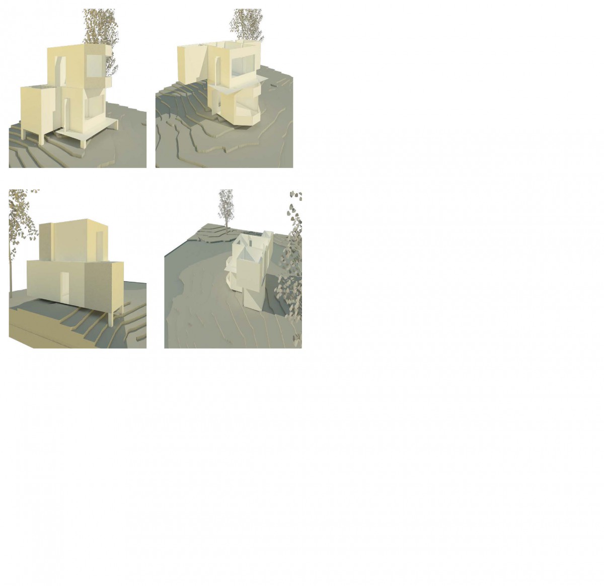
My House, Casa del Frio is a house based in a cold climate. There was a lot of thought put into the house when designing it and the main idea of this house was to be able to see the view of the waterside without really allowing the climate affect the way of living. Since the waterside was mostly visible on the south side, I added all of the glazing facing south. This move also allows sunlight to come in to the rooms throughout the day and warm up the house at the same time. Allowing the sunlight to warm up the house reduces the amount of energy required to keep the house warm throughout the day and only requires energy use from evening to morning. In the diagrams i show how a person would circulate through the house and how the sun moves throughout the day. I also show the separation of public space to private space. The first floor, which is the public space has a small room in the entrance allows a small gap in between the living room to the main entrance. I added this small room to prevent cold air from entering the house and from allowing the warmness go outside. The living room is one of the biggest rooms in the house. I put all the furniture on the sides of the room so the window was visible and allows people to look outside. Another reason was to keep circulation easy. Even though this is located in a cold climate, I added a balcony so when its warm outside, the user can relax outside and eat there. There’s a window facing the balcony to allow easy movement of food through it to the outside so you can eat and enjoy the fresh air. I made the dining room wide to allow more people inside of it and give walking space for anyone trying to pass it to go to the kitchen. The kitchen is big just in case you want to have guest over and then can move around there without being cramped. On the second floor, i created a mini living room making it semi private. It is in between both bedrooms and allows social space. The main bedroom, has these angled windows for different types of viewing of the waterside.
Assignment M


*UPDATE – Floor Plans Added
Assignment K

Assignment J
Assignment I

-First configuration focus on the idea of exposing each room to sunlight. Since the area of the house is in a cold climate, I focused on the idea of allowing the sun to provide its max energy on the house. So what I did was I made the house just one floor. This was a start to test the water out and see what other ideas I can get from allowing the sunshine onto the house. One of the few issues I had was it didn’t allow much of a viewing room into the house and limiting it to a certain part of the house.
–Now for the second configuration, I looked more into views. I wanted to see the best ways the bedroom can get a nice view of the landscape while the public area (living room) wasn’t left out in this process. My idea was to stack the bedroom onto the living so both can share the same views. By doing this, I also wanted to find a way to provide natural lighting and warmness of the sun to seep into the house. I added glazing where I felt the sun would provide direct hit and this allowed the idea of views and natural lighting to come into affect.
-Number three, i explored the idea of having a private outdoor area for the bedroom. This area would allow the person upstairs to be able to go outside and enjoy the great view without having to worry about other people there. There would be glazing in this area to A allow some sunlight into the room to lighten the mood & B allow fresh air from the water side into the room to refresh it. Due to the house being in a cold the glazing would be small windows that are not very long to allow enough space for insulation.
Number four, similar to number two the idea is still the same. But with this one i chose to move the private area to the bottom and the public in the top. What this does is, it allows the public area to be higher. It gives off more of a nicer view to the people using it. It gives more green open space to the private area but at the same time it gives more of a private feeling since the room is more hidden compared to the public rooms of the house.
Fifth configuration. Very similar to number three, this configuration has more surface area on the fifth floor. The two same ideas of allowing open balconies on both floors are still in place. But with the extra space now the 1st floor, this allows the living room to expand or increase the circulation space. Still having low ceiling in all rooms to preserve the warmness that comes in, The more space for circulation allows easy moving around the house. It also allows more rooms to be place or an increase in the sizes of other rooms
Assignment H
 Practice Sections
Assignment G
Assignment F

*UPDATED Floor Plans. Increased size of floor plans to see better. Added Parti Diagram
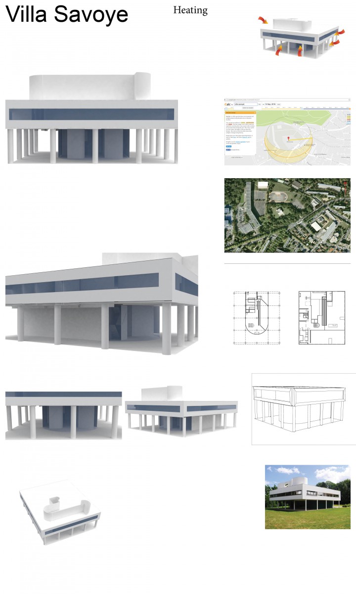
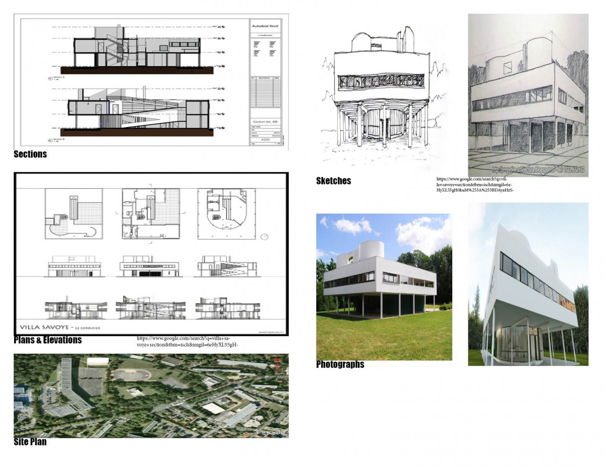
Villa Savoye was designed for a family. Le Corbusier followed the 5 points of architecture when designing this house. Long windows, space under the house to allow green space, rooftop garden , and the way the columns were placed. As the diagram shows, the private space is on the second floor. Created a small opening on the bottom floor and left a lot of open space to allow for parking of a car. The bottom floor has a staircase and ramp to the second floor. On the bottom, there is a room for a house maid. By doing that it allows complete privacy from the family.
Assignment E

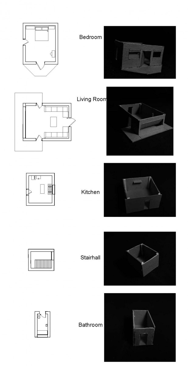
In these renderings, i tried my best to show the amount of space in this room. I tried also my best to show off why i enjoy this room so much. From the separation of public v private to the comfort level, this room seems to deliver what every person needs. i also tried showing how easy it is to move around this space and how lighting has its affect onto the space.
Assignment D


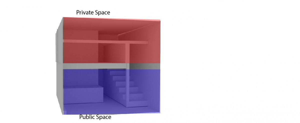
Villa Savoye, a house ahead of its time. Right away when I saw this house I fell in love. From the way it was built to the separation of levels, this was just an amazing house right away. Made following the 5 points of architecture, this is just one an amazing house. The way the bottom is open to allow air and garden space to be available in the bottom. Most of the private space is on the second floor. There’s an open court on the second floor so the person living there can enjoy some fresh air but still have complete private.
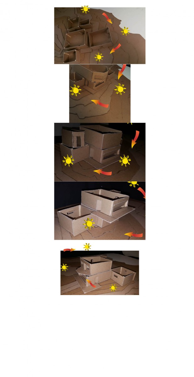
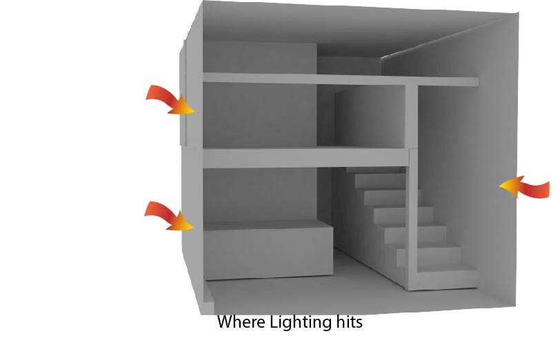
The diagram what it shows is the affects where the lighting comes into. it shows where the sunlight hits in the house.
Assignment C


I enjoyed the way this room is. I enjoy that it is a loft and allows the separation of Private v Public in a simple way. This loft has everything found in a common house and seems to provide comfort and allows social time. Every bit of room available is used in this loft which i enjoy since no space is left to waste. I enjoy the way natural lighting comes well into place and brightens the room and also brightens the mood when exposed into the house. From materials to design wise, this loft seems to fit every need a person has.
Assignment B

Assignment A

