-
- Draft 1
-
- Draft 2
-

- Draft 3
-
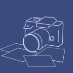
- Camera
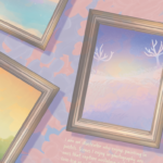
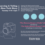
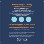
This week I learned that you can make a title of a chapter more interesting by formatting it like this! CHAPTER 1 – Making marshmallows. I also learned if pictures aren’t all the same size, it’s still best to try to center them to make some parts consistent. On top of that, I’ve learned that graphic design involves research. By that I mean you can’t take images from the website because of copyright but you can illustrate them. So I had to figure out what is the best way to illustrate several buildings to make them look consistent yet still stick to the theme? My two mentors Or and Philip suggested using a polaroid camera, having pictures around the wall or scattered at the bottom of the poster. I could also use a corkboard and pin-up photos of the old and new buildings to better incorporate my client’s idea instead of doing a one-point perspective. So not only did I have to research old buildings, but I also had to figure out where to place them and their size so the visuals would aid the text, not be the focal point. Philip taught me how to align things perfectly to the page, and overall I’m also learning how to measure the speed at which I work with the deadline. This means I take the ideas that are given to me and execute it the best I can and fix them as I go. Time is very valuable when everything is due next week including all your classwork so it’s super important not to try to get everything perfect within the first draft.