A City Tech OpenLab ePortfolio

Author: Evelyn Ng (Page 2 of 4)

Massimo Vignelli Poster

Typography poster inspired by Massimo Vignelli’s colors and grid method. This poster was printed and placed outside on display of City Tech’s library. In our class assignment, we had to pick a quote from our favorite designer and create posters using the grid technique. Originally I was trying to place things to fill the space but still align, at the end of the class I figured that I could tilt the text and still keep it aligned. The interesting shape created by the quote looked similar to a skyline which made it more meaningful and dynamic since Massimo Vignelli moved to New York later to work.

Continue reading

Week #13 Using Creative Work

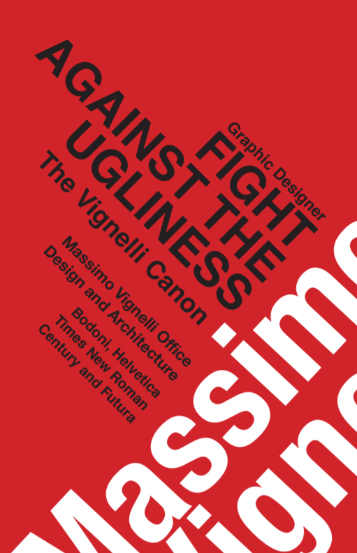
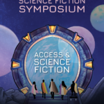
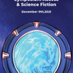
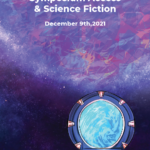
Last week I had a new client, I will be doing the Science Fiction Symposium and representing everyone as a superhero to include them in Sci-Fi. Since I had some time before my meeting I tried to search up things related to space to save some time when it came to inspiration. My internship usually asks the client for logos, we also use the city tech logo all the time since we are given a file of that. We usually do not alter the client’s logo, so if it comes in a color that doesn’t work for our poster we try our best to accommodate. We haven’t signed any confidentiality or non-disclosure agreements unless it was for the recovery corps. In the case of the ESP project I did, I have to keep the research confidential.

In the past when I used another creative’s work for school purposes I never really credited it, examples would be for photoshop exercises. If I used it for my essays or powerpoints I had to credit it in the works cited areas. My opinion on the copyright issue for the hope poster case is a bit on the fence. I think the artist should have credited the photographer who took a picture of Obama. Only because the figure is the same, the pose, the expression. The colors are different, but I would personally label it 50% different. When you do fan art illustrations of characters usually you would change their pose, have a different way of drawing their expression, and also shading. This is mainly the reason why I stay away from realistic portraits as well. I think it is difficult to edit photos in a way that looks entirely different. And if you stylize a figure too much, like Beyonce you could be at risk for lashing back. I watched this happen to a Netflix artist who drew her for TikTok. I feel like in this situation, whether they profited or not from the hope poster they are still using someone’s photograph. The golden rule I hear from fellow illustrators is that if it’s not 70% different you must credit.

Week #12 Webinar

Today I watched Annotate and collaborate: Streamlining online text reviews. In the adobe cloud, you are able to browse many resources, inspiration on Behance, and look for fonts. Within my work you can find your library of work, you can also find all the assets you have been using from colors to images and vector graphics. You can share this with your colleague so they can see the library. You are able to put images InDesign by pulling them from the creative cloud library, you may also search directly from the InDesign app. Afterward, you can invite people to share for review and add comments. When your teammate accepts the invitation it takes you to a browser view and you can comment on the InDesign document themselves. This saves time because people can review the already made comments to save time instead of the repetitiveness from chain emails to multiple people. They can resolve the comments as they go and it is all through the same URL. What I learned today is that there is an application similar to google docs specifically for designers. I think this is definitely useful and should be implemented in our current remote work and ongoing because sometimes it’s hard for some of us to receive auditory feedback and remember them. Or maybe students who are thinking the same things can try to come up with new feedback after reading the existing comments to get more variety and constructive criticism.

Reading response 3

After reading what I learned was that I should always try to face the camera as much as possible. I know this is a little difficult for me because of the space that I have to work with but in the future when I have my own studio I will keep that in mind. I agree that people should choose a non-distracting photo that isn’t too outdated. The photo I have on my zoom and LinkedIn shows me when I was still going to school and was taken with a professional camera during photography class. I think smiling is a thing we all forget to do from time to time especially with zoom fatigue but I can say it really does make a difference. When I see my professors smiling even when they are explaining the content of the course it makes me feel like I am in the right place and it is a safe spot. I find it difficult to smile when nervous especially if I am presenting, appropriate clothing is something I have always considered. I try to wear clothing with no patterns and words when I appear in meetings. I think the most important part of this reading that I would like to work on is not staying too long in meetings. Not because I do not enjoy the company or being in those meetings, but sometimes when the agenda has been discussed it would be nice if I could immediately start working on the items. But I find it really hard to end a meeting so that it does not seem abrupt.

Week #11 Networking

On Friday I attended a general ed meeting where there were many professors who presented their own projects and findings. I was invited to speak about my student success story about being an emerging scholar, and continuing my work in the summer with the recovery corps. Everyone was very supportive of each other and had many questions. When I presented I had my camera on and I talked about my process of creating visuals out of technical information. Not only was I able to understand soil mechanics but I was also able to draw it in comic form even though I had never taken narrative class ever at my time here at City Tech. I am proud of my results, and I will forever be grateful to my professors for inviting me to speak and work on this project. Thank you to Professor Guzman and Professor Woolley for supporting me and guiding me this far, and for providing me the opportunity to work at faculty commons. I will continue to strive to better myself as a student and as an artist.

Week #10 Networking

Today we did a trim path challenge where we could only use shapes and text tools to design something. We could advertise for ourselves if we didn’t know where to start so this is what I created. During this exercise, I noticed a lot of settings in after effects have changed since I last used it. Everyone had one hour to design something and I created this sushi and sun combination. I didn’t know how to make other shapes but everyone else had some really cool techniques like making outlines and zooming in and out of the frame. Overall I thought it was a very creative excersise. The event was hosted by Daniel King.

Week #9 Networking

Club meeting that met with Justin Volz, he worked at titmouse.inc asa an intern. He worked in the management section and then got hired to be a cleanup animator. It was helpful for them because they learned how people put together their files for the final animation. Then he got hired for background design, they also got to animate it. Eventually, they got to do character background and layouts, animation and did background painting. They also worked as a motion designer at BBDO. He got to work with multiple big clients and pitches. This artist went freelance after that and got into UI/UX animation. Meeting these artists and hearing about them tell us about their journey has taught me that progress isn’t linear. There are people who get experience and then go into freelance, or freelance first before they get into a company. The work produced is amazing and seamless. I love the illustrations for the bittersweet valentine’s gif, and how the ribbon stretches across the flowers. Watching and hearing about this process makes me really appreciate motion design. If there was a free program that was like after effects I would have considered this career but unfortunately, I don’t really have the luxury to afford the adobe subscription.

Week #8 Webinar

The webinar I chose was “Creating high impact presentations”. Adobe recommends that you use their adobe stock. For a presentation, it’s important to have images and videos. To create an impactful presentation you need images that work with your presentation. You shouldn’t mix illustrations and photos together, try to keep images all the same style. After selecting your images you can license the images. You can add adobe stock to import these images in your presentation. This saves time because you do not have to worry about licenses after doing this and reduce the number of files saved on your machine.

Class two reading

The reading talks about how important it is to be direct. The example they provide is a father asking if his son wants to hold hands. “Do you want to hold hands?” and “Please hold my hands” have two different meanings. One is asking if the other person wants to do something for you while the other one is saying please meet my need. A statement is better than a question sometimes, I could see this if I were to ask my client “Please provide the copy” compared to “Do you have a copy?”. I also never considered telling people who interrupt “Hold that thought” even though I have heard it many times when students participate. I think something I should consider is if I find myself interrupting to just offer someone the floor, or ask them to continue.

Week #7

Today I recalled how to print a booklet out via InDesign as well as how to properly decorate a poster. When given a video such as SoHo memory we took screenshots of buildings but also items related to the topic such as her pop-up museum. At first, I only had buildings but my mentor Philip taught me I can increase the size of my poster to tabloid and make my poster into a corkboard and pin my building illustrations on the side. Another thing that I learned is that I should stick to what my client expects and if there is a really great idea I should also include that in my second round of posters. Also rendering everything equally is important. It was a little awkward that I had my camera incredibly rendered, but since I was working in real time some of my recent pictures were a little bit more rushed. I appreciate the mentoring relationship I am building up since I usually struggle with getting input on graphic design compared to illustration and I’m excited to work with the rest of the team. I didn’t realize how much time my illustrations but with time constraints sometimes you have to make compromises with the object so I went with simpler shading.

« Older posts Newer posts »