Museum of the city of New York Trip

femfemin

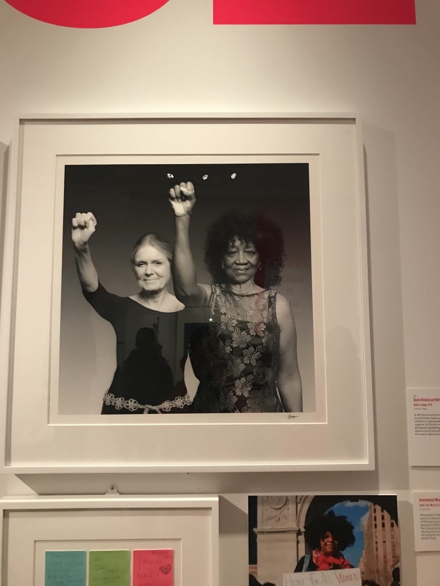
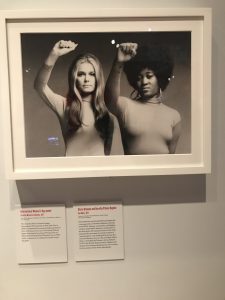
The above images are of two women – liberation activists who go by the name of Gloria Steinem and Dorothy Pitman Hughes. The older image that represents women’s strength / freedom and overall movement was taken in 1970, whereas the more up to date photograph was shot in 2013. I found these images interesting because of the timeline in history and the overall story behind the raised fists. I also find these photographs to be very meaningful because of how it represents unity and strength between an African woman and a white woman both during the 70’s women activists movement and now – where – although things have indeed changed for the better – there are still unequal rights that woman face in todays day and age.


mk


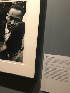
” while he was surrounded by the crowd before his speech at the United Nations on April 15, 1967, I dropped to my knees and caught Dr. Kind in a moment of deep thought. My determination in getting the photograph led me to my eventual friendship with Dr. King” – Benedict J. Fernandez


I find this photograph very interesting because of how this photographer was able to capture a “private moment” in time with Dr. King which portrays more than Dr. King and rather a symbol of hope, determination and wisdom.


cry

poe


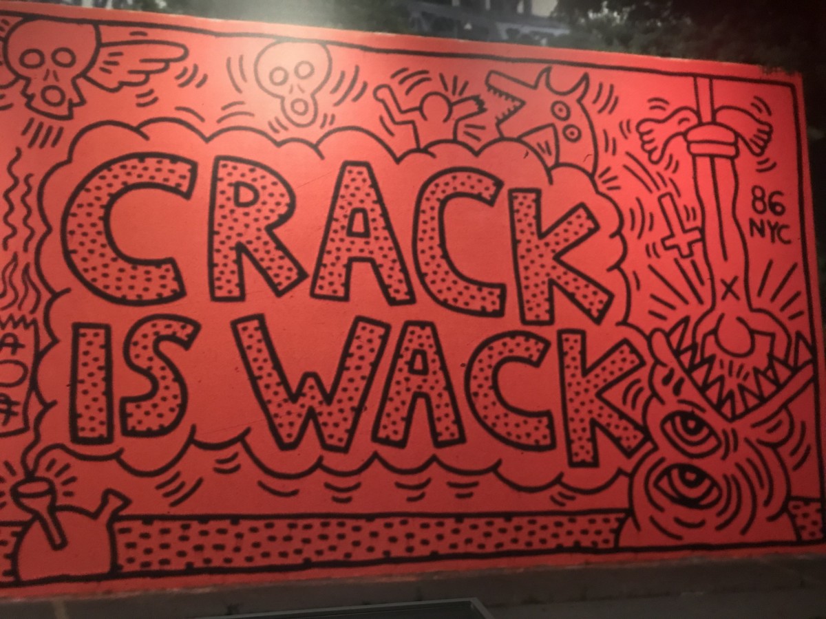
I found this art piece interesting because of the phrase “crack is wack” which is an old school phrase that sounds familiar. This piece was also made by Keith Haring who is a well known creative artist – in which I have looked up to for inspiration on projects both personal and for class. The design of this art piece itself also gives off a nostalgic vibe as Keith uses playful typographical elements to jazz up the copy “crack is wack” and make it more intriguing in the eye of the viewer.


Webinar – Monotype

Pro tips for picking web fonts – design tools / services:

Besides the importance of type in design and being one who hopes to learn as much about type as one possibly can – I chose to selected the Montype webinar : http://go.monotype.com/Picking-Webfonts-June-2_Post-Webinar.html – which also happens to be the first webinar event for this specific source…

pic

The monotype webinar was hosted by Dan Rhatigan who is a type director from NY that is responsible for type libraries and overseeing the development of new type families.

The topics that were covered in the webinar were the following:

  1. Type on screen
  2. Typefaces
  3. size
  4. styles
  5. color
  6. spacing
  7. the right tools

Although I felt I knew most of the factors and tips that were being discussed I still feel I was able to learn at least one thing from each topic/category (which were all fundamentals and tips or the overall use for web fonts/type ).

The main term that was used for “type on screen” was the pixel grid and monitor/screen resolution – which may not be the same for all users viewing a website or platform with type.

Going into the further topics Dan mentioned one important key which was that your choice of font should not be chosen just for the look/style/design and rather its function. “typefaces are designed ideas” – Dan.

Dan also mentioned how type CANNOT just be swapped out for any typeface of your choice – which was discussed during the typefaces topic where he also mentions how certain typefaces are made for certain platforms – and how was making your c=decision you should always check the typeface in context. (almost like printing proofs when designing a publication / project/ poster.

Now when it comes to the size – although you may choose your choice of typeface / font – the weight of the different typefaces vary even when they are the same point size. Type gets more legible with better screen resolution – but overall web format is considered a rough environment when it comes to type. Not every user may see the same “type design” on their screen depending on their resolution (of their monitory/screen etc)

Scale can play a big role in how your going to use web font text vs display.

styles

families

Certain colors may reduce the legibility or overall appearance of your type (no matter the font choice etc). For spacing – Even if the same size font(s) – the contrast (black & white) makes it seem like theres a difference in spacing (leading) or kerning as well especially because of the format (web=pixels)\

showin


Lastly I also wanted to mention that Dan spoke about css/html 5 coding and web-safe fonts which are basically fonts that are available to use on the web (because not all fonts are available due to the fact that web is used worldwide etc.) CSS coding may affect weights of chosen typeface automatically even if the font is available (web safe font)

APC-NYC: Rising Stars + Mentors educational / networking event (2/2)

app

This past Wednesday I had the opportunity to attend the rising stars & mentors 2018 event at the new school located in NY, NY. There were a total of 7 panelist speakers during the panel discussion and a Q&A with industry professionals who were all from different companies or who had different occupations / job titles.

The panel discussion and Q&A lasted for the first couple of hours which was eventually followed by a networking get-together (that included food and refreshments) which included both the panelists and audience members.

The panel discussion was moderated by a GCSF mentor/member – Jimmy – who asked many questions on behalf of all  professionals on the panel.

Some important topics of discussion that I felt helped me learn more about “work-life” and gave me a lot more insight about the industries of design and production were:

  1. The balance between work and life (family and hobbies)
  2. how and when to appropriately approach the short-term/long-term life goals (in terms of career path)
  3. what / how success if perceived in the eyes of millennial vs old/new generations (new media , technology and adapting to change)
  4. why it is so important to do what you love – (because you can do it good and won’t get bored or feel lost in terms of career choice/midlife crisis).

After the Discussion there were very few questions asked but that did not come as a surprise to me because of how well the event was not only moderated but also how much / many topics were covered and talked about thoroughly…


panel


Following the panel and q&a was a networking event in which I was able to speak with some of my GCSF colleagues as well as panelists.

I spoke to / connected with a few panelist speakers from the event which include John Mozzarella – art director at patients & purpose (potential MTP for art and design club), Jenifer Walter (creative directer – founder of lucky magazine) and Ali Weidmann (production assistant at Showtime network – who is also a potential MTP speaker not to mention she was the youngest panelist speaker – only a few years out of college).

Journal #10

bechance

I currently use an app called Behance Display. This app is an app that connects your behance and displays your work(s) in a professional manner / look, especially in a time of need. If you’re wondering how I may find it to be so convenient – I would state the obvious…  well its an app that can carry your digital portfolio anywhere/everywhere on the go or even at a last minute networking event etc. The pro to this app and using bechance over a personal website or adobe portfolio is that you don’t need to wait for your website to load or switch from page to page (works/self initiated etc) and on your business card (if you have any) you can include your behance which will also serve as a digital portfolio for you for free. Behance display is available for iPhone/ios users and android users as well. I would rate the app 4/5 – being that although it does serve as a convenient app that does not take up too much storage on your phone – I find it sort of inconvenient that Behance has another app called “Behance” that is separate from behance display and would rather the two be integrated.

Journal Entry #9 – app review

app

Although there are many scanner apps offered by other parties such as adobe and dropbox – I have been using an app called iScanner. With iScanner you can scan books, receipts, any kinds of documents, paper notes, whiteboards, schedules, timetables – anything you might need in your day-to-day life. I feel that it is not only convenient – but it is free in the App Store for both iPhone and android users. It also does not require or take up too much storage on your phone and users also have the option to important export files etc. and are able to use all the features of almost all scanner apps if not more! I use this app not only out of convenience but to save time, money and patience! I rate this app a solid 4.5/5 and am still using it til this day – although I have indeed tried using other scanner apps – but found that they either force you to update and pay for the apps full features etc or the app takes up too much space on my iPhone.

Journal 8

website

Another experience I had that I felt I learned from at the Brooklyn Navy Yard during my internship was the website launch. As part of the re-brand of BNYthere was a meeting held with the external affairs and a partnered tenant organization (also within the yard) who designed the website and presented the ux/ui experience to us. Although the website was never launched while I was at the Navy Yard – I still felt I was apart of it especially because I was able to see revisions and see how / why the ux/ui was designed specifically to not only aligned to be on brand with the navy yard but have a professional look and user experience for clients/users and job seekers. I was able to work partially on the website revisions by contacting and researching current  tenants and organizations and adding / sending their info to a file in which would be sent to Radish lab (website designer organization) in order for them to update etc. before the official website launch.

Journal entry 7

During my internship at the BNYDC as a graphic designer for external affairs located at building 292 I felt like I have learned more than I actually / physically did in terms of labor. I felt I had a more mental growth experience rather than a mass-production of graphic design related work during my time at the BNY. And although this may sound positive – there are also negative aspects involved as well. What I feel may have been some negative aspects are that I didn’t do enough design work for me to actually include in my portfolio or professional lifestyle – I did indeed work on some corporate projects and spreadsheets for partnered organization info etc. especially when it was a slow work day. But for the most part I learned to always try to keep myself busy and be productive with my time and in return learned to become time efficient and organized in many ways – considering I am a full time student. Some of the positive aspects of my internship experience was the communication… I took the initiative most of the time to communicate amongst my fellow co-workers whether it was just to ask a simple question or even a complex one to get a little more insight about BNY brand or external affairs. I didn’t learn too much about the navy yard as a whole as much as I thought I would but I definitely made connections whenever I could as well as participated in discussions whenever I felt necessary (meetings, conferences, events etc.)

Self evaluation

Although I have recently finished my time at the BNY as a graphic design intern – I would like to mention one specific project I worked on which I was definitely proud of. The project in which I felt proud of was actually a project that I worked on for another BNY employee named name is Carli Beseau, who had asked me for my help on a photo flyer project. Although Carli doesn’t work in my department (external affairs) and instead is actually the Executive Director of Programs & Exhibits at building 92, I still prioritized her project as I would for any and all other projects I received and/or executed etc. Carli had provided me with a brief for what she wanted which was:

Project title: How to take the best photos with your phone

Objective: Prepare a brief outline (one page or less) of tips and tricks for taking strong photos on your phone. This brief will be used to help people as they prepare photographs for social media. Namely, posting on Instagram

Audience: EA team here at the Yard

Goal: To help EA team take stronger photos so that we get more likes and shares on social media

Ideas: I’m not sure what your brief will look like, but consider exploring items such as:


  • Design principles: thirds rule (taking photographs a bit off center), edge tension (cut things off in interesting ways), suggestions on photo editing apps (I like Priime), etc.


After reviewing and executing the project brief and flyer itself successfully – I was also given the opportunity to discuss the project at a meeting with my external affairs team and the team from building 92 that works with my team (dept.) which also made me feel more confident of my work and contribution.


Sustainability Crash Course Networking event at Pratt

pratt

The networking event I attended was located at Pratt Institute here in Brooklyn. The event was a sustainability crash course instructed and hosted by professors and/or Professionals who are already involved with their own business etc. At the crash course I learned about sustainable design and I was also given the opportunity to discover professionals who have established their own business and practices in the real world. I attended two sessions in which I very much enjoyed and the first one was led by am Dagirmanjian co-founder of Storey Inc. and the second one was led by Alexandra McNair founder of Fashion FWD.

1st session

The session with CEO / speaker Sam Dagirmanjian was helpful because he spoke to us about his story and how a “story” in general should be used to attract your audience. He explained how storytelling is very effect to your audience because it could be very empathetic. The first part to reaching people online is to create content that’s topical, relatable and informative and interesting of unusually appealing. Other key points Dagirmanjian made were how storytelling is how people communicate which is one of the most important tools and skills to have. He also mentioned how your content should be intriguing, convenient and easily shared across all media outlets / channels. Storey is a tool that was created to helps all innovators / creators, ambitious or determined entrepreneurs / founders, and idealists to share their ideas effectively in order to reach success or inspire others including their very own consumers.


fashion

The second session which was about Fashion and the good/bad which taught me about the negative / positive effects that the apparel industry has on workers, communities and our overall health even as consumers who aren’t aware of all that should be known when it comes to the fashion industry. A consumer may never really think about the process of making that one piece of garment because it doesn’t directly affect you even when we buy a pair of jeans or a shirt.  I was also unaware of how poor the working conditions in areas of developing countries like India are. Workers of these industries work in tanneries / factories without the right protective garments which cause health illnesses for the workers and the communities that these industries are located in. There was a photo shown of a factory that had been demolished due to poor facility conditions – where most of the workers died as a result.


Connections


Sam Dagirmanjian

CEO of Storey Inc.

https://www.linkedin.com/in/samuel-dagirmanjian-9153b550/


Learn Through Failure

BNY Logo

Since the begining of my employment at the Yard I have been learning a lot about re-branding of the Brooklyn Navy Yard as well as gaining a well rounded experience for me as an designer. I consider myself a young professional and feel even more confident when referring to myself as a graphic designer because I have gained experience and knowledge including soft skills to prove and a broader network to prove it. I have also become more fluent with my professional verbal language and body language from working at the yard and interacting with other employees and professionals who I speak with, network with or those in which I feel the need to leave a good lasting impression with. One thing that I have always kept in mind throughout my experience at the Brooklyn Navy Yard as a graphic designer is problem solving.

I have learned to ask less questions, not that asking questions is a bad thing – and I have learned how to creatively and persistently come up with solutions no matter my tasks and duties. I seek to solve my own problems because I dislike the feeling of not getting things done or completing tasks that I know I could or should have finished in a shorter span of time. But when I simply can’t complete a task in time – I consider it a lesson that I learned from “failing”. I consider failure a necessity. Failure is the seed of knowledge, it creates roots to knowledge and eventually experience. Good or bad – failure is what makes a person human. People make mistakes but in my opinion a mistake should never be repeated excessively and instead should be a process of learning – it is important to learn from your mistakes – but most of all never be afraid to fail!