
Pro tips for picking web fonts – design tools / services:
Besides the importance of type in design and being one who hopes to learn as much about type as one possibly can – I chose to selected the Montype webinar : http://go.monotype.com/Picking-Webfonts-June-2_Post-Webinar.html – which also happens to be the first webinar event for this specific source…
The monotype webinar was hosted by Dan Rhatigan who is a type director from NY that is responsible for type libraries and overseeing the development of new type families.
The topics that were covered in the webinar were the following:
- Type on screen
- Typefaces
- size
- styles
- color
- spacing
- the right tools
Although I felt I knew most of the factors and tips that were being discussed I still feel I was able to learn at least one thing from each topic/category (which were all fundamentals and tips or the overall use for web fonts/type ).
The main term that was used for “type on screen” was the pixel grid and monitor/screen resolution – which may not be the same for all users viewing a website or platform with type.
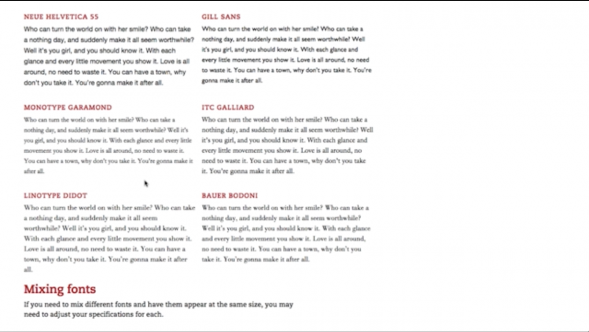
Going into the further topics Dan mentioned one important key which was that your choice of font should not be chosen just for the look/style/design and rather its function. “typefaces are designed ideas” – Dan.
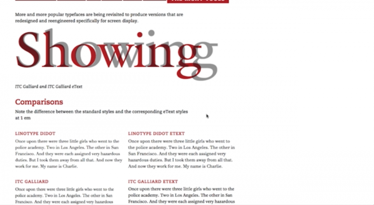
Dan also mentioned how type CANNOT just be swapped out for any typeface of your choice – which was discussed during the typefaces topic where he also mentions how certain typefaces are made for certain platforms – and how was making your c=decision you should always check the typeface in context. (almost like printing proofs when designing a publication / project/ poster.
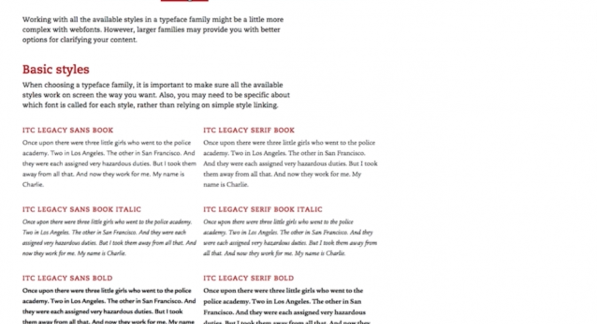
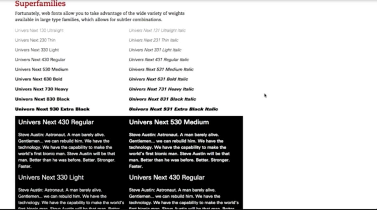
Now when it comes to the size – although you may choose your choice of typeface / font – the weight of the different typefaces vary even when they are the same point size. Type gets more legible with better screen resolution – but overall web format is considered a rough environment when it comes to type. Not every user may see the same “type design” on their screen depending on their resolution (of their monitory/screen etc)
Scale can play a big role in how your going to use web font text vs display.
Certain colors may reduce the legibility or overall appearance of your type (no matter the font choice etc). For spacing – Even if the same size font(s) – the contrast (black & white) makes it seem like theres a difference in spacing (leading) or kerning as well especially because of the format (web=pixels)\
Lastly I also wanted to mention that Dan spoke about css/html 5 coding and web-safe fonts which are basically fonts that are available to use on the web (because not all fonts are available due to the fact that web is used worldwide etc.) CSS coding may affect weights of chosen typeface automatically even if the font is available (web safe font)

