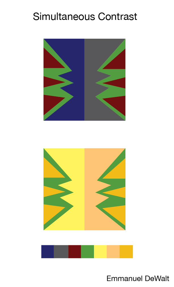
In this project about simultaneous contrast the objective was to explore color relationships by recognizing how colors change due to the proximity to other colors. The first thing we hd to do was do a simple figure/ground design, where the figure shape color will be the middle value and will be the same in both units, but the background color will change; one would be a very dark hue, one a very light blue. The final project that is posted was a more complex design where we needed to have three background colors and the control color can be active all around the composition. One set of hues will be dark values, the other set of background hues will be very light hues.
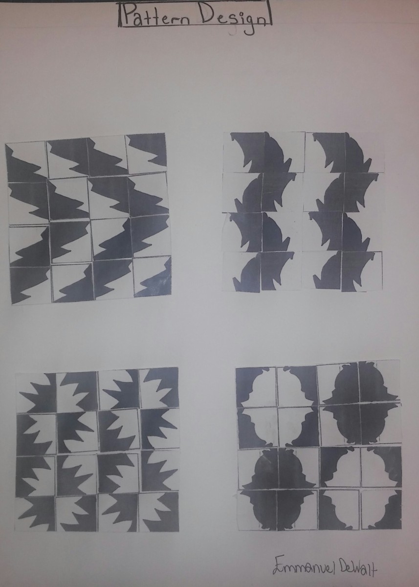
In this project about pattern designs we took the figure/ground plant drawing that we did and we took different pieces from it to create this pattern design above. We focused on the negative and positive value of the figure/ground plant design. In the process of the project we needed to notice the repetition being used in the pattern design and also try to notice the image within the pattern design. Attention was needed on the symmetrical balance between the two sides to work with the repetition of the pattern.
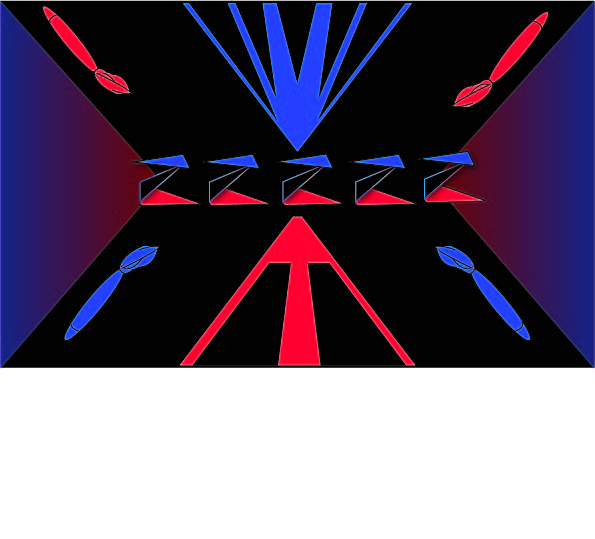
In this project about flag/logo design we had to interview our partner that we had in class and get some information about their likes and interest, their personal attributes and qualities, and outside affiliations that includes their religion, country, teams, and organizations. So the whole process was researching the background if the pictorial symbolic language and then the flag design will have the banding ideas, simple composition devices, and color symbolism. While doing this project we had to keep in mind the concept from our first project that involved line, power and fragility (abstract lines to create power/fragility compositions moods). Our research and design knowledge allowed us to express abstract ideas and specific shapes to create logo symbols of our partner integrated into color field flag design.

