


The first visual quote idea that came to mind was to create “slow down” in a sign that we’d see on an everyday basis. I decided to have the words share one of the same letters, in this case the “o” to have it be more interactive with each other. I chose the yellow sign to have it look more like a sign so the viewer understand that it’s meant to look like a sign.

For my second idea I decided to go with a bold but simple idea. I played around with the weight of this a lot so it would have some difference in the looks of it since it isn’t sharing any of the same letters. I added the arrow on the “d” because the down arrow went better with that letter than it did with the “w”, which in my eyes made it more effective. I also decided to add a yellow green background since it gives a more attractive look to it and the color indicates slowing down.
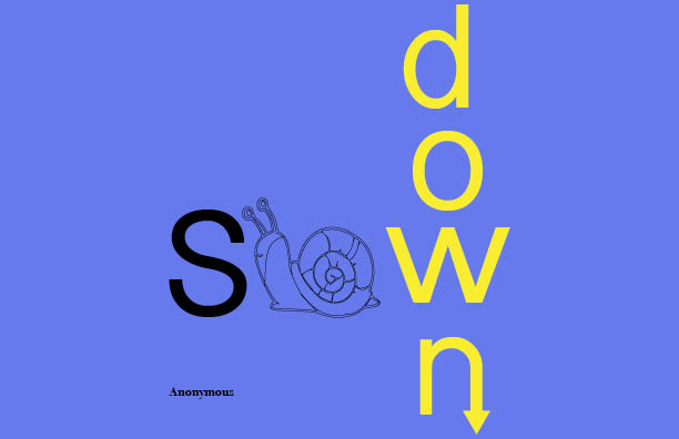
For the final idea I wanted to mix both ideas and add something unique to it to make it look and have a different approach than the others. I chose to have the word “down” in yellow because at a yellow traffic light, it’s indicated that the driver slows down. I added the down arrow to the “n” so it would help show the meaning of down. I took out the “l” because it looked as if there were two l’s in the word, so I decided to add a snail to represent the “l” and the “o” to help visually illustrate the meaning of slow. In this version I chose to have both words share the “w” because that was the only letter that wouldn’t affect the meaning of the other word. If I had them share the “o” the illustration of both words would have a different and a weird meaning to them.

