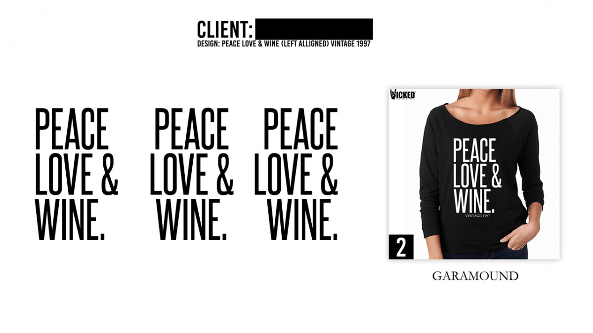
This week my manager put my design skills to the test. All of the orders that came in were for customs (thank you, marketing campaign). So by extension, several mock-ups needed to be created.
Designing type for clothing can be tricky. Text alignment is almost always centered and narrow. It just looks good the vast majority of times. This client disagreed however. So I sent them a demo with their design aligned to the left. They loved it and placed their order moments later.


