For our class “in the field report” assignment we all went to visit the School of Visual Arts Gallery. The overall presentation of the exhibition was very simple, clean cut and straight to the point. At the School of Visual Art Gallery, the art exhibit: The Master Series: Tom Gesimar was a primarily focus on the process taken to develop todays graphic identity for companies and institutions. Tom Gesimar is founder of BrownJohn, Chermayeff & Geismar firm in 1957. They have help shape the faces of corporations for years and Gesimar continues to work in graphic design.For example from the show I chosen three pieces “Chase logo 1961,” “Symbol Study 1971-1979” and “Inequality Matters” poster series 2006.

SVA Gallery
SVA Gallery Logos
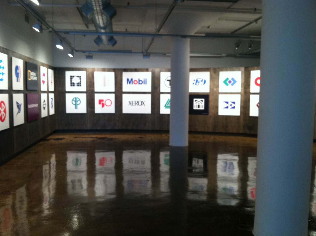
Going to this gallery was a real eye opener because I was walking around and seeing logos that I see every day like “Mobil Gas” and “PBS”. My eyes had really gotten wide once I seen the “Chase” bank logo, what made it so interesting to me was that something so popular as “Chase” I thought was built in one day. But realizing that a branch like that had processes and development stages to become what it is today.
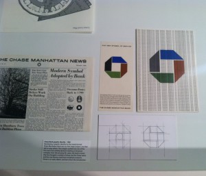
Chase Manhattan Bank
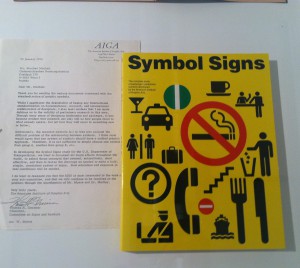
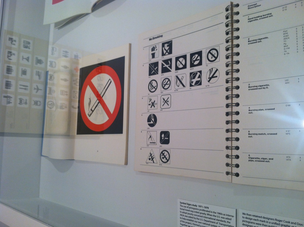
As soon as I came across the “Symbol Signs Study” and see the amount of signs that have one meaning and is understood globally. I always liked that just graphic images can portray a simple idea or message.
SVA Gallery Symbol Signs
SVA Gallery Signs
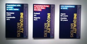
SVA Gallery Inequality Matters Poser Series
The final piece that seen at the gallery is the “Inequality Matters” poster series was used to express the ranks of each country that covers various development indicators. Throughout the entire design the information landmark was color coded and in the same spot as the last one. The concept behind the design was very efficient and made the primary focus easily understood.


No comments