
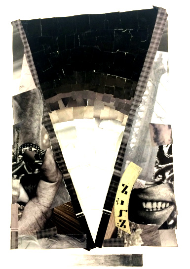
This project was about color specifying in Texture and Value. In art, value refers to the lightness or darkness of a color. The texture is a tactile quality of the surface of an object, the way it feels if touched or the visual feel represented in a painting or drawing, drawn with value shades in Graphic Design principles. Our objective was to use texture and value. Undergoing this project, challenges I encountered doing value texture was picking/finding textures out of magazine articles.
Also, a major challenge was complying images to help portray my thought process. The hierarchy on how I wanted to display my greyscale lastly was another challenge. The completion of this project has taught me that how to make an image using only shades of one color.
I learnt how the value of one color actually exist, the limitations of value and texture is endless. Organizing my work on a page was a major lesson learned, arranging color shades in a coherent manner was a good

