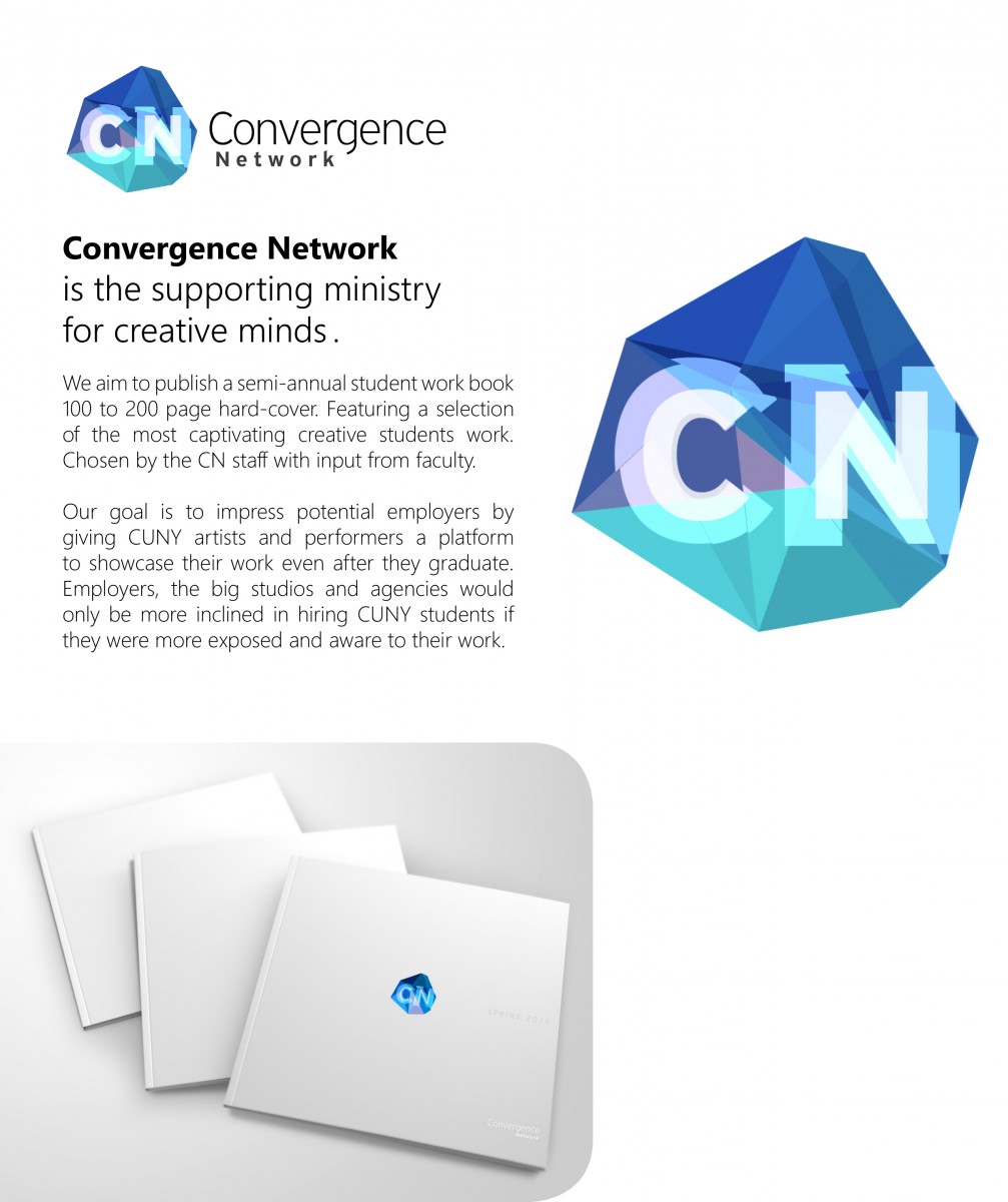
Spend the last week working on a flyer. The color scheme is cold and the logo is currently under redesign which I’m fully involved with as of 3/21/2016.
The type was placed on the left with justified light font for the heavy text. With a fairly basic structure for the heading being bold and subheading regular to create the hierarchy. With the three logos I was trying to create repetition and a visual triangle around the text to draw the eye in and interest the reader.
I understand that the middle logo is huge, I was trying to juxtapose it with the type and aesthetically express that this is what CN is. It’s actually the same height as the text I made it that size on purpose.
the bottom image wasn’t mine I used a template to present what the book could possibly look like.