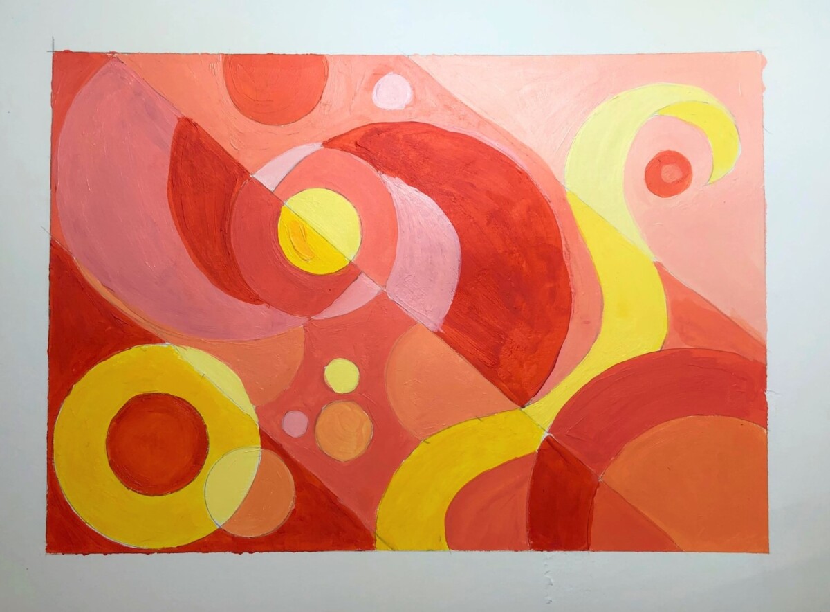
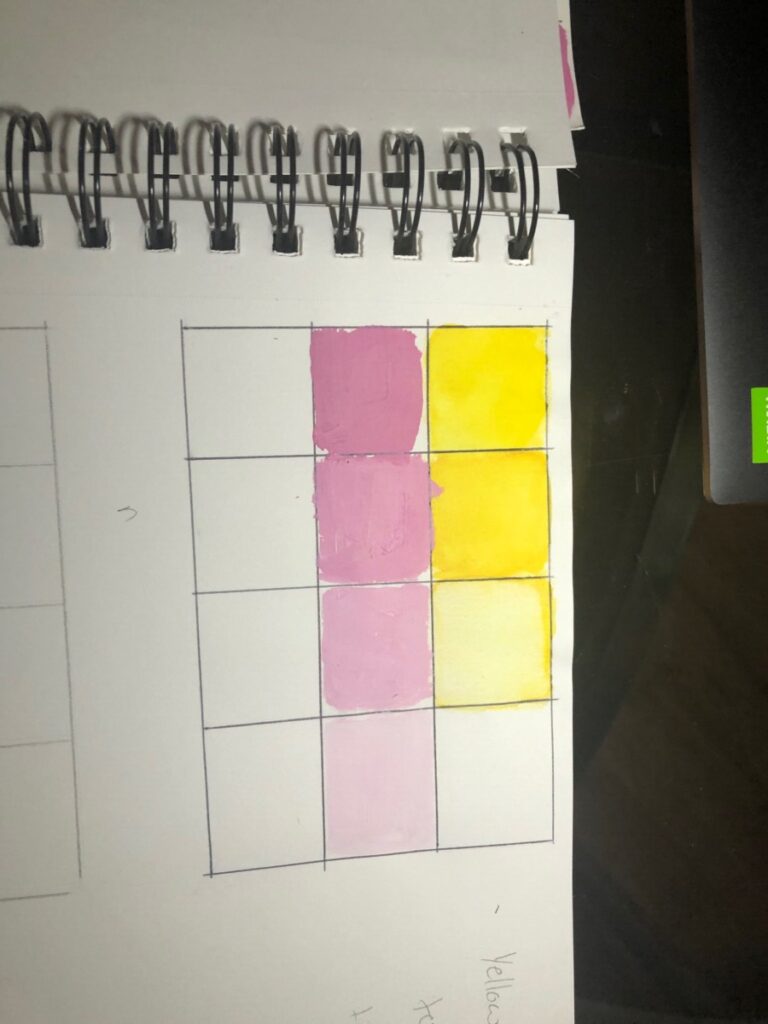
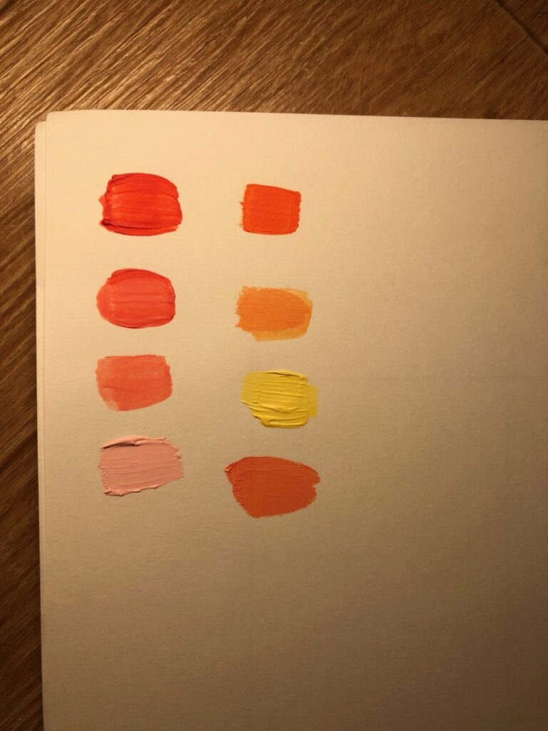
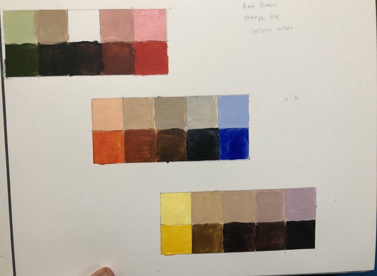
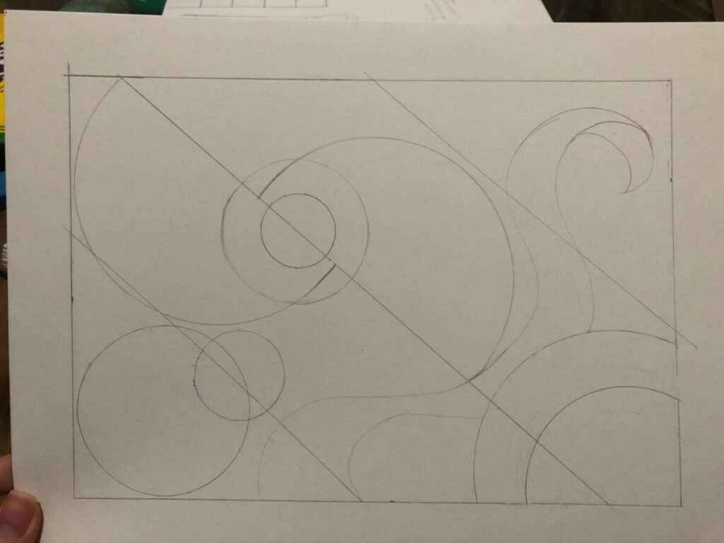
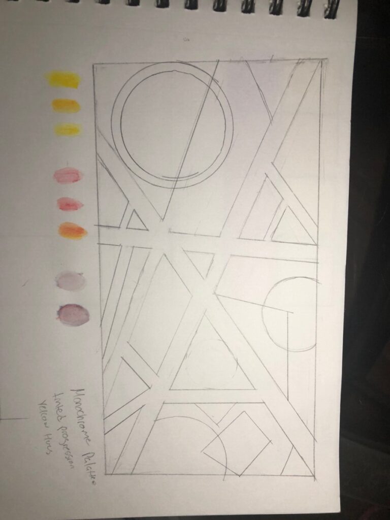
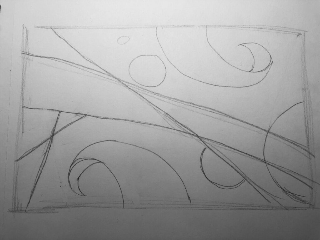
Final Reflection – In my painting I used Gradients from dark to light by tinting the colors as I passed each border. I tried to use warm tone colors such as red, yellow and orange. From the color wheel I tried using analogous colors: reds, oranges and yellows. I also tried to use monochrome colors by basing the colors with one color and tinting them as I progressed. This was a challenging project especially mixing the colors. However, it was a good challenge I really enjoyed how every time I mixed the colors and tinted them, unexpected pretty colors emerged from it. The abstract part of it was also a nice comeback from the abstract thumbnails from the earlier project, only difference is we now need to add color. I also learn new terms to use for color combinations like monochrome, analogues, saturated and unsaturated colors. I did not do the project correctly as I only used 1 color palette when we needed to use 3, I mistakenly thought I used 3. It was a challenging project but enjoyable!
Research note-
This book mirrors shifts of technology and global social life. Bauhaus promoted planning, and processes of creation however, artists today value accident creation and customization. The Bauhaus analyzed form in terms of basic geometric elements; they believed that these basic forms could be understood by everyone. Albers and Moholy-Nagy used media and new materials because they saw that technology was transforming art and design. Basic design of Bauhaus elements includes point, line, plane, texture, and color, organized by principles of scale, contrast, movement, rhythm, and balance. For transparency is a powerful digital tool that is universal and accessible for everyone. It is always used in graphic arts; Layering is another universal tool. Software tools provide visual media in which designers are tasked to create art that is relevant to everyday life that serves to deliver messages that are meaningful to audiences.


Leave a Reply