Project #5 – Color Palettes-part one
note: the word Palette is used here in two ways. The palette is a surface that you paint on, but a group of colors used for a design or painting can be called a Palette.
Project Description
Color Mixing project to develop understanding of color attributes and palettes, terminology, Paint application techniques, and sensitivity to Color Contrasts and Progressions (gradation) in creative designs.
Outcomes:
- Ability to recognize and define major color properties: hue, value and saturation (chroma)
- Ability to see individual hue in terms of it’s value and saturation, in relation to other hues.
- Ability to determine and utilize color palettes: monochrome, analogous, warm/cool, complimentary, triads (primary, secondary) etc. using CMYK and RGB systems
- Comfortable with paint mixing, paint application, formatting page, using rulers and tape for edges.
Discover: 5 explorations of color through grids and scales, one Practice sketch page, one Final Bristol page, colored pencils, acrylic paints,
Process:
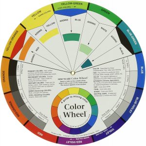
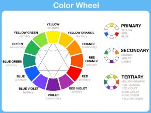
- Study color wheels, terminology and palettes from resources below.
- Colored Pencil Practice page
- On sketch paper, make a hand drawn or ruler grid roughly 4″x4″ with 1/2″ divisions.
- Using ONLY magenta (or red), blue and yellow, create as many unique hues by blending 2 or 3 colors together, gently overlapping layers. White of paper comes through to help create tints. Create primary and secondary blends, as well as muted colors by blending all 3 primary hues.
- Painting: Lay out clean plastic palette surface with red, yellow, blue, white and black.
- Practice using paint knife to mix colors and paint application on sketchpaper until you are comfortable
- grid 1) 4″x4″, with 1″ blocks – warm color scheme, reds, oranges, yellows . Use tints, shades, and tones. Use tape for edges.
- grid 2) 4″x4″, with 1″ blocks – cool colors – greens, blues, violets- use tints, tones and shades.
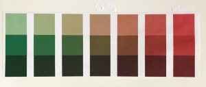
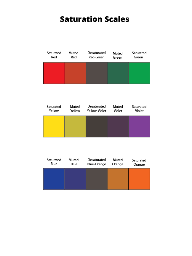
- 3 Saturation scales + tints, (see below) NO BLACK 2″x5″ one inch blocks, can be drawn vertical or horizontal on your page. Complementary color pairs:
- Red/Green,
- Orange/Blue,
- Yellow/Violet. No black for these scales. See detailed instructions below.
- Each Saturation scale has a second row (that’s why the Scales measure 2″ x5″), which is a tint of each mixed color on the first row. The tint gives you a better sense of how the muted hue looks.
Process for
Painting Saturation Scales:
- Primary Colors: Start by painting the primaries in the appropriate boxes.
- Red
- Blue
- Yellow
- Secondary Colors: Then mix and test your secondaries (Green, Orange, Violet) on piece of scrap bristol. Once you have the correct color, apply each in the appropriate boxes.
- Orange (mix red + yellow)
- Green (mix yellow + blue)
- Violet (mix blue + red)
- Desaturated Browns / Chromatic “Grays”: Next mix equal or nearly equal amounts of each complement pair. Test first and let dry completely before applying these to the center boxes. The resulting browns should be in the middle, neither complement being too prominent.
- Mix Red + Green
- Mix Yellow + Violet
- MIx Blue + Orange
- Muted Colors: Create muted primary and secondary colors by mixing a little bit of complement to each color.
- Mix a little green with red for a muted red
- Mix a little red with green for a muted green
- Mix a little yellow with violet for a muted violet
- Mix a little violet with yellow for a muted yellow
- Mix a little blue with orange for a muted orange
- Mix a little orange with blue for a muted blue
HINTS:
- Use only primary colors plus white and black for this project (Saturation Scales do NOT USE BLACK).
- To prevent streaking or weak coverage, thoroughly mix paint before applying.
- Let mixed paint dry completely on a test piece of bristol before applying to each box. Paint will dry much lighter!
- Wash your brush thoroughly after each paint application.
- Apply paint in (3) thin layers to build up a flat surface. Let paint dry in between each coat.
- Paint should be flat and opaque. No paper should show through.
- At the end of your painting session, apply extra paint to scrap bristol for future use. Don’t waste your paint.
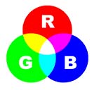
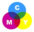
RGB lights combine to make white CMYK inks combine to create black
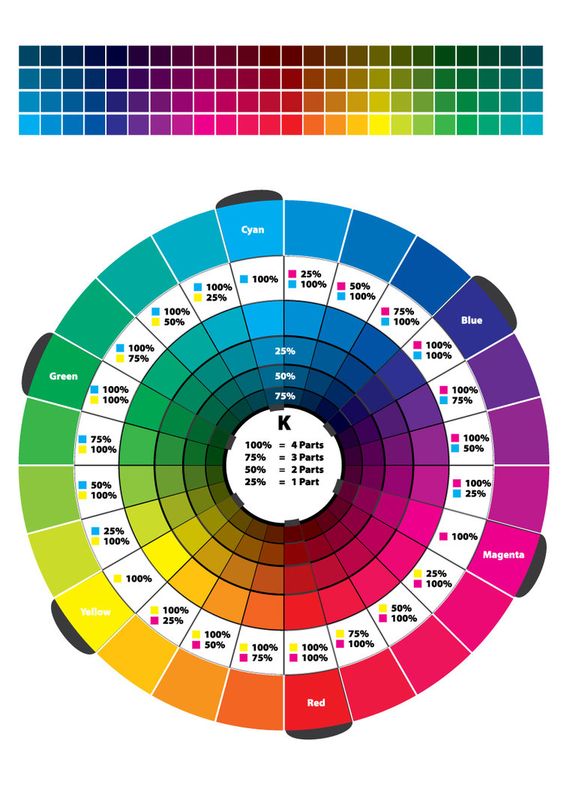

Digital color wheel for exploring palettes and terminology
Color Project #5 Part two–
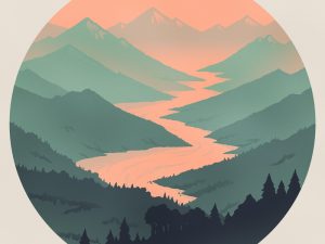
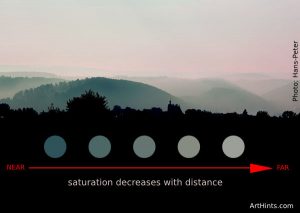
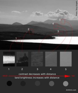
Develop Space through Color: Atmospheric Landscapes
© 2020 GRAPHIC DESIGN PRINCIPLES 1

