COMD1100,spr2020
A City Tech OpenLab Course Site

The OpenLab is an open-source, digital platform designed to support teaching and learning at City Tech (New York City College of Technology), and to promote student and faculty engagement in the intellectual and social life of the college community.


HI Zhoulu,
Thanks for posting the completed grids and scales. Remember when you post, look at “category’ settings on the right in the post window, check the box for Student posts and also the box for the assignment; I changed yours to Project #5 so it would show up in the whole group of projects.
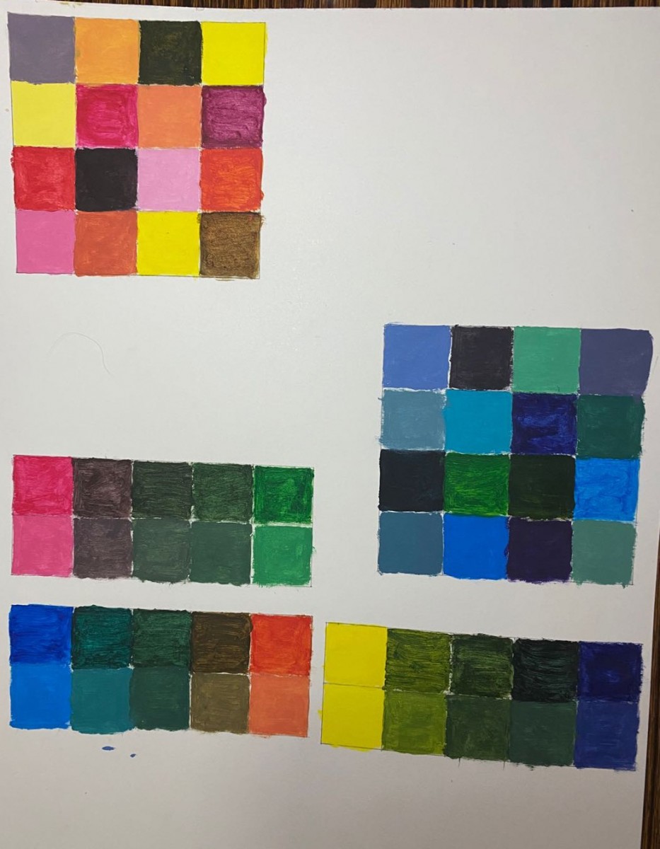
The warm and cool grids look nice and bright – clear changes in hue, saturation and value.
In the complementary color saturation scales, you could use more white in the tinted row to bring out the calm neutral hues of those low saturation mixtures. Take a look at Agustin’s to see what I mean. I think it helps. Also, when you’re painting, a couple more layers of paint can make some of the boxes smoother and more opaque.
Nice job!
Please comment and let me know what you think.