COMD1100,spr2020
A City Tech OpenLab Course Site

The OpenLab is an open-source, digital platform designed to support teaching and learning at City Tech (New York City College of Technology), and to promote student and faculty engagement in the intellectual and social life of the college community.


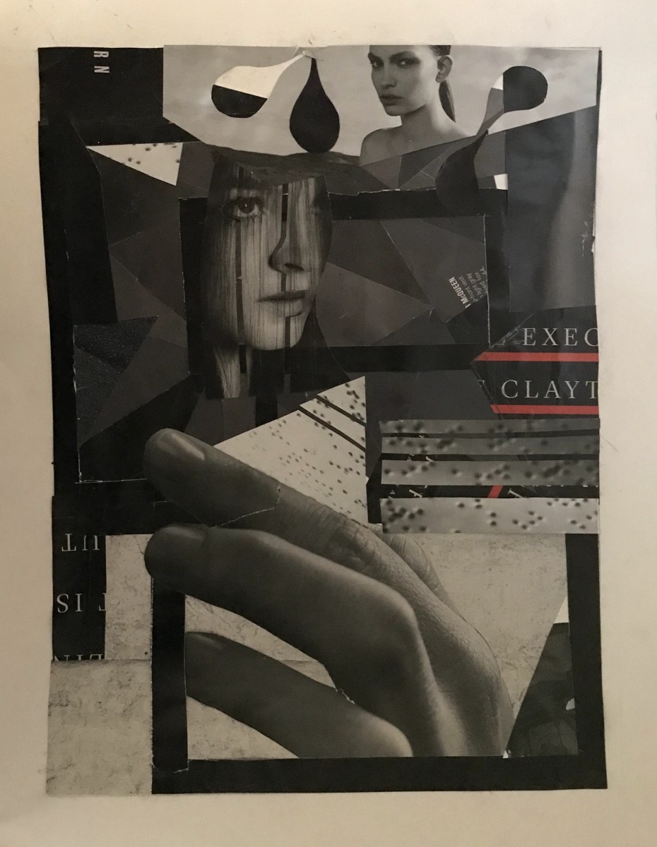
I like the value collage in achromatic grays (gray without color)
The use of imagery mixed with texture and gradations between lights and darks leads the eye through the piece well. Having the largest form (the hand) down low, then the medium size head in the center, then the small head cropped in upper right is a very good use of SCALE, an important visual device to create space and HIERARCHY (order of importance).
You did decide to use imagery more than Texture to interest the viewer, branching off from the original project which was really not to cut out images but just pieces of texture to move the eye around and create a sense of FEEL. That aspect could be stronger.
thanks for posting,
Professor Diamond