
In this project, I created a ligature out of my initials, to represent my name and my brand.
First Attempt

In this logo I went with triangular shape for the initial letter so that they can clip together. On top of that I add two writing tool display a play and pause button to indicate a animation element. I chose this logo because it show my initials and my passion for art and animation. But some challenges in this sketch were trying to show the elements of my passion and also trying to make the logo different. It didn’t work because it looks similar to my original logo, and overall there was too much going on.
Second Attempt
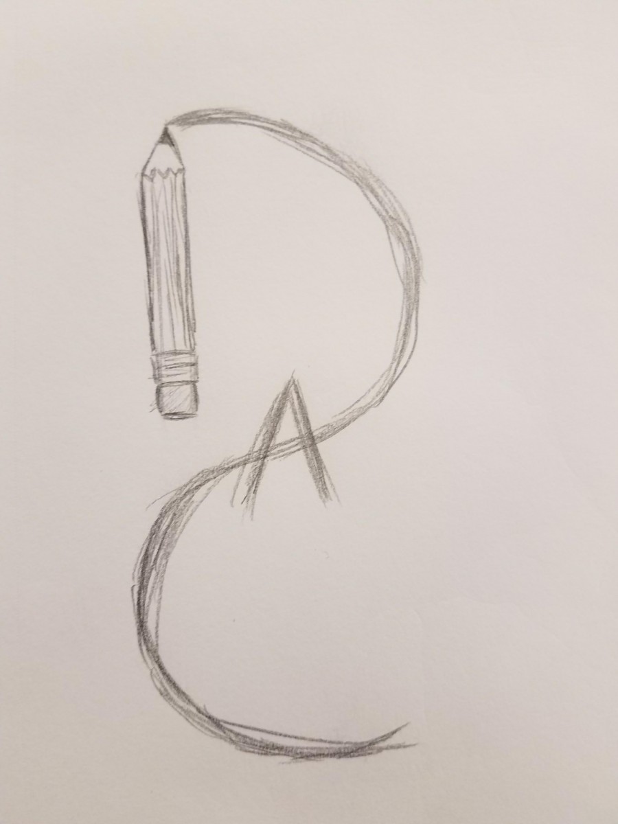
In this logo I went for a more simple but creative approach. Basely I drew a pencil with the led of the pencil creating a ligature of my all my initials, this time including the “A”. I chose this one because while it is very simple it still show my love for art. But some challenges for this design was trying to show all of the initials clearly while trying to still keep that creative look and successfully displaying the idea I was going for. It didn’t work because everyone I showed it to had a hard time seeing the initials and they thought it was an backwards “S” they didn’t see it like I saw it and therefore it was no good.
Third Attempt
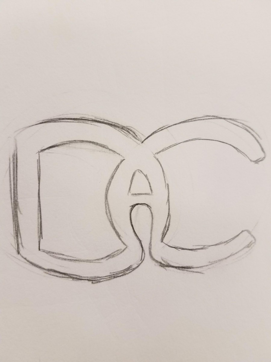
In this logo I went for a visually pleasing and connecting ligature while keeping it creative. The D the A and the C are all connected forming a perfect ligature. I chose this one because where it lacks in showing my passion for art and animation it makes up for in being appealing to the viewers eye. Everyone I showed it to like it and can completely understand the initials in it. The only challenge I had with this ligature is getting everything to connected perfectly. This logo didn’t work for me because it was a bit sloppy in the connecting of different part around the the logo, for example the bottom of the “A”.
Final Attempt
![]()
In this final attempt I basely tweaked the last logo a bit to perfect it. This became my final piece because it’s visually pleasing, very creative, all the elements look neat, it’s simple and easy, and it’s a perfect ligature of my initials. Despite the fact that it doesn’t completely display my passion for art or animation, just by glance you could tell that this logo is towards a unique purpose/ meaning. The different colors allow you to distinguish the different initials in the logo making it a great ligature. On top of that there is also the fact that everyone like it more, considering that it is a cleaner version of my 3rd attempt. Logos don’t always display details or meaning but as long as they get the main idea down they fulfill their purpose, this is a perfect example!

