Movement & Rhythm

43692_b89e385220a25728_b.jpg

43151_b2da7b0b2afc334a_b.jpg

106357_dda05abce1c4715b_b.jpg


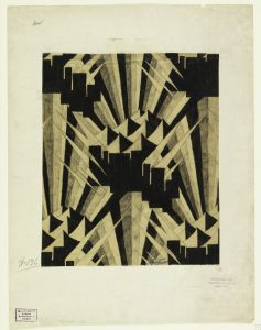
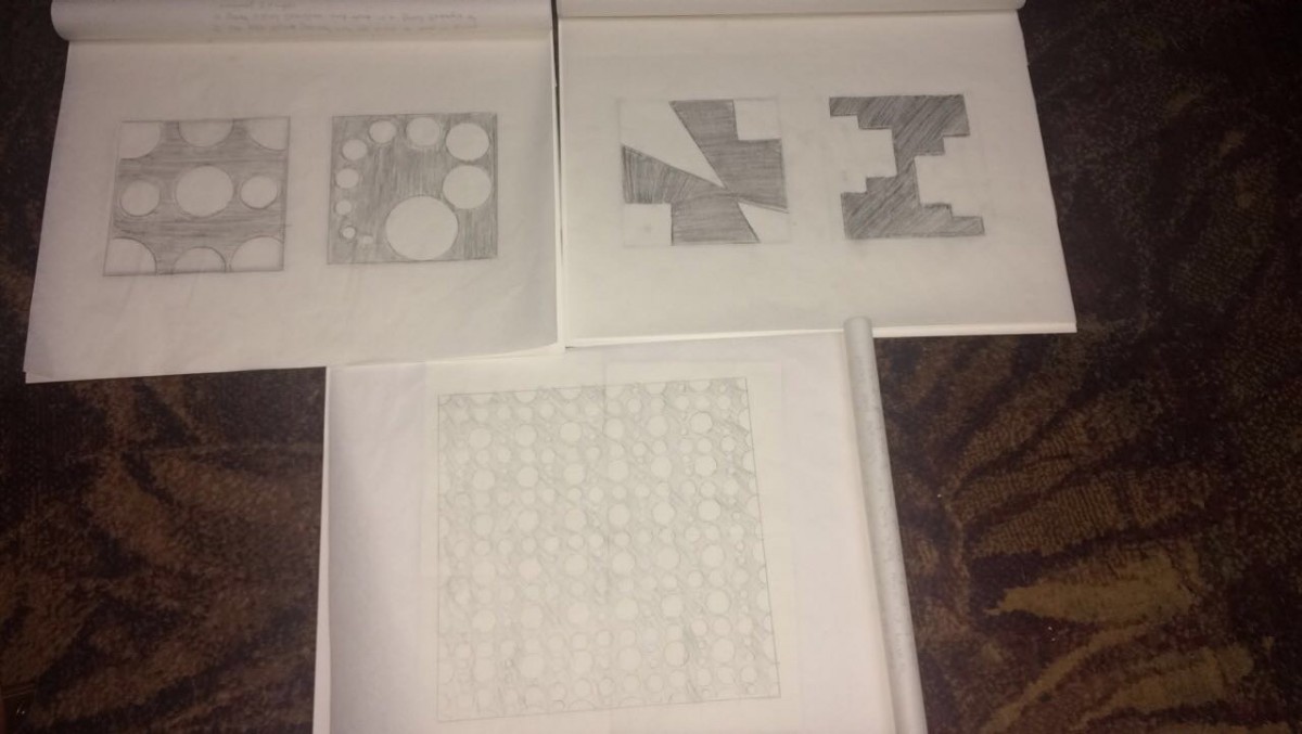
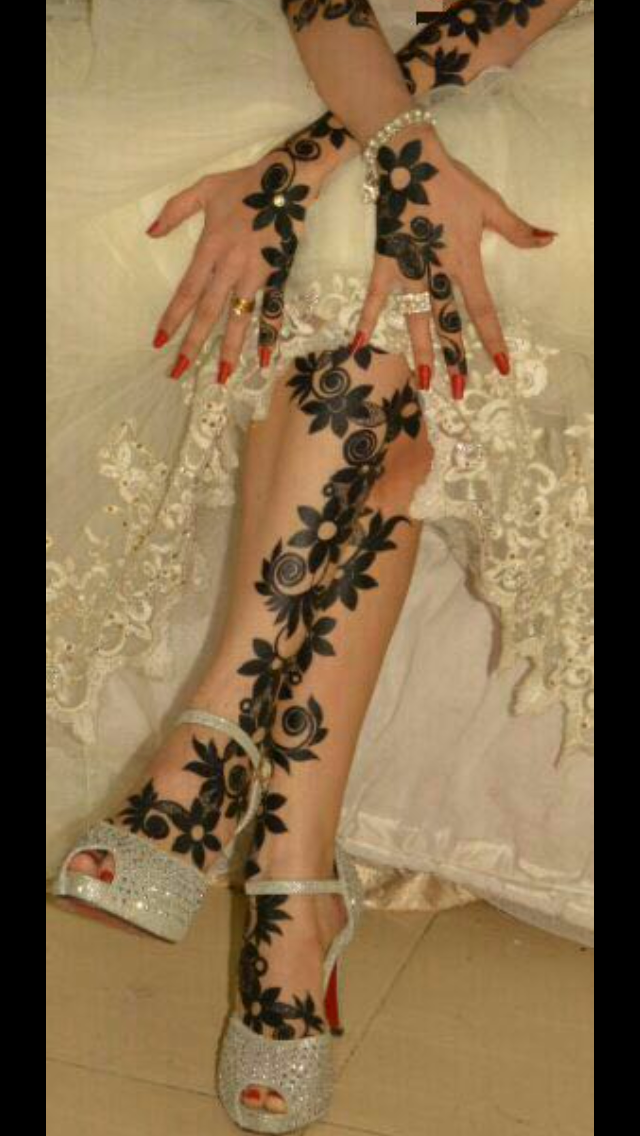
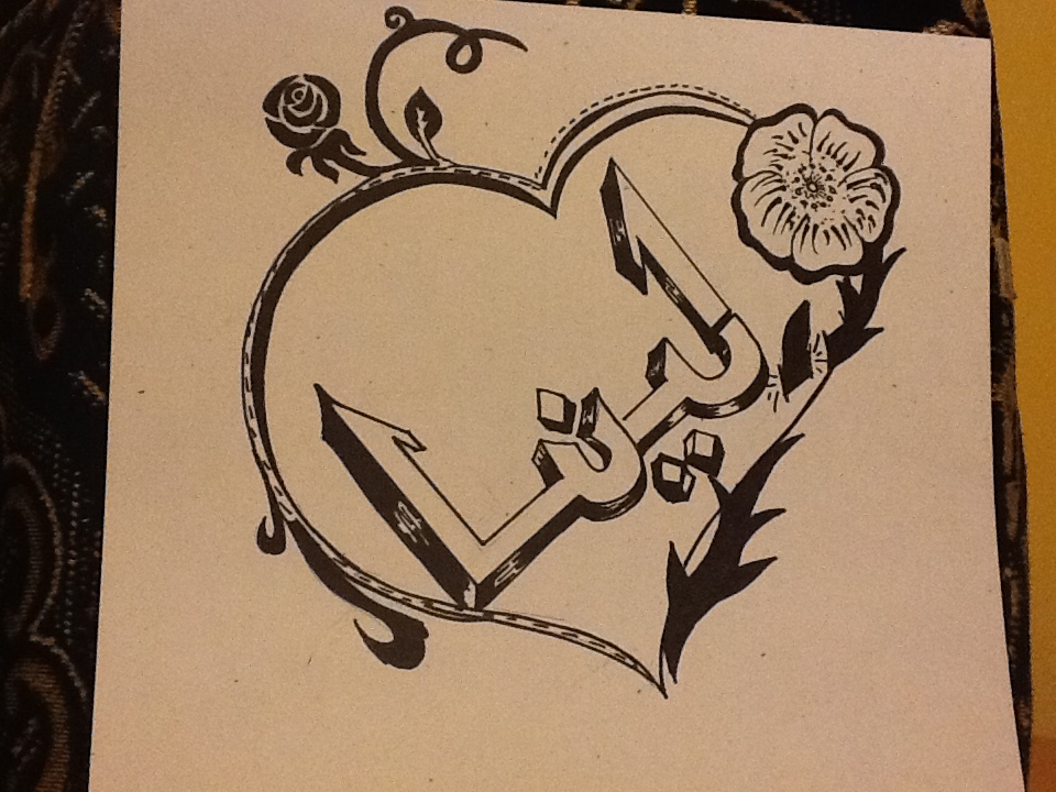
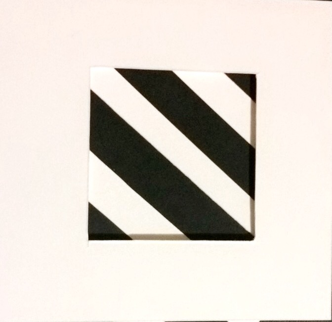
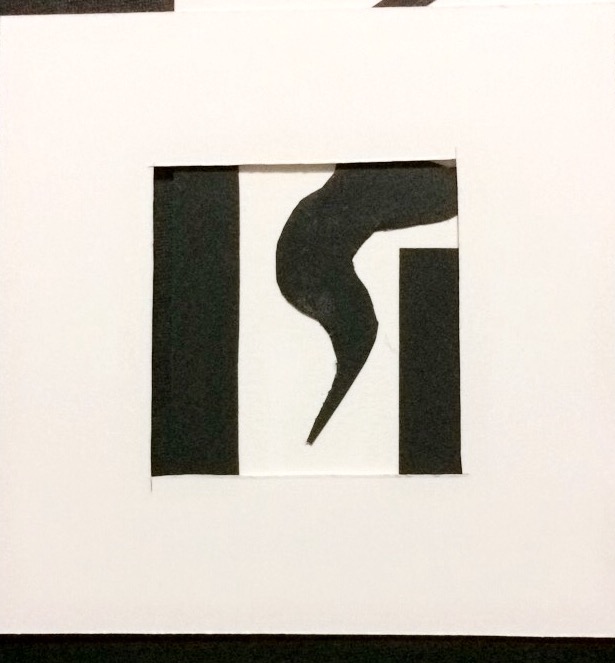
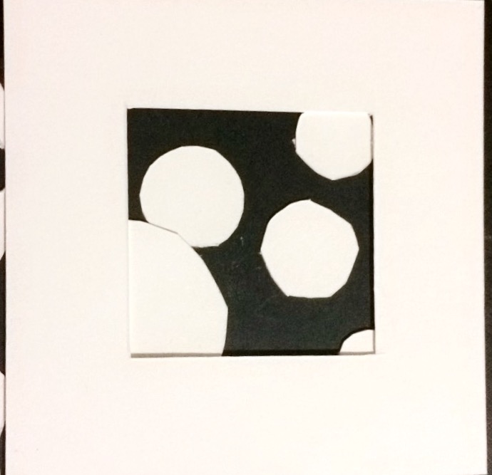
All three images shows a great example of movement. They all have a great visual hierarchy. The first and last one are my favoirte ones, they guide the viewer eye in a dimentional way. As my eyes were looking throw them in many ways following their movement, I figure out the use of emphasis. For example, the last one is well in its contrast of color and as I look around I go back to the ball patterns which shows the great use of emphasis. As for the second one it shows a great idea of organic shapes that shows a successful movement with the great balance of figure ground and motion.
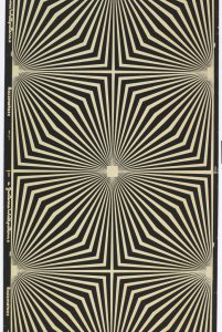
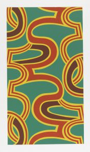
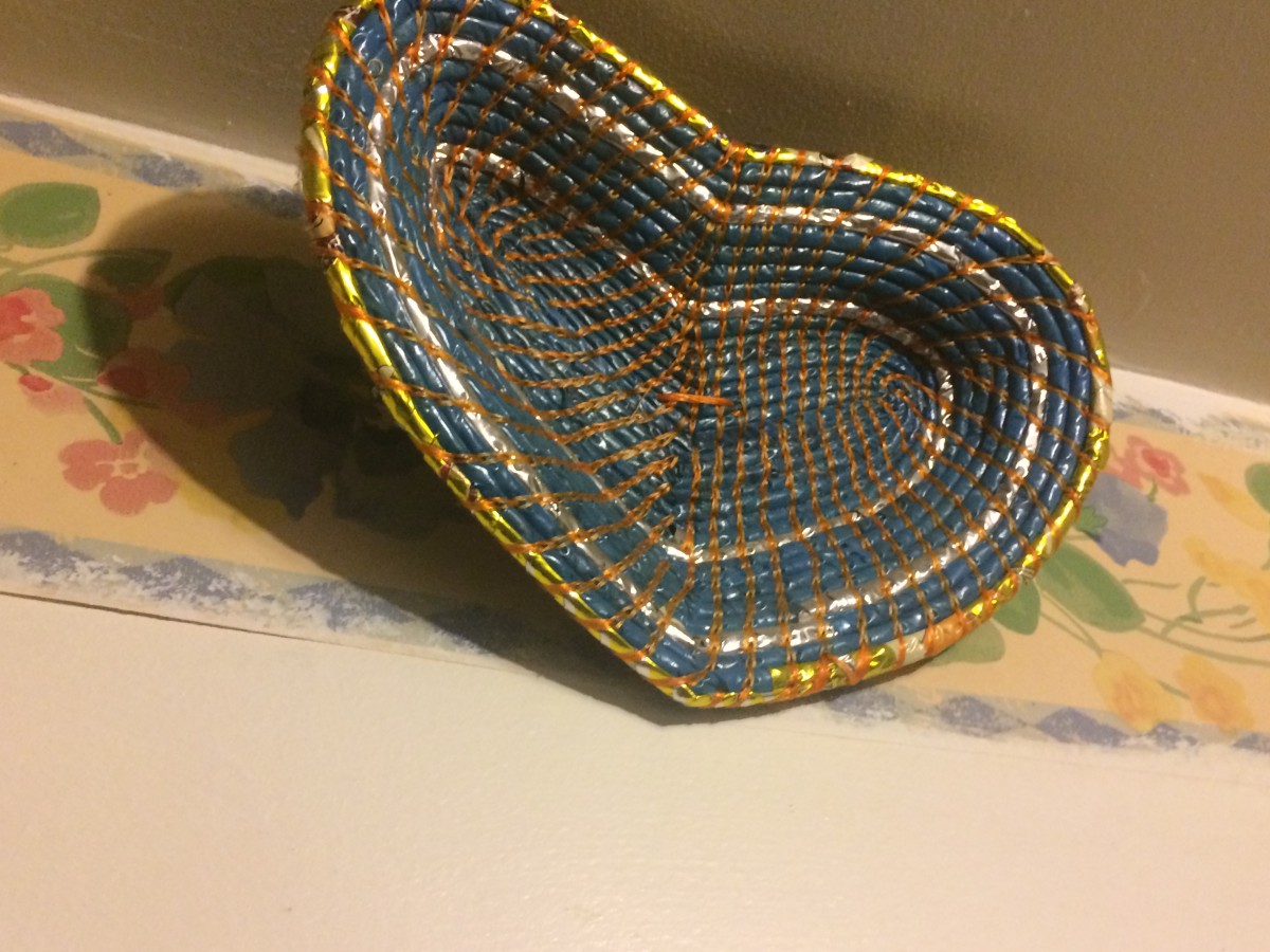
Rhythm:

90752_f84fbfc4e55fca33_b.jpg

46005_a1ee0690bdf65be3_b.jpg

101599_76ed465f93ec958f_b.jpg


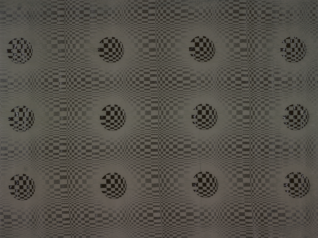
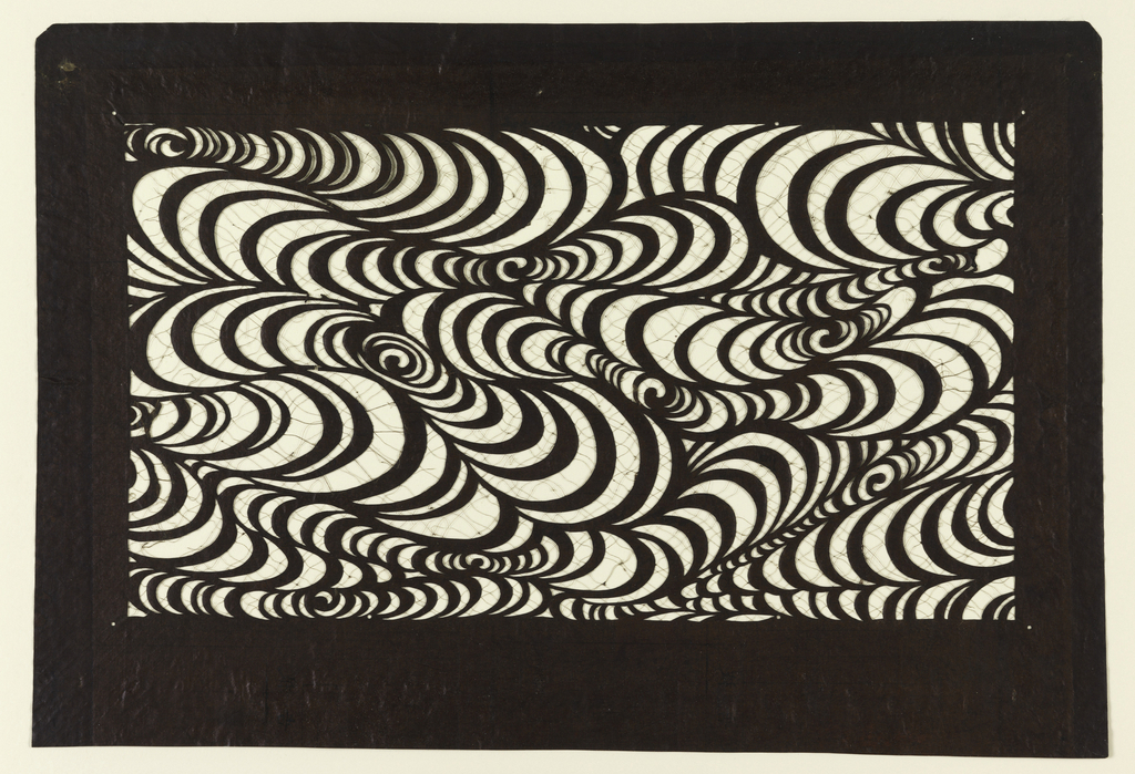
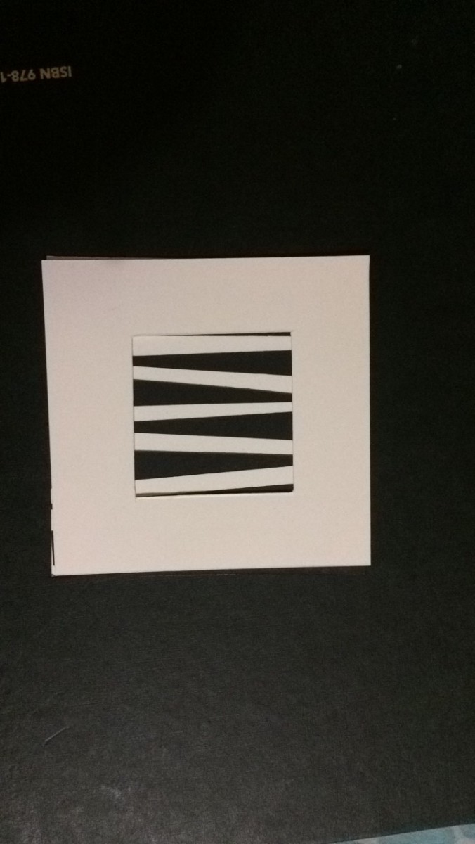
Those images are highly strong in making a successful rhythm. They all unique, the repetition, alternation, and tradition are very entertainment. As our eyes looks into each one, we could see the powerful intervals between them. For example, the first one shows an interesting intervals of flowing rhythm, while the second one shows a sequence of geometric shapes that are cahnging in the edges and thats called a progressive rhythm. As for the last one, it shows a regular rhythm because the same element is being repeated over and over. I truly love it!


Posted in Uncategorized | Leave a comment

Graphic Design #I (Project 1)

The first project in Graphic Design princlple one was a great experiment for me. The purpose was to acknowledge ourself with both the negative space and positive space using the multiple elements and rules we’ve covered from the beginning of course. The project was taugh yet fun. I had the opportunity to phsyically learn how to do perfect craftsmanship which was very challenging. In fact I purposily chose to do some of my craft of part one and part two of the project to be circles because cutting with acto knife was a big fear that I was able to achieve, specially cutting the circles.

The 4by4 compositions went successfully in term of  applying some of the element and rules of graph design. I was able to see the emotional relationship between the negative and positives space of both the reversal background and actual background. perhaps, I was also able to see a great symmetric lines, especially when I had my second part of the project. It was the 7b7. We had to pick one of the 4by4 inch compositions and turn it into a one inch and make a pattern of 7by7 inch grid. The result was very appealing in terms of the figure ground and positive ground because they make a great organization that the human eye could visually view from different perspectives. For example, I was able to see a great repetition, balance, contrast, symmetry, and movement in a successfully visual hierarchy. As a result, this project build me up to physically discover whats underneath the relationship of those important rules and element of graphic design.

-The following PDF is the actual project and the image is the reversal of it.

Project#1PDF


Posted in Uncategorized | Leave a comment

Visual Hierarchy

This gallery contains 3 photos.

TWINKLE, TWINKLE, LITTLE ROCKSTAR! a very clever poster that clutch my attention. The strong use of hierarchy is done successfully. I could easily see the organization of the visual image, the direction are pretty easy to see. The message is … Continue reading

More Galleries | Leave a comment

Rhythm & Movement


All of theses three images that I found on Coroflot.com are truly beautiful. They show a clear examples of rhythm. The repetition, pattern, arraignment, and similarities all join together. There are some progressive rhythm that changes little by little. For example, the last image is a great example of pattern and the use of both reversal background helps the outcome of the progressive rhythm to look unique.

beside Rhythm, those three images are great in movement. they are very appealing to me. In fact, I could see the regulation they have in terms of harmony and unity are on point. The feeling that pulls my eye along this artwork is just beautiful.


Posted in Uncategorized | Leave a comment

contrast

https://collection.cooperhewitt.org/objects/18438725/

https://collection.cooperhewitt.org/objects/18605029/

https://collection.cooperhewitt.org/objects/18697877/

Those are a really great idea of contrast. According to the first one, I could see its simplicity, which the little gray box, yet it help gives a great visual image. I could see the two dimensional elements that are different. As for the second one,  the balance between the negative and positive space makes it very powerful. I like how the women and dog are pushed together and the connection appear strong to grab my attention. As for the last one, it shows two great contrast, which is by inserting two different elements to create a great and strong visual image.

Posted in Uncategorized | Leave a comment

Texture inspiration

I am inspired by both the image texture and the pattern texture. They both very appealing and both creat it’s own unique emotion/visual of sense.  Design is well knowing in making a powerful sensation and emotional feeling to the outside world.  Therefore,  I believe those designs will be something that I want to incorporate and use during my educational career. The image texture fall into many categories, the visual texture which is like the abstracting of nature that it represents in a 3D texture.  The first attachment image is a 3D texture.

Continue reading

Posted in Uncategorized | Leave a comment

The difference between art and design

What is the difference between art and design?

The major difference between art and design is when art is the freedom of expression, while design is the communication of connection toward the audience/outside world. In other words, design is the content and it is what the outside world wants in terms of communication and relation with multiple things. Art is not the same because it does not need or have the same limitations, ideas, skills, or products to obtain the process of achieving an optimal result.

Another difference between the two, is the rules. Art does not follow any rule in order to accomplish its view point opposed to design, there are many rules like limitations, resources, ideas, knowledge, and skills. Perhaps, some parts of those rules may fall with both art and design, yet each one has its own motivation and frame of belonging. For example, and artist may probably draw freely based on their perspective point and present it using their own knowledge, while design or a designer will have something specifically to represent by actual emotional relationships between a client’s and the outside world. This is a major different because it has its taste of connection that shows the communication view of two different intentional categories. The idea of having the intention is by understanding the underneath rules like the 20 rule of thumbnail sketch. Most of those powerful rules result in figuring out the visual forms to the outside world. It all comes together with the big view of the values, abstract, goals, intentions, and performance to help take the idea or anything to get an attention widely.  

Posted in Uncategorized | Leave a comment

Student Design

I had the opportunity to meet with Shallah Jones in my Type & Media course. Shallah  is a great artiest who is more into Raster & Vector design. I like all his post on instagram (rv_jones_f) and I think it will be a great idea took take a look at his amazing work he’ve done.


Posted in Uncategorized | Leave a comment

Frame & Scale

By placing the frame that made over the original composition, I took a close picture of it and was surprised. I tried many different angles to see the many different views that I could get from just one composition. The last two composition was easy to tell weather that had a black or white figure ground. The two first compositions was on track, looks or could confuse the eye and mind on trying to figure out which color is the fore ground or the background of composition. In fact, it is very important to know which one is which because frame is used to unify, organize or separate something to show its purpose. As for all stable, reversed, and ambiguous figure ground that I had in my  composition,  show as a whole size even by comparing the scale and its affections size relationship.


Posted in Uncategorized | Leave a comment

Perks for CUNY student

NYCCTBROADCAST
Sent: Friday, February 10, 2017 10:09:06 AM
To: NYCCTEveryoneDL
Subject: Volunteers to Read to a Young Student !!

Dear Students:

Once a week, members of the City Tech community walk down to PS 287 and read to an elementary school student for 40 minutes. This fun and rewarding opportunity is made possible through Read Ahead.

 On Thursday (2/9) at 1pm in Namm 321, Read Ahead will be hosting an information session about their mentoring program. If you’d like to come to this meeting, send an RSVP to volunteer@readahead.org so that we can have a headcount. If you cannot make it to the meeting but still want to mentor, you can sign up at[http://%20readahead.org/volunteer] readahead.org/volunteer, watch a training video at[http://%20readahead.org/training] readahead.org/training, and Read Ahead will be in touch about next steps.

For more information, see the attached flier or visit Open Lab: https://openlab.citytech.cuny.edu/readahead/ Thank you!

Robert Ostrom

Assistant Professor, English Department

New York City College of Technology

City University of New York

300 Jay Street, Brooklyn, NY 11201

rostrom@citytech.cuny.edu

718-260-5395

“This is my favorite perk so far. It is a great opportunity for new student to experience new ideas in the outside world, especially for those who still undecided on what their major is.”

-Dhahabah Baidhani

Posted in Achievements, Internships | Leave a comment