
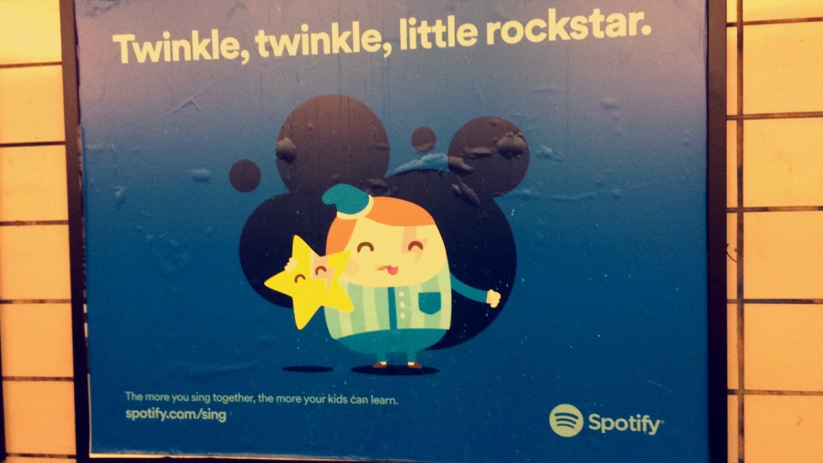
TWINKLE, TWINKLE, LITTLE ROCKSTAR! a very clever poster that clutch my attention. The strong use of hierarchy is done successfully. I could easily see the organization of the visual image, the direction are pretty easy to see. The message is to show us how singing with kids could impact their learning. I personally think that the contrast is well done and it start from the image then to the big text all the way to the little text follow by their logo.
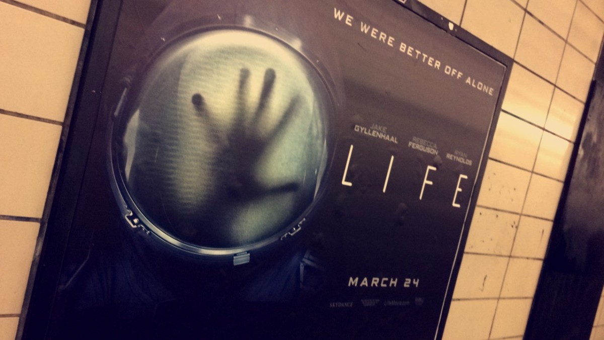
In this image, I see a strong example of visual hierarchy. Although I don’t like scary or mysterious symbols, I thought that I should not be judgmental based on what I personally like. since I always ignore those type of posters, I wanted to look behind the image itself and this one pertically shows the behind message by looking at the unclear hand inside a huge cell. I strongly believe that the contrast of the hand makes the viewer look at the rest of the details. It holds a strong movement that pushes the boundaries away from too much writings and have the title and image tells most of the story.
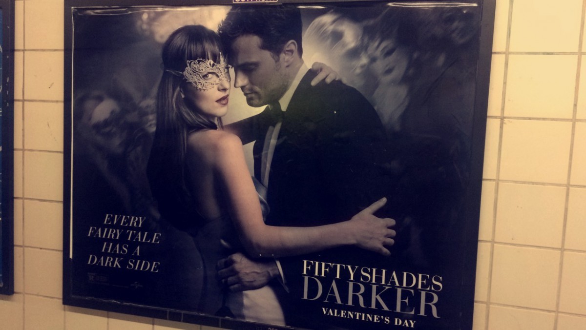
I also like this poster due to the illustration of depth. I think the overall look is absolutely fantastic. Both the positive and negative space are a great example of a strong hierarchy. With the strong use of them, I could easily first see the two individual’s, then the big text in the right side followed by the small text to the left. After that, we then look back to the image figuring out the active background of it because it shows depth of multi overlapping faces.

