In the end my group and I decided that these are the icons we will be using. The glasses to represent Maya, the cute skull for Loubna, and a flower for me. I think these choices were good because they bring out our real personality.
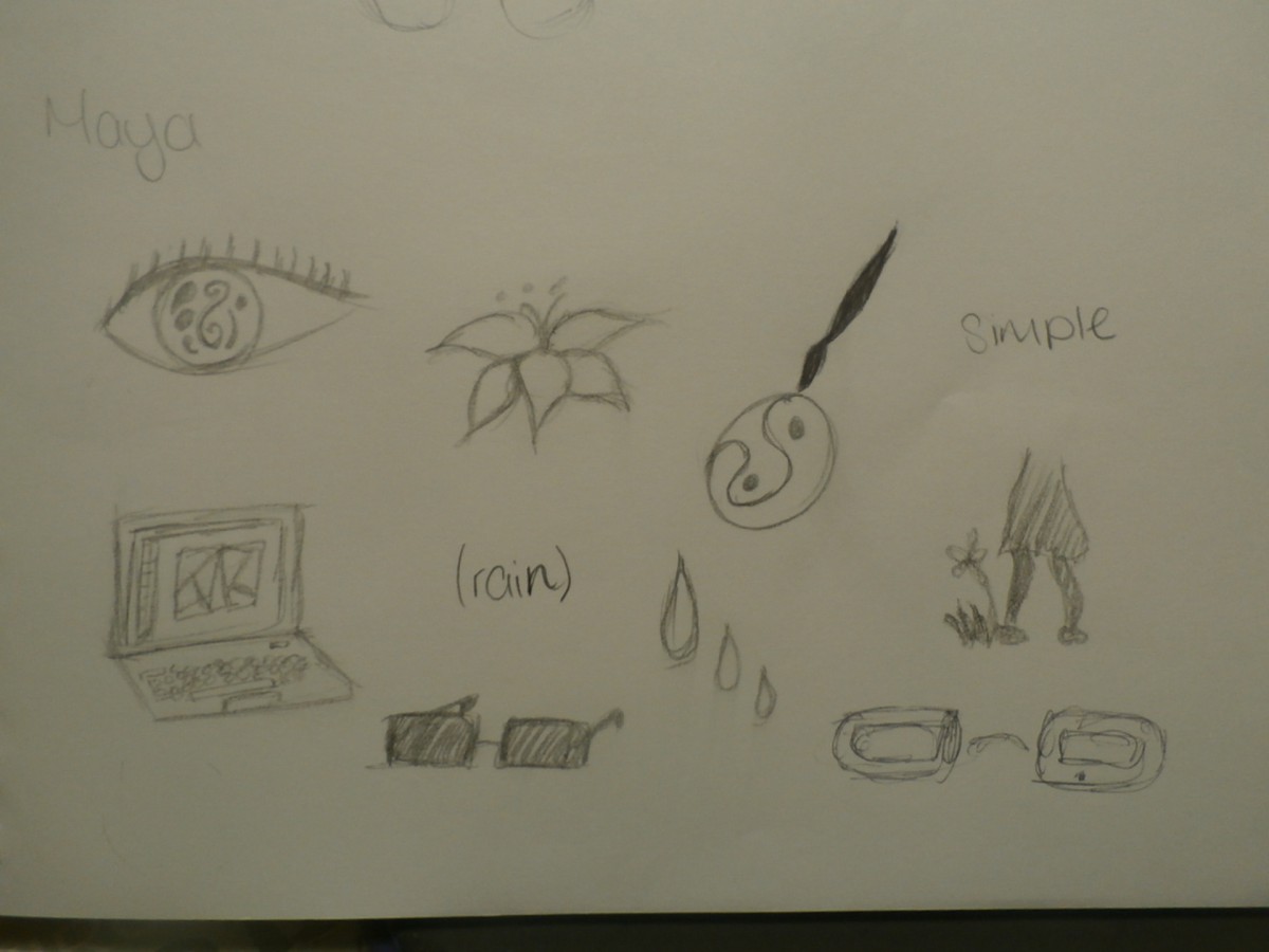
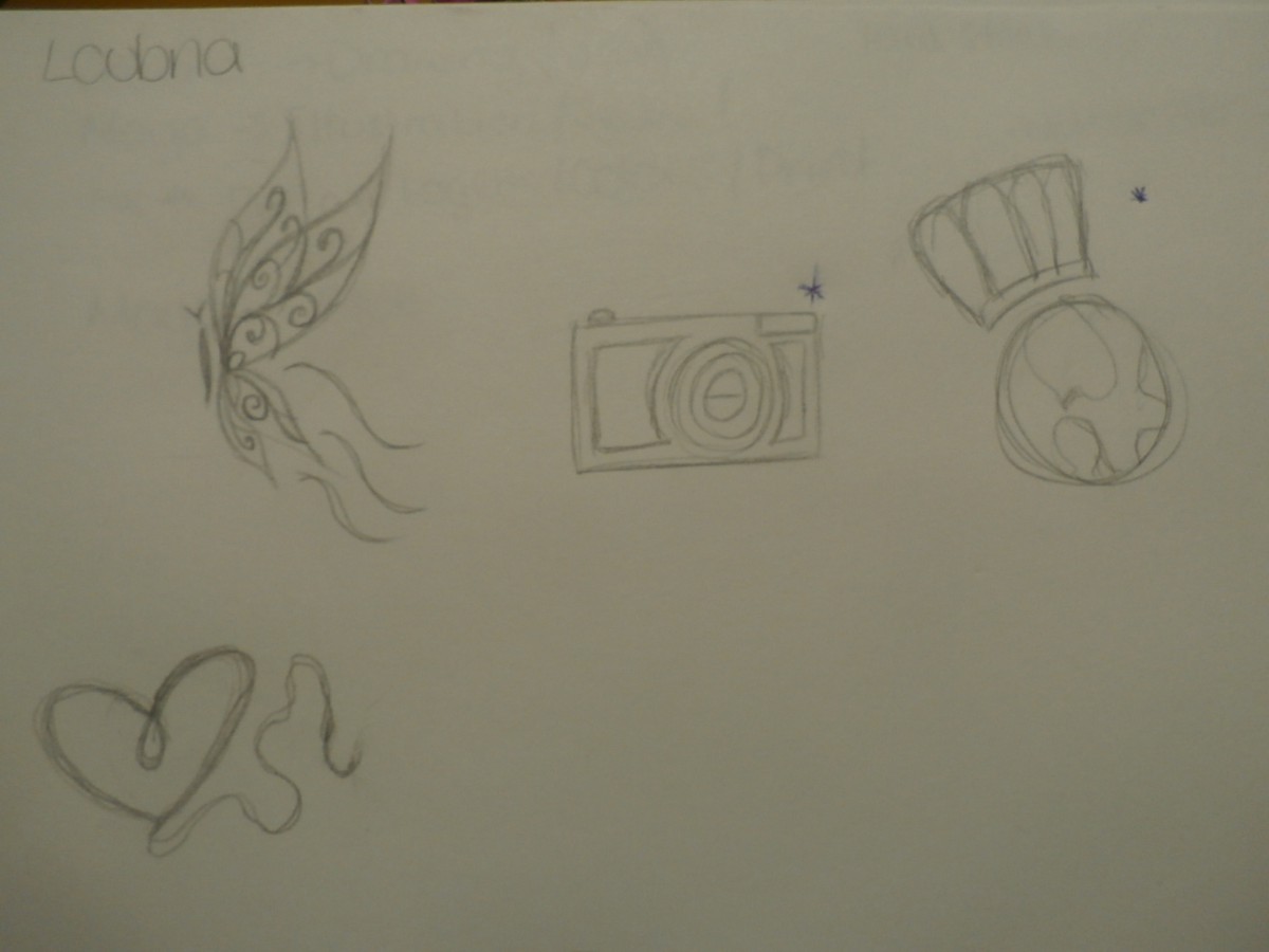
These are my thumbnail sketches for both my partners, Loubna and Maya. We all sat down and told one another things we liked, disliked, what we believe our personality is. I saw Loubna as this butterfly because she likes to travel and seemed free spirited. She told me about her love for photography and food. The heart is drawn because she is caring and seems to accept a lot of things. Maya is artistic intelligent and is observant. She likes flowers and computers. I see her as this girl who likes balance, and order. She reminds me of rain.
I took roughly 5 min to draw all of these. I do believe I should have put more time into it but I had a bad day.
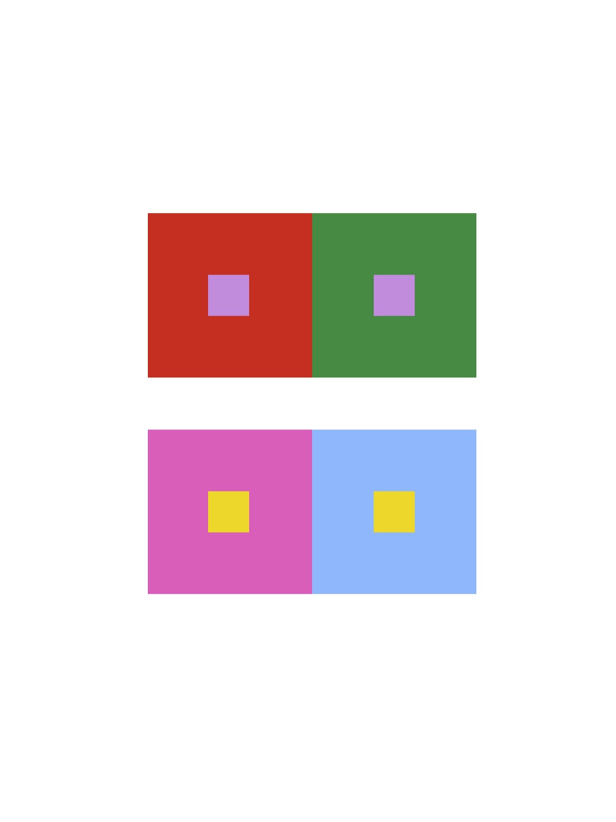
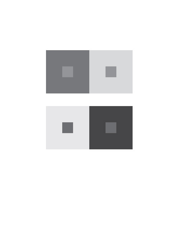
At first I thought this was going to be hard but I was able to get it on my first try. You can really see the difference in both hue and value in both boxes. I feel as though i have a much better understanding of color now that i have done these exercises and trained my eye to see the differences in value, hue, and saturation.
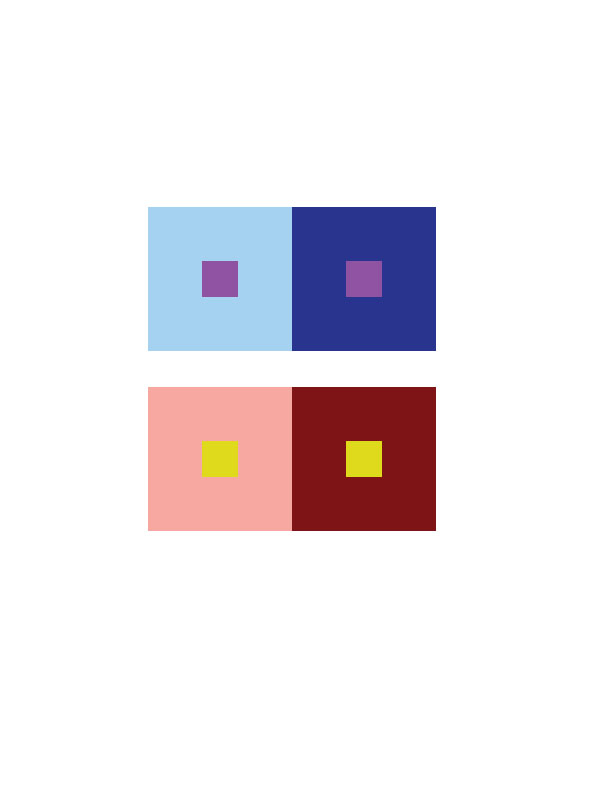
Making the first one (shifting in hue, not value) was difficult to do. I printed several of them just to experiment. I still feel as though my eyes are tricking me when I look and think too much about the color interaction. It’s very interesting to train your eyes to see color different from the way people normally would see them. Now everywhere I look I think about how colors interact with one another. I don’t just see blue, i see different values of blue and how some blues have more red or yellow than others. This gets me to think of how color influences people and the messages it sends out.
I experimented and did more than just 2 pairs for each group. When i was done I realized about an hour to an hour and a half passed.
I have created two pairs of color interaction of achromatic grays in Illustrator. You can see that in both pairs, the smaller squares appear much darker when surrounded by high key value (or lighter) gray. When the middle squares are surrounded by a dark to middle (or low to middle key value) gray, the smaller square appears lighter.
I have already made another critique post for this assignment in my previous posts but i will do it again since i did not include my thoughts of second part of the assignment.
While I don’t like my prismatic, chromatic grey, and muted color collages, I do think I did a good job with making a swiss style band poster with my group. At first I didn’t like working with a group because sometimes people can be unreliable and slack off. I quickly learned that my group was not bad at all and we were able to work well as a team. In the end I am proud of my group for being able to make our swiss style band poster in just the short amount of time we were given. When we remade our poster in adobe illustrator I was glad it game out nice and clean. The colors looked great also.
Overall I think this project was a tough one, especially when we needed to paint, but it also gives me the confidence to overstep my fears and weaknesses and just do better the next time. This class has taught me that no matter what, your weaknesses and fears should also be your driving force to become more than what you expected.
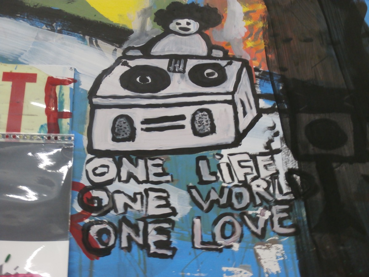
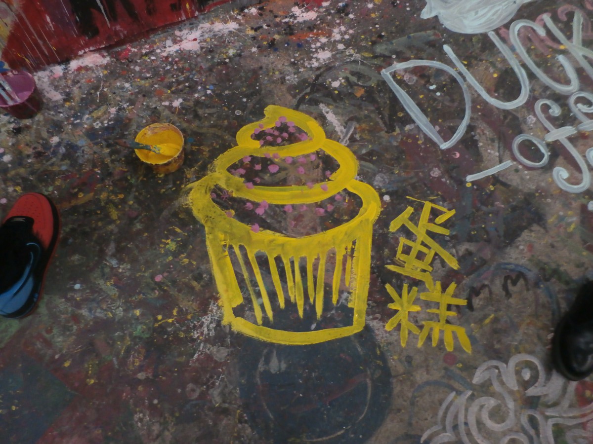
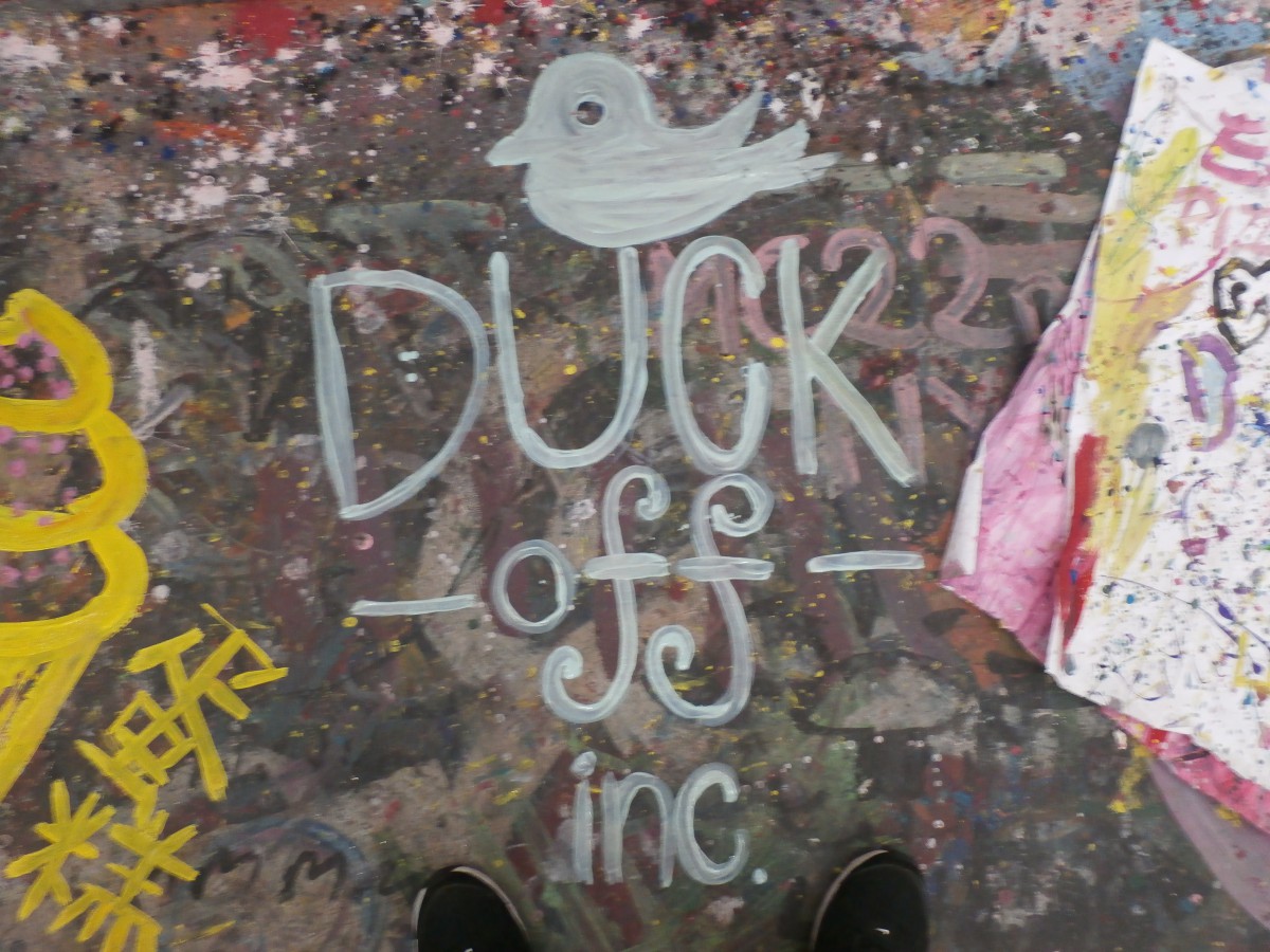
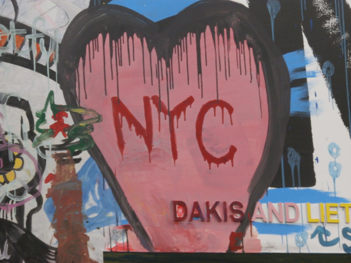
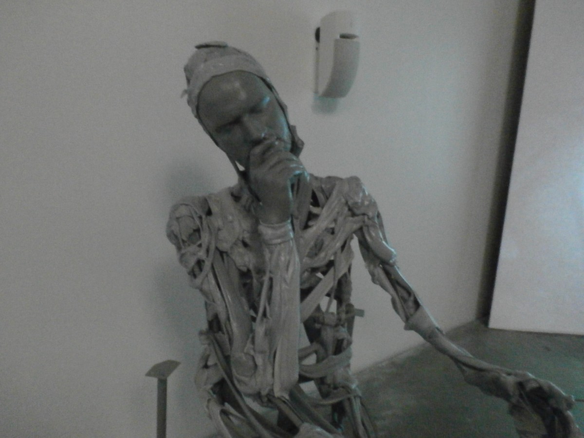
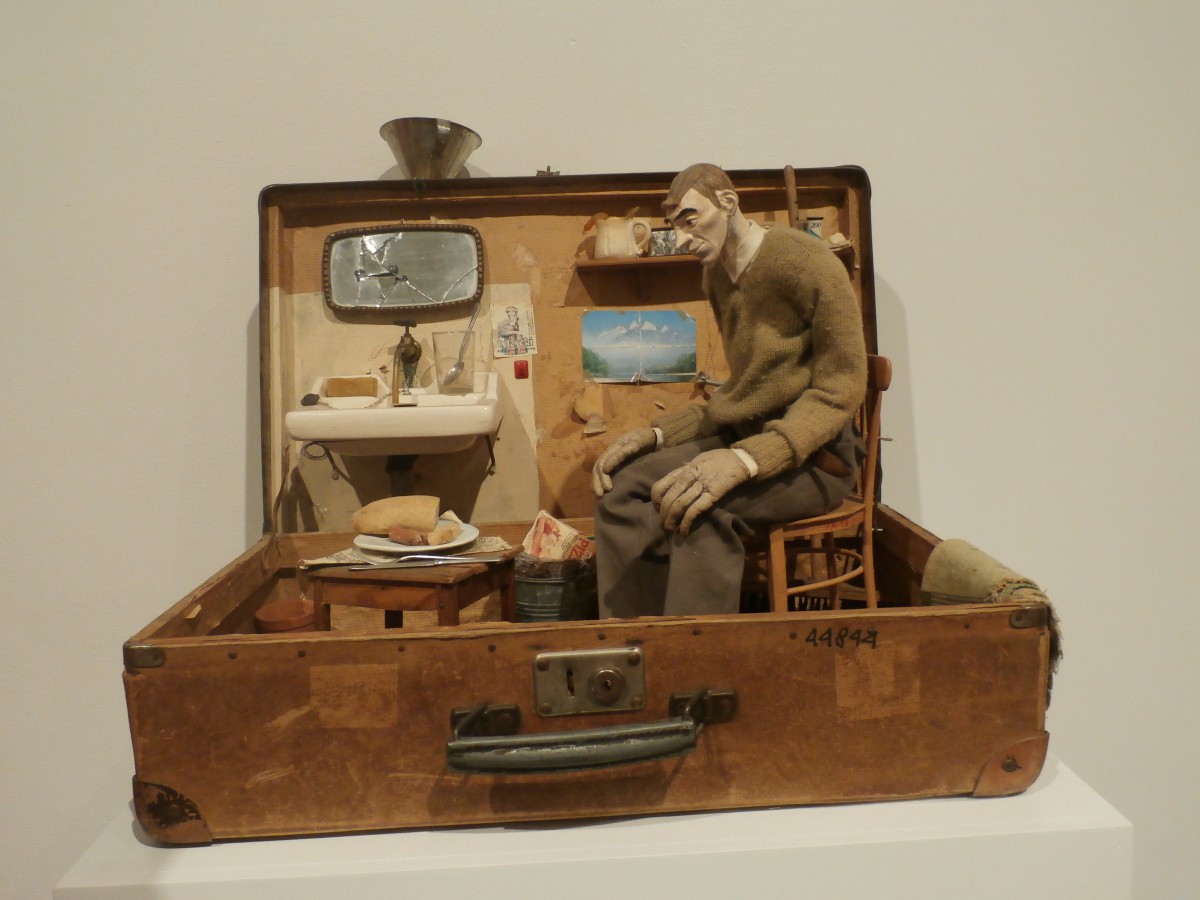
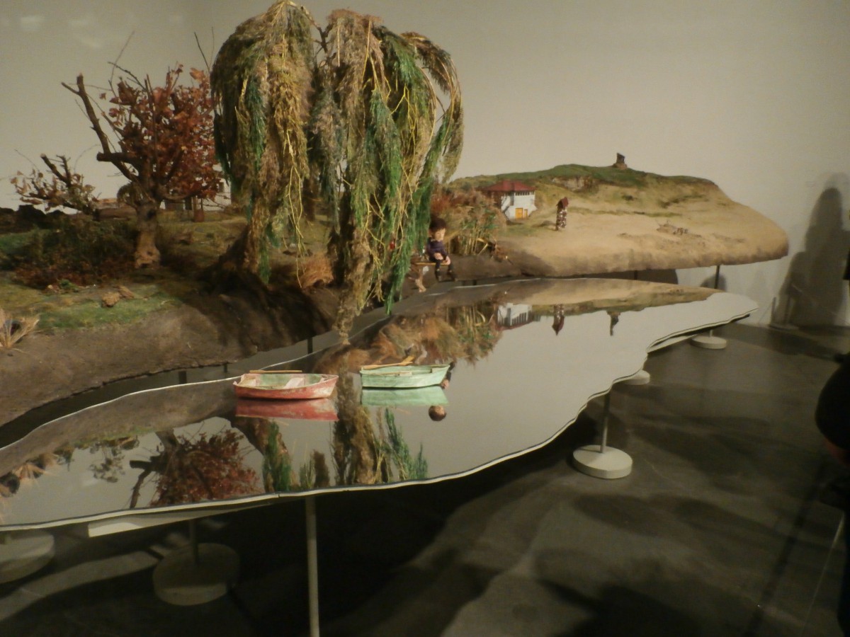
I went to the exhibit on a Thursday with my friends. We went to the place where you can paint, draw, and etc. I was amazed by how many people there were and all the different types of art people painted. I even made my own drawing. I also explored other parts of the exhibit. There were a lot of sculptures of people, displays of dolls, and even videos of the artist on drugs. It was a great experience and I am glad I was able to see the exhibit.
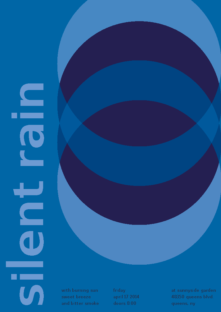
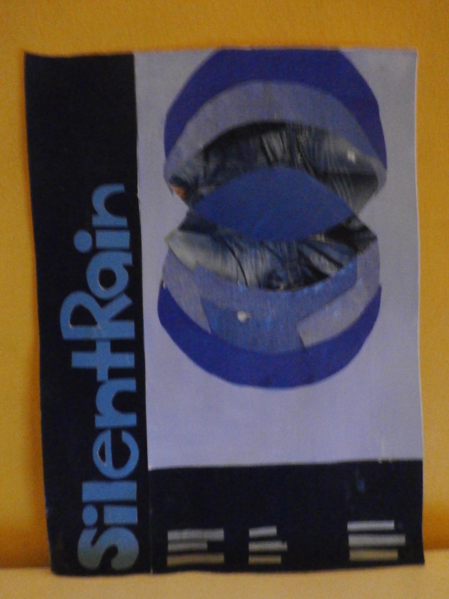
Using the already made swiss style band poster I made with my group, I recreated it in Adobe Illustrator. Recreating the poster was easy for me because i already have had experience with Illustrator but i was having trouble with the color. I tried to use no more than three different levels of saturation of blue. “Less is more” was what i had in mind. This took me about 1 hour to do.
I made this poster with Nami, Zeefah, and Isaias. We got a cool color card, Pavement as out composition grid, and used Silent Rain as our cross-sensory phrase. I think we accomplished a lot in just the hour we had to make it. 🙂
I was really excited to work with colors when i first started out this project. The hardest part for me was to make the Chromatic Gray Collages. I easily got frustrated when mixing the paint and it was time consuming. I often got muted colors too. Working with colors was more difficult that i had imagined. My eyes were sometimes tricking me and i would get confused. Working with prismatic and muted colors were much easier than working with the chromatic grays but in the end of the project i was not satisfied with any of my work. I felt like i didn’t follow the guidelines. I really plan on remaking my collages when i have more time in my hands. It was frustrating that i kept on running out of yellow and white paint too. I think i need to improve in conserving my paint and also in mixing them. I need to challenge myself more by remaking these so i can improve and hopefully get a better grade too. Although i am not satisfied with any of my work, I think the project itself is really good for training your eyes to know the differences between muted, chromatic grays, and prismatic colors. It is also good to know the difference in saturation and color.
"Art is not what you see but what you make others see" – Edgar Degas