Due 5/14
1. Project 6 due
(I will collect it at the museum)
Meet at the Cooper Hewitt Smithsonian Design Museum
at 2:30 (aim to arrive a little earlier). We will meet in the front lobby.
2 E 91st St
New York, NY 10128
Call or text me if you are lost or running late 718 679 7200
2. Continue working on the final project:
Color inventory project – album cover
Details colorinventoryformat
Link to video explaining color inventories
Due 5/11
1. Design Journal entry #26
Proportional color inventory and non-proportional color inventory
2. Keep working on Project 6- this will be due at the start of class on Thurs May 14th (at the museum). I highly recommend that you do as much as you can before Monday.
Looking ahead
Thurs May 14th
*Project 6 due (I will collect it at the museum)
Meet at the Cooper Hewitt Smithsonian Design Museum
at 2:30 (aim to arrive a little earlier). We will meet in the front lobby.
2 E 91st St
New York, NY 10128
Mon May 18th
*Project 7 and extra credit due. Guidelines: extracredit_spring
Meet in classroom
Thurs May 21st
*Projects will be returned at the museum
Meet at the Museum of the City of New York
at 2:30 (aim to arrive a little earlier. We will meet in the front lobby.
1220 Fifth Avenue (at 103rd Street)
New York, NY 10029
Due 5/7
1. Design Journal entry #25
Listen to the beginning of this podcast and write what you think about it.
2. 10 nice rough draft sketches (in either your design journal or in illustrator and posted on your eportfolio) of compositions including 3 shapes that you might use for Project 6.
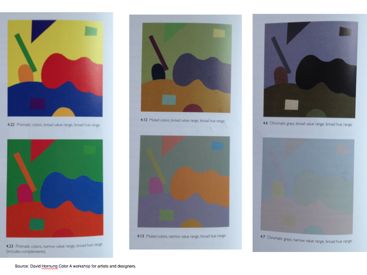
Work on Project 6, which is due on Monday:
6 copies of a composition using the following color guidelines:
- Chromatic grays, broad value range, broad hue range
- Chromatic grays, narrow value range, broad hue range
- Muted colors, broad value range, broad hue range
- Muted colors, narrow value range, broad hue range
- Prismatic colors, broad value range, broad hue range
- Prismatic colors, narrow value range, broad hue range
Use the same composition for all of them! Place two on one sheet of bristol in this formatProject4 (so you will be handing in 3 sheets of bristol).
Create a composition with 3 shapes. So there will be 4 total colors used in each composition (1 on the background and 3 on the 3 shapes).
Due 5/4
1. Design Journal entry #24
Psychology of color and what you think of it
2. Project 5 due at the beginning of class. You must post it on your eportfolio with a paragraph about what you learned.
Project 5 includes 10 different compositions:
Six color relativity tests:
- Change in hue
- Change in saturation
- Change in value
- Change in hue, saturation and value
- 2 different colors that look like the same color
- Bezold effect
And 4 spatial depth tests:
7. Change in hue (400px x 400px)
8. Change in saturation (400px x 400px)
9. Change in value (400px x 400px)
10. Make a bigger composition
(800px x 800px exploring spatial depth with hue, saturation and value)
- Due 4/30
1. Design Journal entry #23
What is the difference between a color’s luminosity and inherent light? How does this relate to hue, value and saturation?
2. Read pgs 96-101, 106-117 from Design Elements by Timothy Samara, 2nd edition.
3. Work on color relativity tests
There should be six in total:
- Change in hue
- Change in saturation
- Change in value
- Change in hue, saturation and value
- 2 different colors that look like the same color
- Bezold effect
Due 4/27
1. Design Journal entry #22
Bezold effect, simultaneous contrast, color interaction and keyed color
2. Both color wheels and saturation continuum with two sheets of tracing paper attached. Bottom sheet has your self assessment. Due at the beginning of class.
Due 4/23
1. Design Journal entry #21
All of the following terms in regards to color relationships: monochromatic, analogous complementary, triad and tetrad.
2. Continue to work on both color wheels and saturation continuum. This project 4 and will be due on Monday April 27 at the beginning of class.
Due 4/20
1. Design Journal entry #20
Prismatic color, muted color, achromatic gray, and chromatic gray
2. Use the template that we handed out in class to create the a CMY color wheel using gouache. Color wheel template BLANK
- CMY color wheel

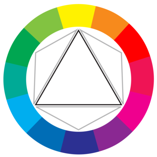
Source: http://www.sitepoint.com/rgb-or-cmyk/
Explore the colors. Notice the color when it is wet and when it is dry. Try to create swatches with even coats and no brush strokes or streaks. Glue the swatches in a circle of the center (horizontally and vertically) of a 9″x 12″ piece of bristol.
Keep bringing all of your materials to class including paint.
Due 4/16
1. Design Journal entry #19
Primary triad, secondary triad, tertiary hues, cmyk, rgb
2. Eportfolio- Write a paragraph about what you learned from project 3 and clap on 3 other peoples posts.
2. Read pgs 86-95, 102-105 from Design Elements by Timothy Samara, 2nd edition
Read pgs 70-83 from Graphic Design The New Basics by Ellen Lupton
Due 4/13
1. Design Journal entry #18
Color, hue, saturation and intensity
2. Bring in an example of the most true red that you can find
3. Project 3 completely finished at the start of class
This includes:
1. Value Scale set
2. Composition in pencil
3. Composition in pen/ink texture
4. Composition in magazine
5. Composition in gouache
Each with 2 sheets of tracing paper cut to size neatly attached to the bristol. The bottom tracing paper must have your self assessment. Point out what needs work and what you did well. What is working in terms of your design principle, transparency, layering and value?
Due 4/2
1. Design Journal entry #17
Low key, high key, narrow range and wide range in regards to value.
2. Finish two of the value scale compositions for today (the whole project will be due 4/13).
Due 3/30
1. Design Journal entry #16
Do you believe that you can create a composition which evokes a feeling or meaning using just form and space? In other words, without literal images, words, or other content?
– this will be better answered if you read the reading first
2. Read pgs 70-73 and 82-84 in Design Elements, 2nd Edition by Timothy Samara
3. Sketch out your design on one sheet of bristol in a 7″x7″ square which is centered. Do this lightly in pencil (so you can erase it) and add your value numbers.
4. Paint the value scale in gouache on the value scale sheet you started last week.
Due 3/26
1. Design Journal entry #15
Choose one design principle that inspires you and explain why. Give 3 examples of using this design principle in your notebooks. Find 3 examples of it being used in design and post it to your eportfolio.
2. Finish 5 illustrator compositions utilizing transparency, layering and the design principle that you wrote about in your design journal.
_The illustrator files should be 7″x7″.
3. Bring all of your painting supplies.
4. MIDTERM today! I will be checking your design journals – bring them in completed.
Due 3/23
1. Design Journal entry #14
Tonal progression, shade, tint and tone
2. Finish value scale in magazine, pencil and ink. Valuescale_formatguidelines
3. Bring your painting supplies (you will need black and white paint for today).
4. Read pgs 76, 94-95 and 102-103 in Design Elements, 2nd Edition by Timothy Samara.
Due 3/19
1. Design Journal entry #13
Tension and value
Suggestion: catch up on some past reading assignments if you need to.
Due 3/16
1. Design Journal entry #12
Layering, transparency and spatial depth
2. Project #2 Song movement book due at the beginning of class
*Must include 3 layers of tracing paper for each side: The bottom sheet to draw arrows of where the movement is in each panel, the middle sheet for your self assessment, the top sheet for me.
3. Read pgs 64-67 and 80-81 in Design Elements, 2nd Edition by Timothy Samara.
Read p 126-157 from Graphic Design The New Basics by Ellen Lupton (digital edition through the library)
Due 3/12
1. Design Journal entry #11 in eportfolio
Take pictures of Project 1 and post them to your eportfolio. Write a paragraph about what you learned from this project.
2. Work on your final Sound Movement Book – this will be due at the start of class on Monday 3/16.
Due 3/9
1. Design Journal entry #10
Mock-up, craftsmanship, proportion
2. Create 3 mock ups of your sound movement book.
Remember to focus on movement, rhythm and contrast.
song movement book
Due 3/5
1. Design Journal entry #9
Can you create a composition without rhythm?
2. While listening to your song, create 30 thumbnail sketches.
3. Choose 5 of those thumbnail sketches to expand and explore visually to possibly use to create your song movement book (which will be 8 panels long).
Make sure that these compositions clear communicate movement, rhythm, and contrast.
TIP: Try opposite ideas and try lots of ideas. Turn them upside down and inside out.
As always, no representational or symbolic objects!!
Due 3/2
1. Design Journal entry #8
Visual hierarchy, emphasis
2. Create final partner movement compositions
On 9×12″ bristol using ink/marker, black paper or newsprint.
Use a 7″x 7″ centered format Movement exercise_formatguidelines
3. Bring in a song that inspires you
– if it is available online (ie on youtube, spotify, etc) that is fine
– if you have the song on your mobile device or a cd that is good too
Due 2/26
1. Design Journal entry #7
Visual weight, rhythm, contrast
2. 10 textures in your design journal
*Be creative*
3. Find 5 textures used in designs online and post to your eportfolio. Say a little bit about them and why you chose them. Make sure you link to the original image!
(example post here)
4. Read pgs 60-63, 68-77 in Design Elements, 2nd Edition by Timothy Samara.
Read p 28-69 from Graphic Design The New Basics by Ellen Lupton (digital edition through the library)
Due 2/23
1. Design Journal entry #6
Symmetry, asymmetry, axis, balance
2. Inked drawings
Project1_formatguidelines_ink
Bring all of Project 1 to class to turn in at the beginning of class
(this includes inked drawings and black paper cut out compositions with tracing paper- all instructions are detailed below where the projects were initially posted)
Due 2/19
1. Design Journal entry #5
Scale, harmony, unity
2. If you haven’t already, finish the black paper cutout part of project 1.
No class 2/12 or 2/16!
Class next week is on Weds 2/18 and Thurs 2/19
Due WEDNESDAY 2/18
1. Design Journal entry #4
Pattern, texture, repetition
2. Project 1, black paper cutouts
Create 4 compositions using your knowledge of geometric and organic shapes and the figure ground relationship.
Format guidelines here: Project1_formatguidelines_9x12
Tape 3 layers of tracing paper cut to size and folded over in the back.
- The bottom layer is for you to sketch in the negative space from your original composition.
- The second layer is for your self-assessment.
- The third (top) layer is for me.
Tips
- Do not use symbolic or representative shapes (no pictures of lemons, turtles, suns, people, words, etc).
- Less is more.
- Play with scale and the relationship of the shapes to each other.
3. Bring a digital camera/phone and cord to upload images to computer.
4. Read pgs 54-57 in Design Elements, 2nd Edition by Timothy Samara.
Read p 184-197 from Graphic Design The New Basics by Ellen Lupton (digital edition through the library)
Due 2/9
1. Design Journal entry #3
figure/ground, frame, space, picture plane and format
2. Read p 84-111 from Graphic Design The New Basics by Ellen Lupton (digital edition through the library)
Read pgs 58-59, 70-71 in Design Elements, 2nd Edition by Timothy Samara.
3. Basic positive negative composition exploration
Steps:
- Cut out black shapes (2-5 shapes out of black paper) and glue them onto a white 4″x 4″ square (smooth bristol).
- Then use that composition and cut out the white negative space and glue it onto the black 4″x4″ square.
- Notice how you used the positive and negative space.
- Do this again with the other set of squares.
- Bring in two finished series of white negative cutout shapes on black paper with the scraps from the original to class on Monday.
Do not use any representative shapes or symbols. Do not hide pictures in the compositions. The goal is to explore balance shape and space- positive and negative while working on craftsmanship- keep practicing!
Email me if you have questions.
Due 2/5
1. Design Journal entry #2
Shape, form, geometric shape, organic shape
2. Read pgs 06-09, 40-53, 288-291 in Design Elements, 2nd Edition by Timothy Samara.
3. Add 3 links to the inspiration tab of our class website.
4. Look up 2 other students who are working with point, line and plane/shape, and post what they are doing and what you think of it on your ePortfolio.
5. Make 10 quick compositions exploring point, 10 quick compositions exploring line, and 10 quick compositions exploring plane/shape using any of your materials for class in your design journal. So there will be 30 in total.
*TIP: Think about size, location, grouping- in general the elements in relation to each other.
No symbolism or representative shapes!
Due 2/2
1. Buy materials and find access to reading
2. Design Journal entry #1 (see below for guidelines)
Point, line, plane
3. Set up your ePortfolio on OpenLab and write an introduction on your page.
Include:
1. write out your design goal, why are you taking the class?
2. what type of work inspires you? what else inspires you?
3. what is your preferred design process – how do you like to work? (i.e. coding, on the computer, with a marker, pencil, in small notebooks, murals, collages, planned out, spontaneous, etc.)
4. what types of projects would you be interested in collaborating on?
4. Read p 11-23 from Graphic Design The New Basics by Ellen Lupton
(digital edition through the library)
Daily Design Journal assignment
Will be announced online and in class
You will be given visual terms to explore by completing the following (for each term):
1. Write the formal definition and the source
2. Write a definition in your own words
3. Find or create a visual example of this term.
Assignments for your design journal may also include a reflection question on areas of contemporary design and your experience.

