1 ) The purpose of this assignment was for the student to understand how to write a business letter effectively using correct balance of text placement and the header as well as enough white space and correct font for the occasion in order for it to be visually appealing to the audience.
When I first completed the assignment, The density of the bullets seemed a bit overwhelming. There were also some features missing in a typical business letters. When revising, I cleaned up the bullets as well as shortening each bullet to a maximum of three lines and I added the features of a business letter as well. What I felt my strengths were was the use of white space in order to make the document look visually appealing.
Portfolio Documet #1 – Lorem Ipsum
2) The purpose of this assignment was to re create a negative memo of addressing a problem in the company in an authoritative way. Also to use good will and positive emphasis while giving the same message. As well as changing the format to make it visually appealing to the readers.
For this assignment, formatting wasn’t an issue but what was a major challenge was finding the right words to say in order to give a positive tone while giving the same message that was given. I also made the message very vague as to what seemed to be the problem addressed. Using the sample memo that the professor sent as a reference, I was able to accommodate for what I did.
Portfolio Document #2 – Authoritative Memo
3) The purpose of this assignment was to make an informative goodwill letter draft having Avis Budget Group address a customer’s complaint as well as explaining to the client the benefits of the new self-service system.
One of the main difficult problems I had with this assignment was not addressing the problem the client was saying as well as helping him to solve it. With this, I had to come up with a way to say to him as quickly as possible how I can get him to an agent as well as how using this new system he doesn’t like benefit him.
Portfolio Document #3 – Informative Message
4) The purpose of this assignment was to reject a client’s suggestion about adding a second photocopying machine in the work space using an appropriate tone as well as goodwill.
The trouble I had with this assignment, was finding the appropriate tone in terms of a you-attitude for the company and not the individual. With this revision I took upon an authoritative approach.
Portfolio Document #4 – Negative Message
5) The purpose of this assignment was to develop a persuasive message that would appeal to different businesses to convince them to contact the Director of Internship Opportunities at City Tech so they could get more information about the internships provided. With the requirements of the program added, this is to convince the businesses to give students the chance of learning more about what future businesses they’ll soon be working for.
From the feedback I’ve gotten, I have a great sales voice, however; I wasn’t able to persuade any businesses to convince them to contact the Internship Opportunities. With this new submission, I changed that up and added a few extra details that will catch the eye of the businesses: That is, what we’re all about. Advertising.
Portfolio Document #5 – Persuasive Message
6) The purpose of this assignment was to inform incoming students in advertising design what to expect in their first semester of City Tech college. The kind of advice is what follows:
- Steps for Success in City Tech
- Resources a Newcomer should know
- Challenges you might Encounter
- A Typical First Semester in City Tech
The trouble I had with this assignment was that I abused the bullet points when I was listing the specifics by giving long paragraph descriptions after each of the bullets. I also gave examples on what a student needed to do but left it as an incomplete thought not telling them where the places are located.
Portfolio Assignment #6 – Short Report
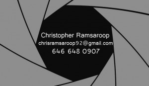
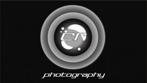
7) This last assignment was about anything we choose. The purpose of this assignment was to do anything that is related to the type of work we are currently doing as well as what we want to be doing in our fields. What I decided to make for my Final Project was a Business card. More specifically for the type of Advertising that I’m most interested in: Photography. On the Front side you’ll find that the art style is that of a shutter lens. I didn’t incorporate that I was a photographer because most designers could tell it’s a shutter lens at first glimpse. I also as well have the word photography on the backside. On the backside is my logo and together it’s called CR Photography. I used the shape tool and manipulated the circles as well as the gradients in order to make my own custom lens. Lastly I wanted to keep the business card simple so i left it with only three neutral colors: Black, White and Gray.
Front:
Back:


0 Responses
Stay in touch with the conversation, subscribe to the RSS feed for comments on this post.