
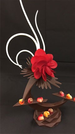
This showpiece is made of all chocolate with some parts being spray painted to add more color. I chose this piece because when scrolling through google images it was of the first ones that caught my eye. It is an abstract piece and has a lot of movement which I think is very important when creating a centerpiece for an event. The smooth flow of the shape doesn’t bring your eye away from the bottom of the piece but it helps bring it towards it. Having the brightest color flower dead in the middle of the piece also helps keep your focus on the main part of the piece. There aren’t a lot of colors in it to begin with but they all relate because the yellow, brown, and green on the flowers moving up the piece are somewhere in the biggest flower. This piece looks like it would be displayed at a fancy or elegant event because of how sleek and simple it is. I could not find the artist of this piece.
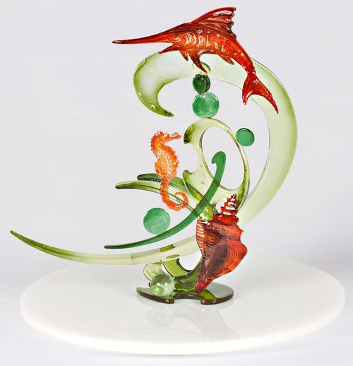
This piece is made from casting sugar and has an ocean life theme. I like how they used minimal colors so it doesn’t look too busy and the color they used for the sea animals is very vibrant. The way the green-clear color moves tells a story to me. At the top, you have the swordfish swimming with the motion of the waves, it doesn’t look like something that can’t move but at any moment will swim away. The seashell is resting on the ocean floor being moved by the water. And finally, the seahorse, which is not standing straight and tall but is at a slight angle. The darker colored bubbles are different sizes which give the illusion of the air bubbles you see in the ocean on every tv show and cartoon, which also helps with the movement of the piece. This piece is made at The Pastry School by Stephane Treand. This is my favorite piece.

This amenity is made of pulled sugar, I like it because it is very bright and eye-catching. The first part of this piece I noticed was the three flowers in the middle because of the negative space behind them created by the circle. After that, I start to get a little lost because the piece is kind of busy. Each element of the piece separately is beautiful but I think being assembled the way it was is a little too much for the eye to process. I understand the top part of the piece, which looks like a small bouquet of flowers and the clear parts are the leaves with some ribbon. The bottom confuses me a little though because it looks like an envelope with hearts and some stones. I can’t tell what the light pink-white colored part is. I feel like this may have been a Valentine’s Day piece because it’s pink and looks to be about love but I’m not too sure. I couldn’t find the artist. This is probably my least favorite out of the four I chose.
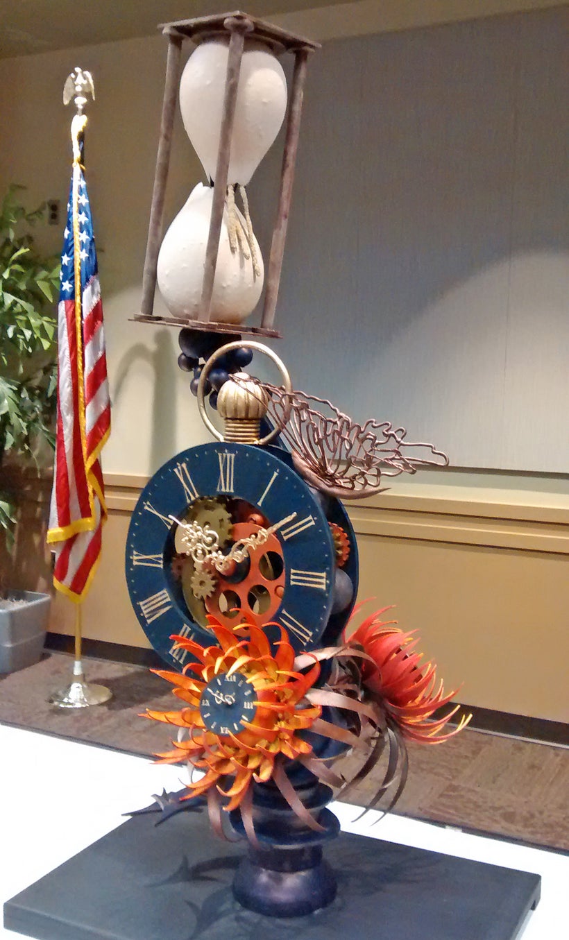
This piece is made of chocolate and although it is a little busy, it is clear what it is. This piece is inspired by time and has a few representations of that, the clock, and the hourglass. In my opinion the clock and flowers look like the artist spent a lot of time and concentration on but the hourglass isn’t as refined. I know they dipped balloons in chocolate to get that shape but it looks like it could have been done a little neater. If you look closely, you can see there are small chunks of chocolate so the finished piece is not 100% smooth. I think this piece would have looked fine without the hourglass because the complexity of the two is different. The artist is Olivier Saintemarie.

This piece was also made by Stephane Treand. I like how the color is ombre and its not one solid color. I feel like if it was just one color it wouldn’t be as eye-catching as it is now. At the very top there is one darker piece of sugar which helps bring the whole piece back together since that is the same color as the bottom half of this. I think it also helps with the contrast and to keep your eye from getting lost. If it was only a bright and transparent color it could get lost if it was sitting next to a white wall. I also like how the bottom of the violin was pieced together like a puzzle instead of just one piece. That makes people look at it more because you try and find that perfect angle that makes it look like it is one full piece opposed to it just being plain and simple. It is not too complicated but not too simple either. Finally the base, I’m sure this was intentional but having the base be the same color as the piece itself makes it look like its getting lost towards the bottom. It doesn’t take away from the piece that much and it was the last thing I noticed so I wouldn’t say it’s a big negative.

This is created by Ewald Notter. I believe the corn and pumpkin are made out of modeling chocolate. I think the yellow is very bright which helps people notice it and the ring of chocolate helps keep your eye on the piece. When sculptures have lines that move around your eye will continue to subconsciously follow that line even if it is going away from the piece. So having this circle keeps your eye in the piece. The direction of the corn brings your eye to the circle, going around to the top pumpkin, continuing on the circle, and bringing it back to the corn. I think it is very simple in the components of the piece but the detail of each is very nice.
This piece is made of chocolate and I think the colors really help it stand out. That white at the top is so clean and pure that it makes the other colors that much better. I like the geometric shapes of the base on the very bottom and what looks like bonbons to me on the “shelves” of this piece. The flower has a lot of detail in each petal and the spikes coming out serve as its own personal background. I like how this artist also incorporated the color of the flowers in the bonbons. The fact that this piece is not straight and dead-on also helps with the nice look. Not everything is going in the same direction so it doesn’t look stiff, even though most of the lines are straight. Overall I think this piece was very well put together.


My favorite is the red piece with flowers. I love the different flow of different techniques used. I also love the different ideas that was used to put it all together. Even though it is pretty and eye catching I do agree that it does get busy
Hi Jada,
i really enjoy the piece that you considered as your favorite, i like the color palate in it, as well as shapes in green, it kind of reminded me of waves or like seaweed on the sea, and the bright orange really make the piece pop, i like the idea of also including some blown sugar balls because it gives that water/ bubbles to the piece.
Hi Jada,
The piece you thought may have been a valentines day piece was a piece i chose for my 5th piece but since we had to submit 4 i dropped it. The middle negative space behind the flowers along with the black swans was also what caught my eye, It is a beautiful piece and i agree it can can get confusing but i think it would be a real puzzling challenge putting it together.
Jada, you have a discerning eye. Your observations take in the whole structure of a pc are very clear. The first two have a curved form that is very pleasing to the eye. In the valentine it absolutely is too scattered and jumbled in spots because there is too much going on. We see that in a lot of pcs. The elegant simplicity of the first two are very refreshing. I hope you can mimic the style of some of the amenities that you have seen when you do the final draft of your confectionery showpiece design. You realize that these pieces (except maybe the sea-scape) are too big to be considered ‘amenities’ right?
Chef, I didn’t know what I posted wasn’t amenities so I added three more pieces to make up for the three that were too big. I hope these are amenities.