
The readings in this section explore the evolution of the International Style’s philosophies and methods, examining concepts in typography and visual layout, including the grid.
The early European avant-garde designers like the Futurists, Dadaists, and Constructivists changed how we use typography. Today we may use typography not just to communicate information or data but as a compositional element to communicate a tone, feeling, or idea.
The readings introduced the ideas of three designers who shared a passion for typography and layout that was clean, efficient, and structured. Influenced by the Dutch De Stijl and Bauhaus movements, their work aimed to achieve a universal method for visual communication.
This evolution of influences from the Constructivists, De Stijl, New Typography, and the Bauhaus led to the mainstream adoption of the modernist International Typographic Style or Swiss Style in the mid-20th Century and beyond.
New Typography
Swiss designer, Jan Tschichold was influenced by the Dutch De Stijl movement and the Bauhaus. In his book “The Principles of the New Typography” in 1928 Tschichold promoted dynamic asymmetry, san serif fonts, and many of the tenets of the Bauhaus. He believed that typography should never distract from the goal of relaying information as efficiently as possible. Layout was based on mathematical calculations to promote visual hierarchy, but he also valued beauty and spirituality.
Tschichold possessed a deep knowledge of traditional graphics and type, but rejected virtually all pre-modern conventions after visiting the first Bauhaus exhibition in 1923. He published The New Typography three years later. In 1933 the ruling Nazi party imprisoned him for spreading Communist ideas. Shortly thereafter Tschichold fled to Switzerland, where he remained for the rest of his life, continuing to design, but rejecting the modern typographic principles of his early work.
- The new typography is defined by clarity and economy of expression, as opposed to ideas of beauty and ornamentation
- Typography must not arise out of preconceived ideas, but by developing form from the function of the text
- Asymmetry is optically effective, as it establishes definite, logical relationships within the text
- Standardization of type achieves clear and objective forms, as standardized building materials are necessary for architecture
- For the typographer ‘the most important requirement is to be objective’
With the volume of information and data shared today, clarity in typography and layout is as important, if not more important as it was when Tschichold formulated his ideas.
Watch the Graphic Design History section on New Typography on LinkedIn Learning using your Public Library Card or the YouTube video below to learn more about this movement. NOTE: In the following video, watch from 44:02 to 48:09
Swiss Style / International Typographic Style
The next generation Swiss designers and pioneers of the Swiss Style, Karl Gerstner, and Joseph Muller-Brockman created and spread their systematic approach to design across Europe and America. The typographic tools for layout and typography that we use today in Photoshop, Illustrator, InDesign, etc. grow out of the structured grid and typographic methods of the Swiss Style. Web design also relies on the grid for clear communication.
Karl Gerstner’s approach to design embodies the International Typographic Style, aka the Swiss Style, in its systematic methods and formal rigidity. In Designing Programmes, Gerstner describes the quasi-scientific technique of establishing a programme to address design problems.
- There is no ‘absolute solution’ for design problems, only ‘programmes for solutions’
- ‘The creative process is to be reduced to an act of selection.’
- Systematic tools such as the ‘morphological box of the typogram’ provide the necessary components for the selection process
- The grid can be a ‘proportional regulator’ but is not a programme onto itself
Joseph Muller-Brockman’s Grid and Design Philosophy is a practical manual for grid-based design solutions, a theoretical treatise, and a brilliant example of the grid system at work. Müller-Brockmann’s strict rule-based methodology anticipates the digital workspaces that would come to dominate design in subsequent years. The short excerpt defines this philosophy.
- The grid is ‘an expression of a certain mental attitude’
- The designer’s work should be a ‘contribution to general culture’
- Design should be ‘objective, committed to the common weal…the basis of democratic behavior’
- The grid represents a ‘will to systematize, to clarify’
Watch the Graphic Design History section on Swiss Typography on LinkedIn Learning using your Public Library Card or in the YouTube video below to learn more about this movement. . NOTE: In the following video, watch from 1:21:57 to 1:25:45
Confoederatio Helvetica = Switzerland (in Latin)
Originating from the early Avant-Garde, the Swiss Style / International Typographic Style (and the modernist aesthetic in general) reaches its height in the 1950s and 1960s. In America, it transforms corporate advertising.
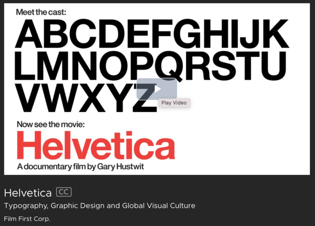
The ultimate Swiss Style typeface “Helvetica” was designed in 1957. It became a hallmark of the International Typographic Style and one of the most popular typefaces of the mid-20th century.
Watch this documentary “Helvetica” from 2007 using your City Tech login. Note the mention of MySpace and other dated references. Also, note that the documentary, which focuses on a typeface that was intended to be a universal typeface, lacks a diversity of voices.
Readings and Other Media:
NOTE: A City Tech ID is needed to access some online resources. Additional openly licensed resources will be added as they become available.
- Jan Tschichold, “The Principles of the New Typography (1928)” in Armstrong, Helen. Graphic Design Theory: Readings From the Field, Princeton Architectural Press, 2009: 35, ProQuest Ebook Central [City Tech Library Card Required]
- Beatrice Warde, “The Crystal Goblet, or Why Printing Should be Invisible (1930)” in Armstrong, Helen. Graphic Design Theory: Readings From the Field, Princeton Architectural Press, 2009: 39, ProQuest Ebook Central [City Tech Library Card Required]
- Karl Gerstner, ”Designing Programmes (1964)” in Armstrong, Helen. Graphic Design Theory: Readings From the Field, Princeton Architectural Press, 2009: 58, ProQuest Ebook Central [City Tech Library Card Required]
- Müller-Brockmann, Josef. “Grid and Design Philosophy (1981)” in Armstrong, Helen. Graphic Design Theory: Readings From the Field, Princeton Architectural Press, 2009: 63, ProQuest Ebook Central [City Tech Library Card Required]

